Voting could be ICON’s killer app. Here’s how to design it.

A voting interface for the ICON blockchain that’s fast, transparent, and easy to use.
The rational voter has little incentive to gain more knowledge about politics because his or her vote is unlikely to affect the outcome. Since gaining more knowledge offers few benefits and substantial costs, the average citizen remains ignorant, though rationally so.
Ilya Somin | Why Ignorance Isn’t Bliss
ICON is different. One person’s vote can affect the outcome. P-Reps (public representatives: validators for the ICON blockchain) rely on votes to cover their server costs and fund additional contributions. Fund the wrong ones and you limit progress.
People earn rewards for voting. So like it or not, that’s the main reason most of them will vote. As long as they’re rewarded the same, they don’t care. They’ll only consider who to vote for if the time or interest arrives. It rarely does.
Even if they do have time, it takes a lot of effort to understand who each P-Rep is and what skills they have to offer. The information is often difficult to decipher, and many P-Reps talk about the same things. How do you decide who deserves your votes more?
People won’t care about their votes just because we want them to. If there’s a shortcut, they’ll take it. So they vote for P-Reps already at the top. It’s faster, and they must be popular for a reason.
But it centralises the network, so how do you solve for it?
Design for behaviour
We expect people to be as engaged in the voting process as we are, but that’s designing for intention, not reality. People are lazy. Aside from voter apathy, we also have to consider how people behave online:
- People abandon difficult tasks after 30 seconds.
- People read less than 20% of the words on a page.
- 87% of people abandon a purchase after a two second delay.
- 80% of people only read the headlines.
- 88% of people won’t return after one bad experience.
And people who only bank online are 73% more likely to switch banks for a better online or mobile service.
People are task driven, irrational, and impatient.
For the best experience, they need a voting tool that’s fast, transparent, and easy to use.
The faster and easier the tools, the more inclined they’ll be to use them. And the more transparent those tools, the more intelligent our network can become.
Home | Voting

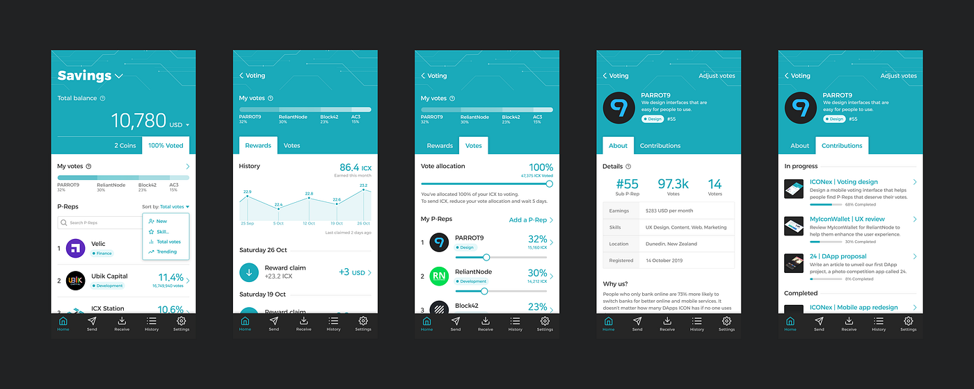
The voting homepage is all about speed. It provides useful information at a glance, and makes it easy to take action.
Use the voting tab to keep an eye on your vote percentage, even when you only open the app to check your balance. Or combine it with the bar graph to assess your vote split. For more details or to change your votes, just tap.
With a few filters, the leaderboard becomes a discovery tool for P-Reps. You can sort the leaderboard by:
- Total votes
- New (see if any new P-Reps have potential)
- Trending (see which P-Reps are popular at that moment)
- Skill (find the best P-Reps in each field)
A leaderboard sorted by total votes creates problems. The P-Reps at the top rarely change, and most people won’t look past the first 5–10. The top P-Reps get more votes, and it gets even harder to change the hierarchy.
So how do you balance votes? The community floated randomisation as the solution. But randomisation doesn’t help people who are there to complete a task and move on. People like structure, and information without order is chaos.
Why not default to sort by new? It gives more exposure to P-Reps who could use some votes, and keeps the community up to date with new talent. There could be a new P-Rep to consider every time you open the app. That’s more interesting than a leaderboard that never changes.
Trending shows P-Reps with the most vote activity over the last 7 days. If a P-Rep’s votes increase significantly, there’s a reason for it — whether they’re a promising newcomer, made a significant contribution, or backed themselves. With the Trending filter, that information is easier to find.
Skills: a new voting strategy

New and Trending help you discover P-Reps to vote for, but there’s something missing: strategy. Let’s introduce one:
Vote for P-Reps with the right skills to push the network forward.
When you categorise P-Reps by their primary skill, you can build your own strategy. If marketing is over-represented, but you think we need more DApps, vote for P-Reps with a development focus. And if you think a P-Rep ranked in the 40’s is better at development than a P-Rep in the top 20, give them more of your votes.
Compare strength to strength. It helps the network get stronger.
The primary skill gives meaning to a P-Rep’s existence. It forces them to focus, and be clear — to the community and to themselves — about where their strengths lie.
Some people will object to this and say it’s impossible to categorise P-Reps by a single skill.
We get it. Most P-Reps have a range of skills, but that doesn’t mean they specialise in all of them. A jack of all trades is a master of none, and to increase the value of the network as fast as possible, we need masters.
People vote smarter when you give them a better metric to judge by. Every P-Rep has a main strength. This will be a discussion for the wider community, but most of them are pretty clear:
- ICON Foundation is development
- VELIC is finance
- AC3 is marketing
- Many others are node operators
Categorising P-Reps isn’t just a voting strategy. It’s a business strategy. P-Reps that specialise are more likely to leverage each others’ skills to improve the network. P-Reps that don’t are more likely to do their own thing and compete with each other for votes. Let’s avoid the adversarial approach. We have so much work ahead of us, and working together will give us the edge over other blockchains.
P-Rep | About

Each P-Rep has a page where you can learn more about them. It starts with a short summary of what they do. They only have 100 characters to get their message across, so they’ll need to be concise.
The ranking, number of votes, and number of voters are key metrics. They reveal how popular a P-Rep is, and whether they have the community’s votes behind them, or the votes of a few with deep pockets.
For full transparency, you can also see their monthly earnings. When you put a dollar value on the rewards, it’s easier to assess what a P-Rep is doing vs what they’re earning. If they produce good work but aren’t compensated fairly for it, you can vote to support them.
Conversely, if a P-Rep earns a lot for doing nothing, you’re more likely to question it than vote blindly.
The rest of the page gives P-Reps an opportunity to expand on what they do. They can share their point of difference, add team members, and include links to their website and social media.
P-Rep | Contributions

P-Reps boast about their server stats as if their only role is to run a node. The initial premise of the ICON Network — and what drew us to it in the first place — is that it was based on contributions, dubbed a Delegated Proof of Contribution network. Running a blockchain node was just the prerequisite.
The community incentivises P-Reps to contribute to the network, so contributions should be the focus. Completed contributions highlight skill level and work ethic. Contributions in progress let you preview what’s coming. Combined, they help you decide if a P-Rep’s work deserves your votes, and how many votes to give them.
Say you’re torn between two P-Reps and decide to look at their contributions. One has some interesting projects in progress, but they don’t have many votes so progress is slow. The other is higher up the leaderboard but hasn’t contributed much of value. At least, nothing that excites you.
Who are you more likely to vote for?
When you emphasise contributions, people feel like their votes matter. They get to fund P-Reps whose contributions excite them, and they can keep an eye on their progress.
When you find a P-Rep you want to vote for, tap Adjust votes.
My votes | Votes

Adjust how many ICX to allocate to voting. 100% is ideal for maximum rewards, but if you plan to send some, you’ll need to reduce the percentage in advance. The slider helps you adjust it and preserves your vote ratios. It’s staking without the complexity.
A 5–10 day wait to use ICX from your voting fund is more than a minor inconvenience. Design can’t fix everything, so some microcopy will have to do.
The bar graph is a constant reminder of who you voted for and how many votes you gave them. If your votes don’t look balanced, adjust the percentage for each P-Rep. The graph changes as you adjust them to help you assess your votes visually.
And if you want to add a P-Rep, it suggests the ones you recently viewed so you don’t have to search for them manually.
My Votes | Rewards

Last but not least, the reason everybody votes: rewards. See how many ICX you’ve earned by voting, when you last claimed some, and the value of each claim in US Dollars.
It’s tedious to claim rewards in the ICONex web wallet. As a reward for voting, people need to claim their I-Score, stake the ICX they receive for it, then manually delegate it to their list of P-Reps. And to maximise their earnings, they’ll need to do it regularly.
There are so many steps required that countless P-Reps have written articles to help others. It’s a terrible experience, and we shouldn’t expect people to suffer through it.
Let’s keep it simple and use an auto-claimer.
Many will dismiss the auto-claimer because we should encourage people to be active voters. Works in theory, but remember: people are lazy. They take shortcuts. If we don’t offer the ability to auto-claim, someone else will.

We can’t design for what we want people to do. We have to design for what they want to do. And most people want to set and forget, with a system that auto-adjusts, like Lisk. One that requires no ongoing interaction.
People with a significant amount of ICX will be more active because they want to increase the value of their holdings. But for others, ICX will be one coin of many. We shouldn’t make them jump through hurdles, and we can’t force them to care.
When people use the app, their experience should be as easy and engaging as possible. If they know they earn rewards frequently, they’ll check in more often just to see their balance. And if we provide interesting, up to date content, they’re more likely to browse while they’re there. That won’t happen if they use someone else’s auto-claimer.

Voters always take the easy path, but if they’re not informed, their votes could centralise the ICON Network.
With our interface, it’s fast and easy to vote, and even easier to learn about each P-Rep in a transparent manner.
Note: As of January 2023, no further steps have been taken to build this wallet.
See also:


