
The ICONex wallet is preventing adoption. Here’s how to fix it.

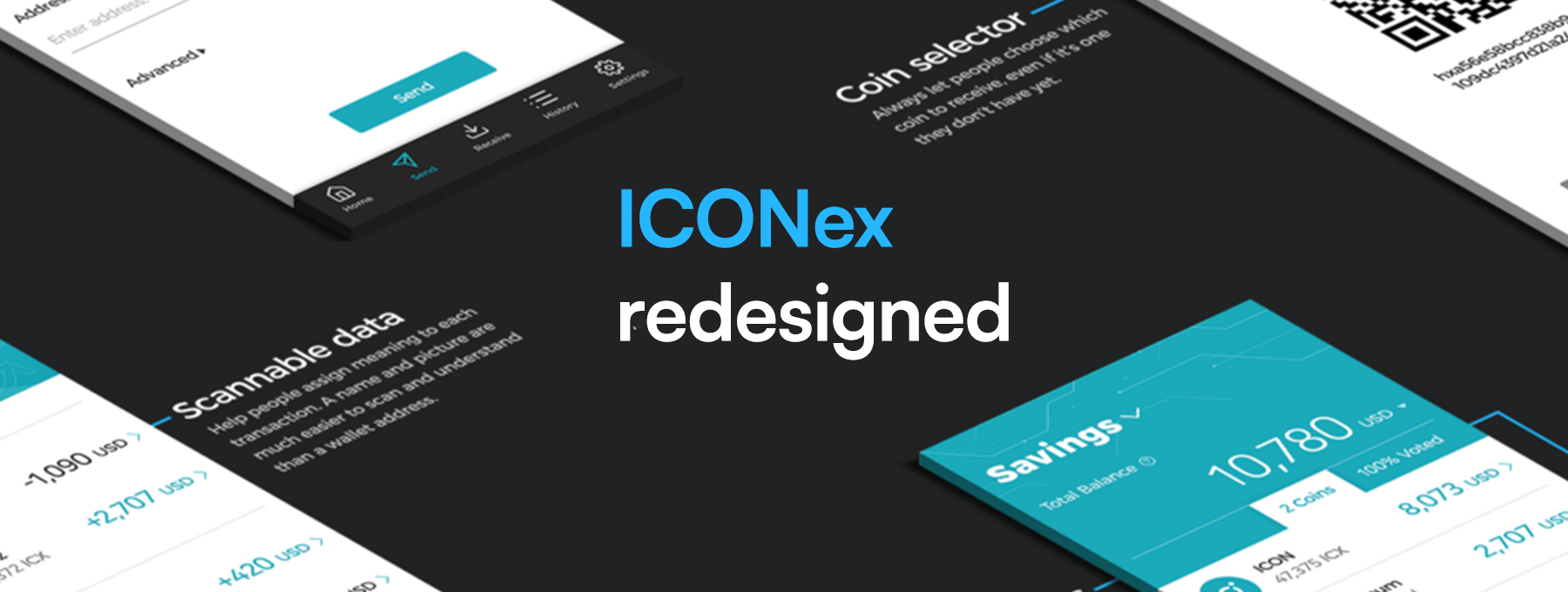
A blockchain wallet designed for adoption, not developers.
People who only bank online are 73% more likely to switch banks for better online and mobile services.
If we want the ICON Network to reach mass adoption, it can’t compete with other blockchains. It has to compete with the products people already use. But it’s not enough to match them: people will only switch if it’s actually better. And the bar is set extremely high.
Everyone talks about adoption, but very few understand how to get it. For every $92 spent attracting people to a product, businesses only spend $1 to convert them. Yet IBM found that every $1 they invested into ease of use resulted in a $100 return.
Marketing doesn’t get adoption. Products that focus on the user experience do.
Voting could be ICON’s killer app. But if the official ICON wallet isn’t easy to use, people will adopt one that is. One that doesn’t let them actively engage in the network.
You can’t fix a problem until you acknowledge that one exists.
The ICONex wallet is preventing adoption.
What follows isn’t personal. We just want to make it better.
Home | Before

The biggest problem with the home page is the navigation. There is none.
Unsurprisingly, hidden navigation reduces engagement by 50%.
In this case, the hamburger menu is the only logical hiding place. But you won’t find the navigation there. So where is it?
The wallet address hides behind an unfamiliar, unlabelled icon. We only tapped it in the hope that it would do something useful. People interpret icons based on previous experience, but most icons aren’t universal. This icon needs a label to make its purpose clear.
The wallet balance hides the main navigation. Who would’ve guessed? When you tap it, nothing happens. It takes more than a second to respond and open the next page, but it feels like forever. We found ourselves tapping the area repeatedly, assuming the touch target was buggy.
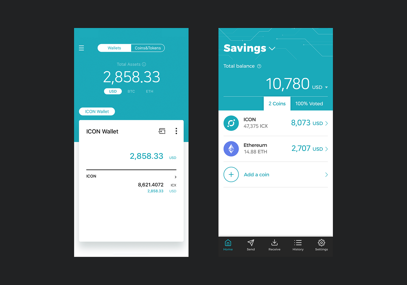
Home | After

People should always know where they are in your app and how to get to their next destination.
— Apple’s Human Interface Guidelines
To help people move through — and engage with — your app, use a tab bar. Tab bars help people see where they are and where they can go. And every icon needs a label for maximal affordance.
The second tab bar shows you information that’s only relevant on this page. See at a glance how many coins are in your wallet, and if you have ICX, your voting status. If it’s at 100%, you know you can ignore it.
The purpose of ICON is to “hyperconnect the world”. So ICONex should support multi-currency wallets. Not one for ICON and another for ETH and ERC20 tokens, but a single wallet for them all. Why do you think the Trust Wallet is so popular? A multi-currency wallet is more convenient, so investors are more likely to adopt it. Even if they don’t have ICX yet.
Receive | Before

You can find the receive page — your wallet address — in two places. One on the home page, and the other on the wallet page. They should look identical, but they don’t. Our critique is of the version on the home page.
When you open the receive page, there are two things you can interact with. The Copy Address button and the sync icon. Or does it mean regenerate address? We don’t want to do that, so how do we go back?
When in doubt, people know to tap outside a card or pop-up window to close it. But even when we tapped the hamburger menu, nothing happened. If an action isn’t available in a certain state, either hide it or de-emphasise it. If it’s inconsistent, it’s confusing.
Turns out, you tap the sync icon to close the card. Why a sync icon? The arrows mimic how the card rotates back to the home page. This isn’t the time to be clever. It’s too subtle, and the icon for cancel or close is always an x.
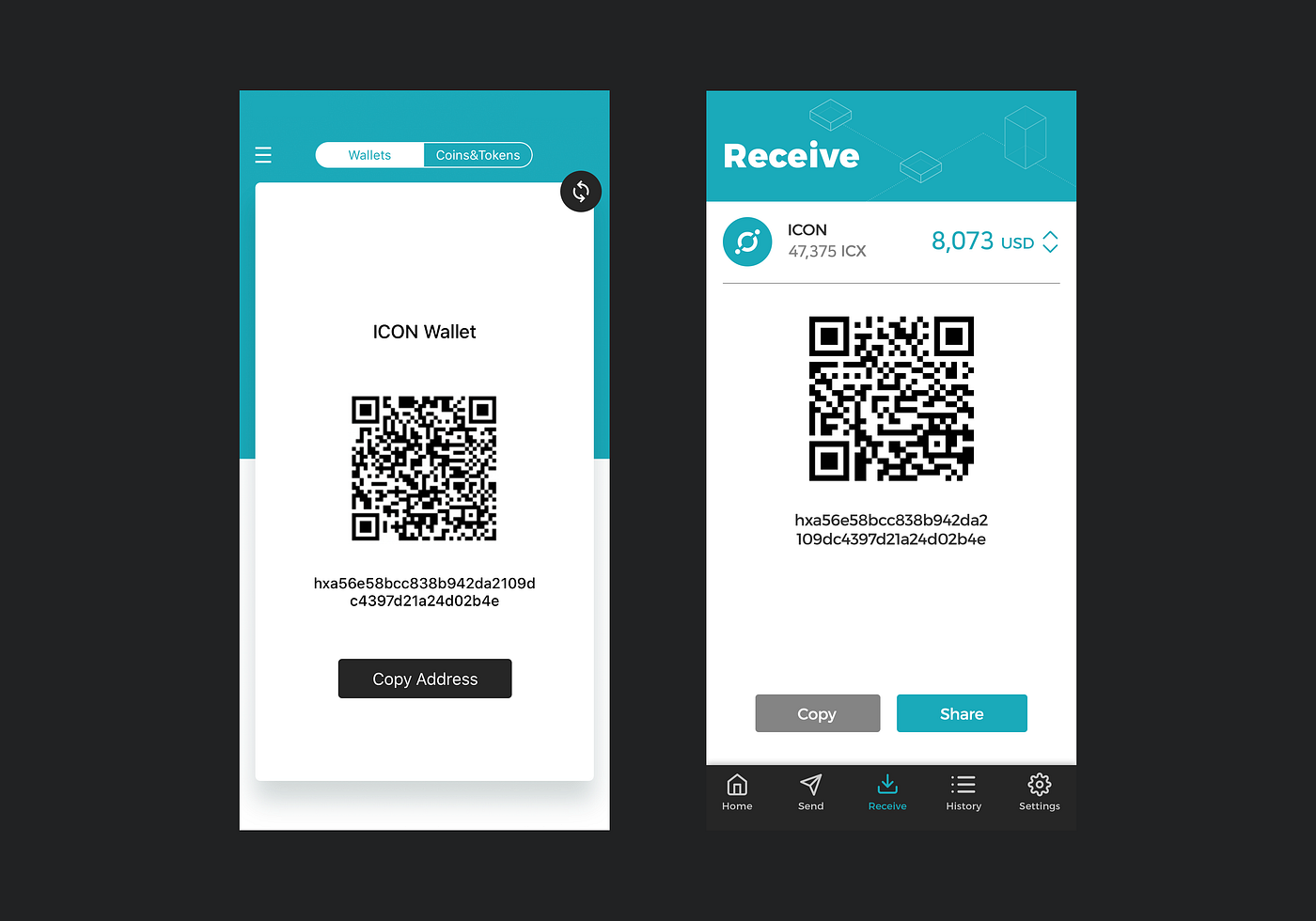
Receive | After

In a multi-currency wallet, you’ll have more than one address. A coin selector helps you retrieve the right address quickly, even for a coin you don’t have yet.
People often copy their wallet address, but that’s never the final step. They still need to do something with it. A share button gives people a more direct way to share their address with other people, apps, and devices.
Send | Before

Cryptocurrency payments aren’t reversible, so the send page presents a financial risk. It has more friction than any other page, yet it has the most complexity.
Balances usually have two decimal places. 4 – 6 decimals is common for cryptocurrency, but 18 is ridiculous. Excluding developers, very few people want or need that level of detail. It’s superfluous and requires people to stop and make sense of their balance before they move on.
After you choose a payee in a banking app, it shows who you’re about to send money to. But after you choose one in ICONex, all you see is the address. Without a name, all you have is a long string of characters with nothing to reassure you that it’s the right address. That doesn’t inspire confidence.
Next up, button labels. Title case is prominent and symmetrical; sentence case is friendly and easy to read. Our priority is usability so we prefer the latter, but that’s not the issue here: consistency is. You have Copy Address (title case) beside Scan QR code (sentence case). Whichever style you choose, the most important thing is to stick to it.
After you choose how much to send and who to send it to, you should be ready to send. But the advanced options suggest that you’re not done yet, which creates more friction.
Step Limit, Step Price, and Gloop are jargon terms that mean nothing to almost everyone. Data seems like the place to add reference details, but tap Add and you’re asked to choose an input type: UTF-8 or HEX. Most people don’t know what those terms mean, let alone what they’d use them for.
And if you think the information dialogues will help, here they are in order:

These messages create far more confusion than they clear. At least now we know why the balance has 18 decimal places. But why are they so long? And why do we need to confirm everything? Are we agreeing to something? It’s not clear. What’s wrong with a simple, unambiguous close button?
Send | After

For a consistent experience across the app, the send page has the same coin selector as the receive page.
When you send cryptocurrency, you likely want to base it on the value of another coin, like bitcoin or the US dollar. So after you choose which coin to send, you can enter the amount in the currency of your choice. It does the math so you don’t have to.
When you add a payee, banking apps offer suggestions as you type. It’s the same when you want to email, message, or call someone. We added suggestions to the address field to help you find the one you need even faster.
The advanced options create more friction than value, so we hid them. People can view them if they want, but they’re not essential so we shouldn’t expose them.
Just like icons, people assign meaning to labels. You transfer money between your own accounts, pay for goods and services, and send money to others. Send is the most accurate description, so it’s the label we used for the call-to-action button.

History | Before

The history page makes you work for the details. Instead of names, you have to identify every transaction by a truncated address. One tap reveals the full address, another tap lets you Check Tx for the full transaction details. Which are, unsurprisingly, more complex than valuable.
Everywhere else in the app, you see the USD value alongside ICX. But not here. Without a name or label, people often identify transactions by the amount. But if you base the amount on another currency, like $50 of ICX, the ICX amount isn’t enough to help you.
Absolute dates provide the most detail, and the international date format is universal. But it also takes more effort to understand. It’s better to hide specifics like the transaction time until people want them.
The top left corner of the screen is the hardest place to reach, yet it’s the only way to leave this page. Gesture controls like swipe to go back to make it easier for people to navigate through the app.
History | After

To provide the most meaning at a glance, group transactions by day and include the day of the week. It’s a simple but effective way to help people view their finances holistically.
People won’t recognise each transaction by the address, nor should we expect them to. A name and image are much easier to scan and understand, so it was an obvious choice to include them.


Closing thoughts
We covered a lot in this article, but it isn’t exhaustive. Just as important are the onboarding issues that kept us away from the app for months. We persevered only so we could participate in voting.
Now that we’ve relaid the foundations, our next task is to get people to engage in the network. Political scientists agree that democracies perform better when more people vote. But we’re one week away from decentralisation, and only 18% of the total supply has voted.
Awareness isn’t enough to persuade people to vote — and vote well. We need to take a different approach to make voting easy and, above all, appealing to the masses.
Until next time.