
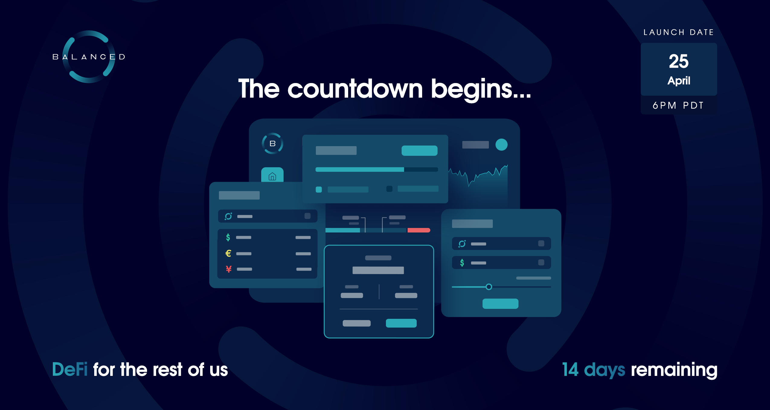
The making of Balanced: Designing DeFi for the rest of us

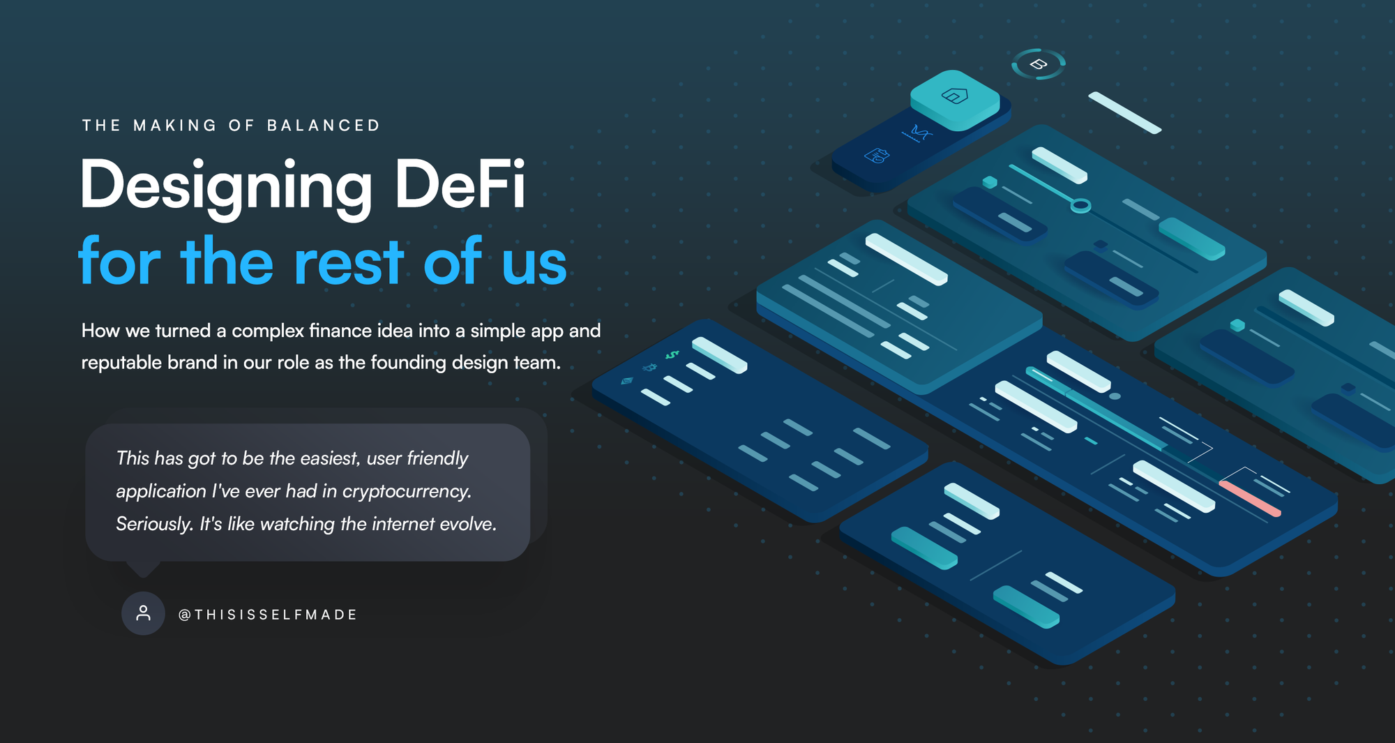
How we turned a complex finance idea into a simple app and reputable brand in our role as the founding design team.
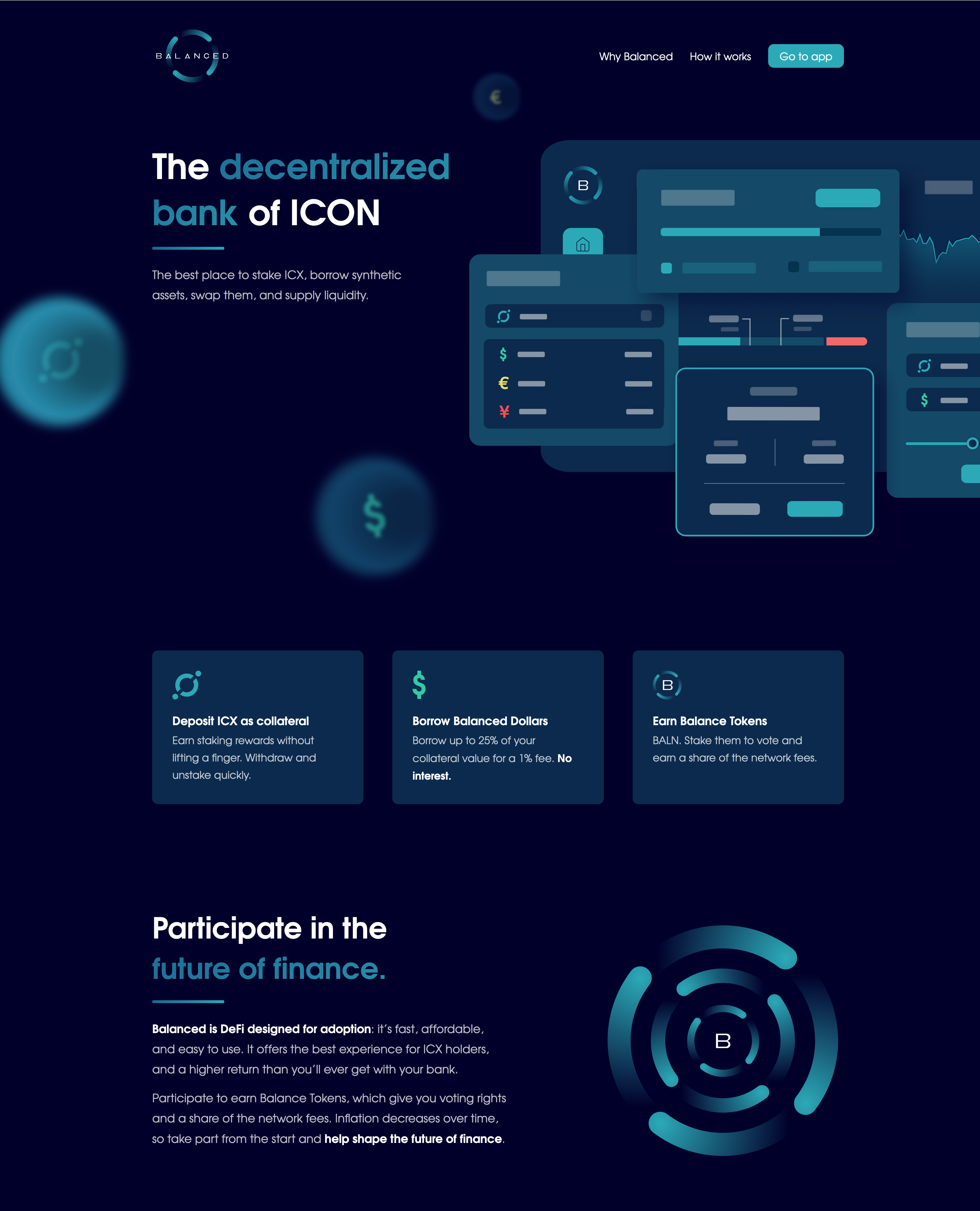
In January 2020, we were approached to design a new decentralised finance (DeFi) product called Balanced.
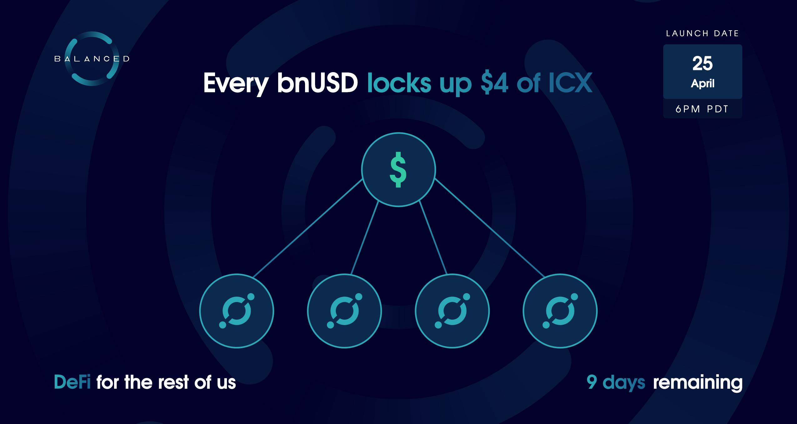
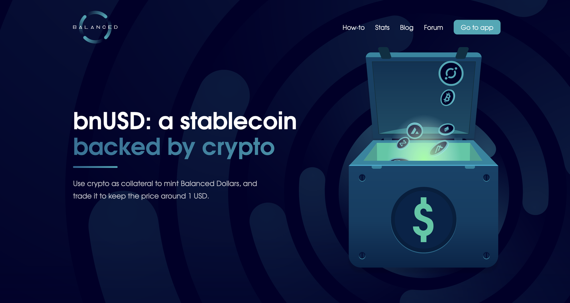
Balanced would allow people to mint and borrow Balanced Dollars (bnUSD), a stable cryptocurrency pegged to the value of 1 USD. To facilitate the trading and widespread use of bnUSD, Balanced would also include an exchange.
Stablecoins are important for a blockchain ecosystem because their value isn’t volatile like other cryptocurrencies. Their stability makes them favourable for payments, trades, and as a store of value. Without a stablecoin, it’s difficult for a blockchain or DeFi ecosystem to thrive.
The ICON blockchain had no stablecoin of its own, so we set out to create the first — an endeavour that took 15 months and thousands of hours of work.
The result was a product that people still prefer over its competitors 2 years later. One that was particularly popular amongst people new to DeFi.
This case study explores the challenges we faced, the process we followed, the results we achieved, and some of the most notable brand, product, and marketing solutions that still define Balanced today.
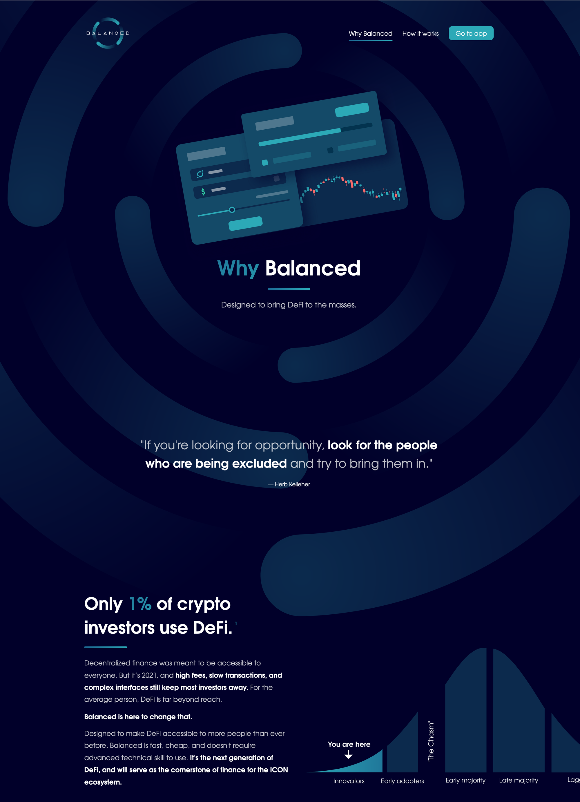
The problem: Only 1% of crypto investors use DeFi
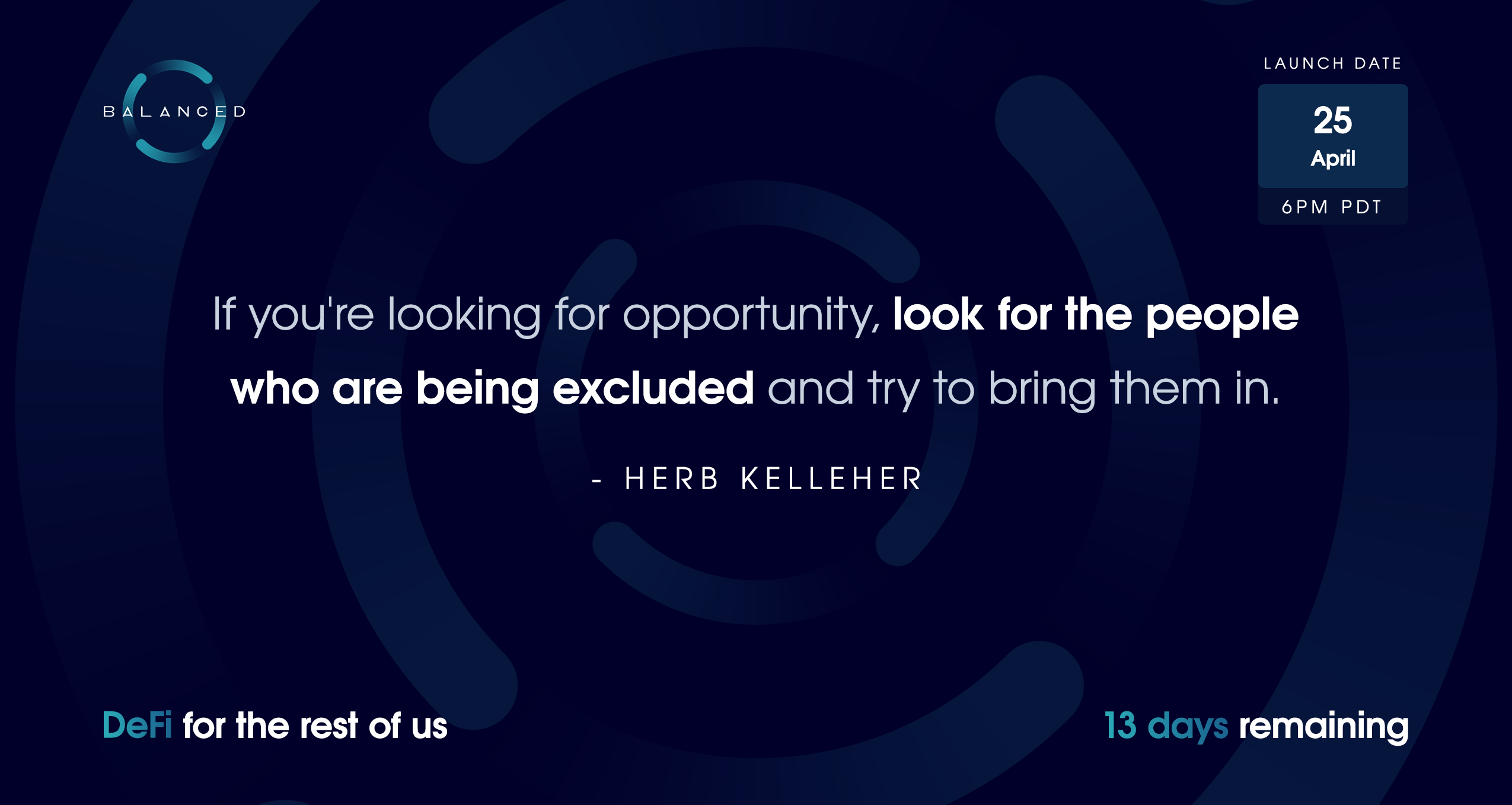
If you’re looking for opportunity, look for the people who are being excluded and try to bring them in.
— Herb Kelleher
Before we joined the Balanced team, we rarely used DeFi — we’d never even heard of the term. Most DeFi products were on Ethereum, where each transaction cost hundreds of dollars and took at least 10 minutes to confirm. It was inaccessible to everyone except crypto whales with time and money to burn.
Transactions on the ICON blockchain are near-instant and cost less than $0.05, so our technology stack would automatically provide a better experience.
As for the interface...
In 2020, DeFi products were so poorly designed that only 1% of crypto investors felt confident enough to use them. And these are early adopters: people happy to jump through hoops to try new things, especially when there’s money to be made.
Balanced’s closest competitors on other blockchains were MakerDAO (stablecoin platform), Synthetix (synthetic assets & exchange), and Curve (exchange). But their complex interfaces were part of the problem, so we couldn’t look too closely at their solutions.
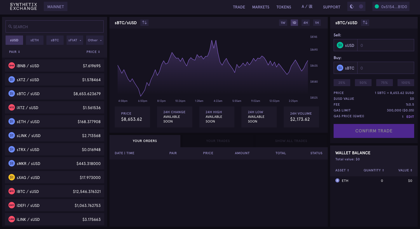
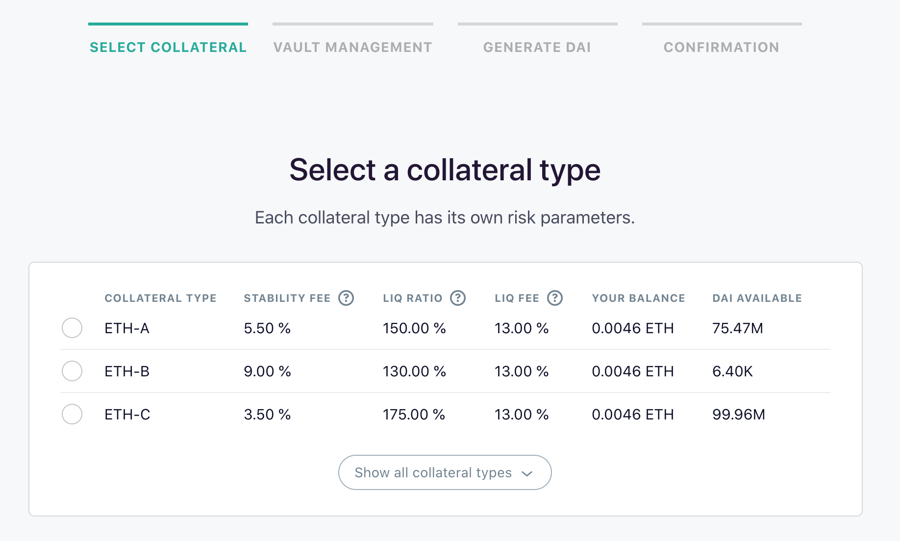
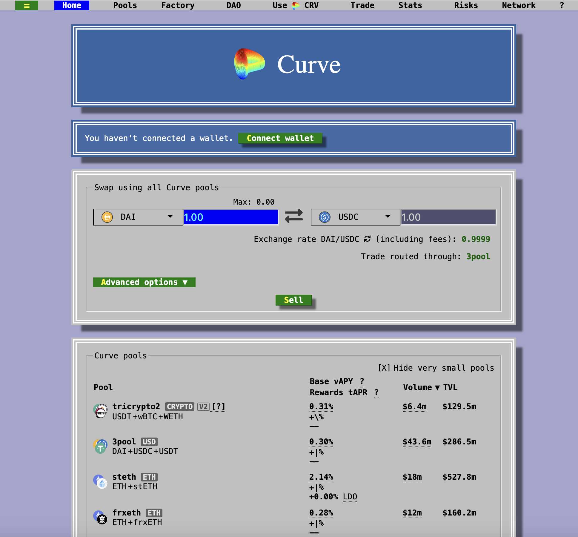
The interfaces for Synthetix, MakerDAO, and Curve in 2020.
We wanted to design a DeFi product that was accessible to the masses. One that we and other DeFi beginners could use with confidence.
To do that, we couldn’t build off what already existed. We had to start from first principles.
Project role and goals
Balanced was a collaborative project between 4 teams. Our team took care of everything user-facing: the interface, brand, website, documentation, and marketing materials.
Our role was to make Balanced so easy and appealing to use that ICON investors interacted with it even more than their wallet (the main “app” available for the blockchain at the time).
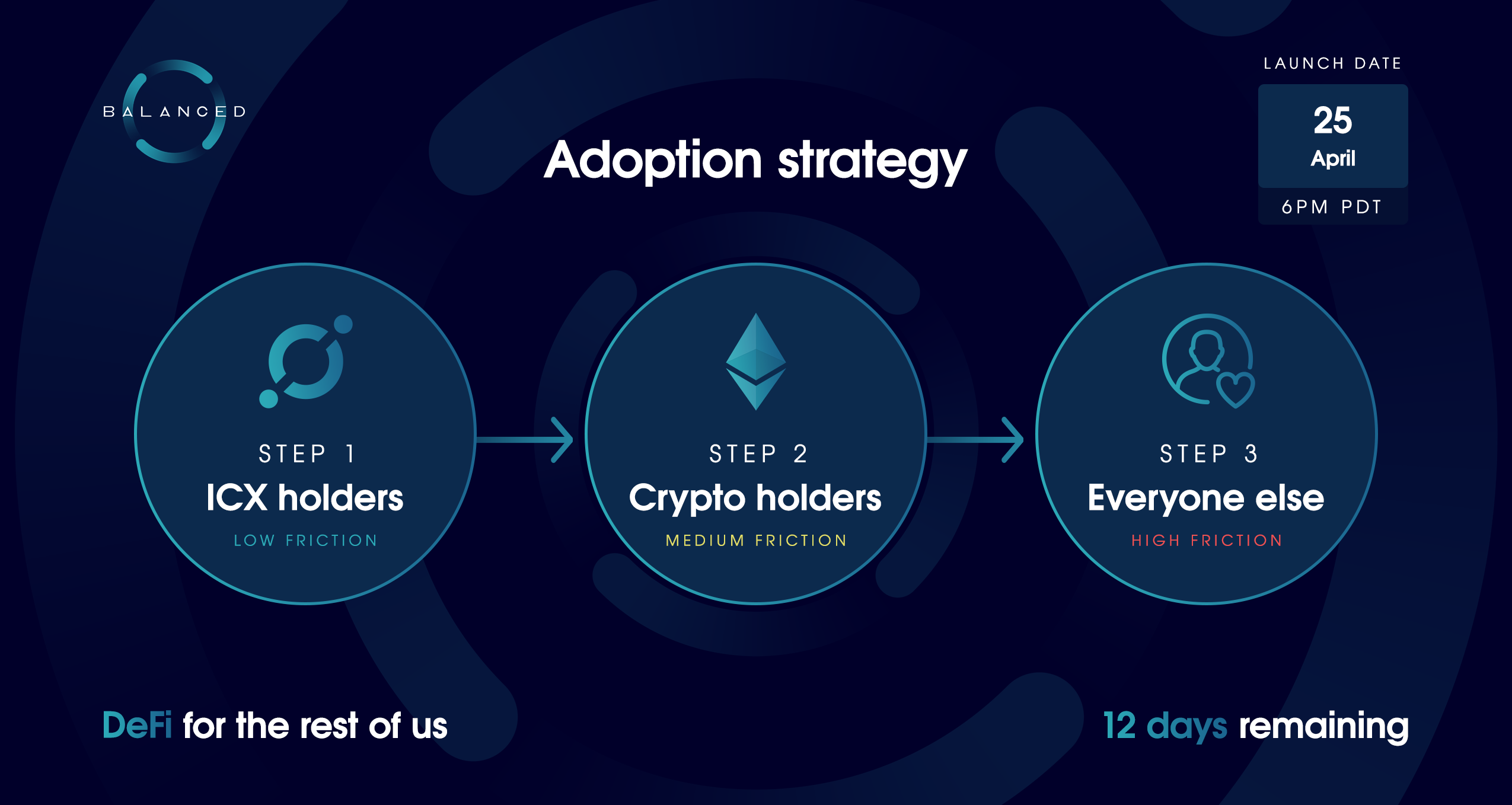
As we saw it, the adoption process had 3 steps:
- Step 1: Deposit ICX (ICON’s native cryptocurrency) as collateral
- Step 2: Borrow bnUSD (formerly ICD / ICON Dollars)
- Step 3: Circulate bnUSD
For step 1, we’d have to design the best ICX experience on the market to make sure investors felt comfortable storing their ICX in Balanced.
For step 2, we’d have to make the loan process incredibly low friction, and the variables (including risk) easy to understand.
For step 3, we’d have to make it easy for people to send bnUSD and provide liquidity for it on the Balanced exchange.
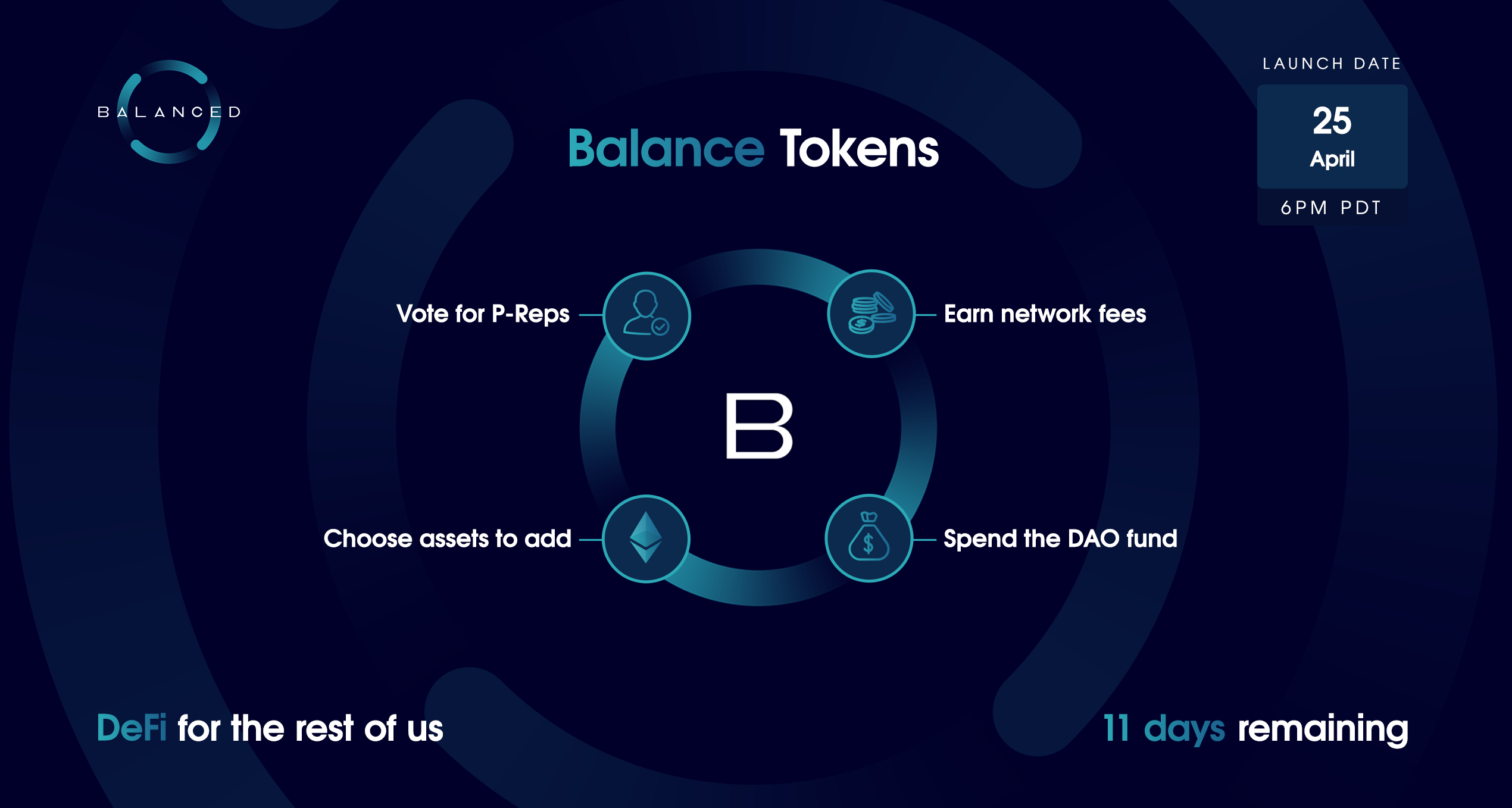
Steps 2 & 3 would also be helped by incentives in the form of Balance Tokens (BALN), the Balanced governance token. Governance tokens are equivalent to voting shares in a business, and often come with additional benefits, like fee payouts.
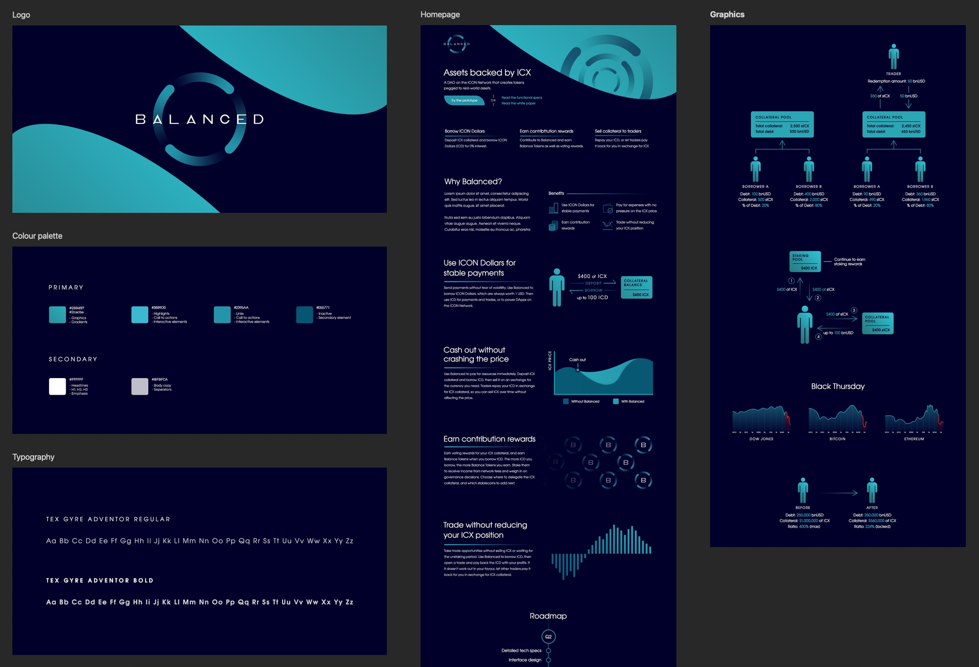
Defining a brand with a reputation for quality
Many DeFi products launched while we worked on Balanced. For some reason, most of them were food-themed, with token tickers like YAM, SUSHI, CAKE, BURGER, KIMCHI, and HOTDOG.
We were under pressure to follow their lead, as the meme culture was guaranteed to generate hype. But we were here to create a higher standard for DeFi. So rather than chase trends and risk being associated with the actions of others in that category (which were often either incompetent or outright malicious), we wanted to build a brand that was the antithesis of this culture: professional, trustworthy, high-quality, and long-lasting.
In crypto, it’s common to announce your project to the world, brand and all, as soon as you decide to start working on it. We had one month to define the Balanced brand and build a matching website — before we even understood what we were creating.
Pressed for time, our goal was to produce a brand with a strong foundation — one that would only need minor tweaks to fit with the final product. Logo redesigns have a severe impact on brand recognition and take a lot of effort to roll out consistently, so we like to avoid them at all costs.
Here are some of our early concepts for the Balanced brand:
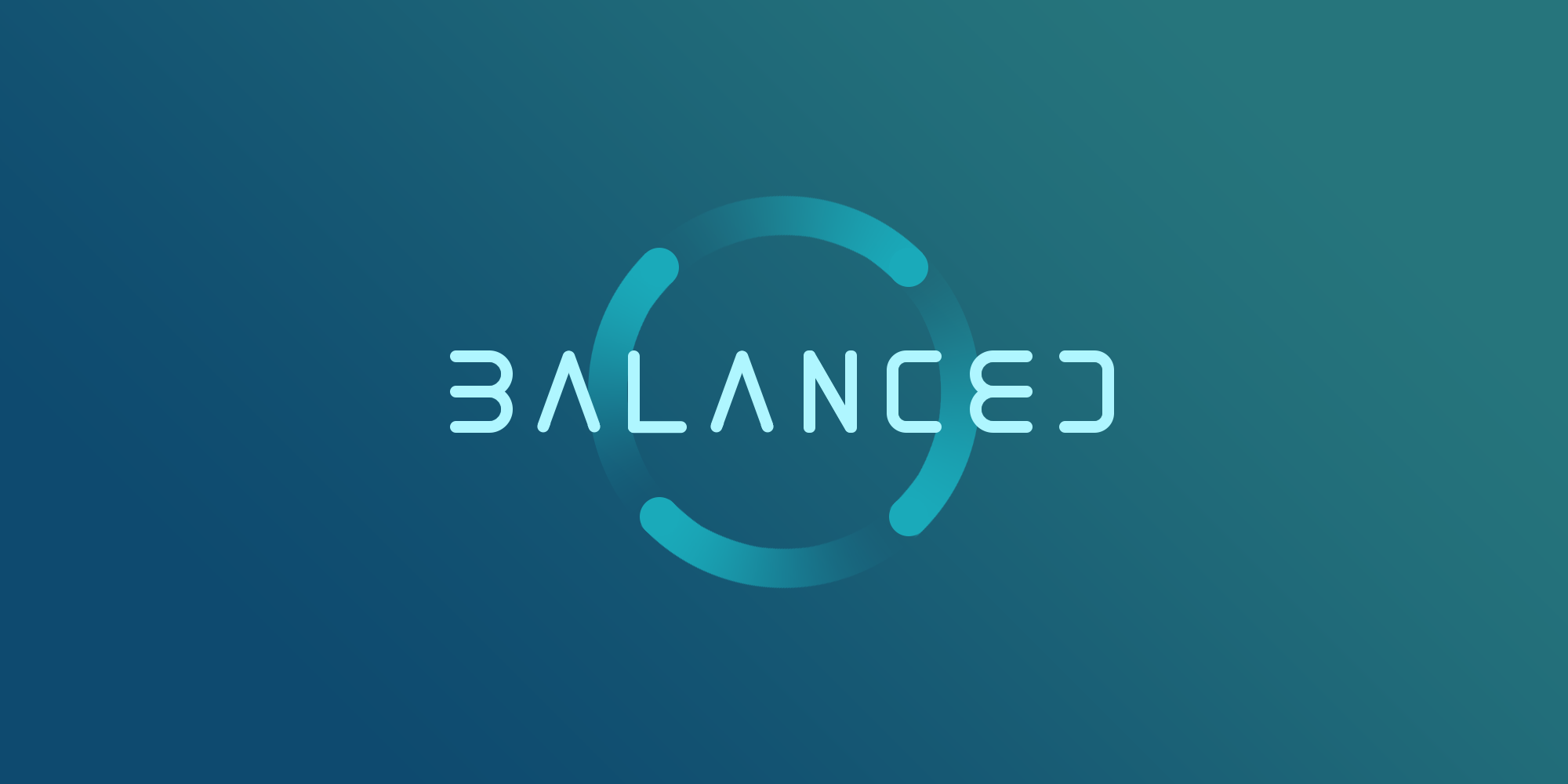
The Balanced symbol featured in even the earliest brand concepts.
The symbol represents the flow of assets through Balanced. In this case, the 4 assets central to its functionality: ICX, sICX (Staked ICX), bnUSD, and BALN.
It was also a subtle nod back to ICON itself:
But while the symbol was good, the initial typefaces didn’t fit with the professional, trustworthy, high-quality, and long-lasting style we wanted Balanced to embody.
Eventually, we pitched these variations to the Balanced team:
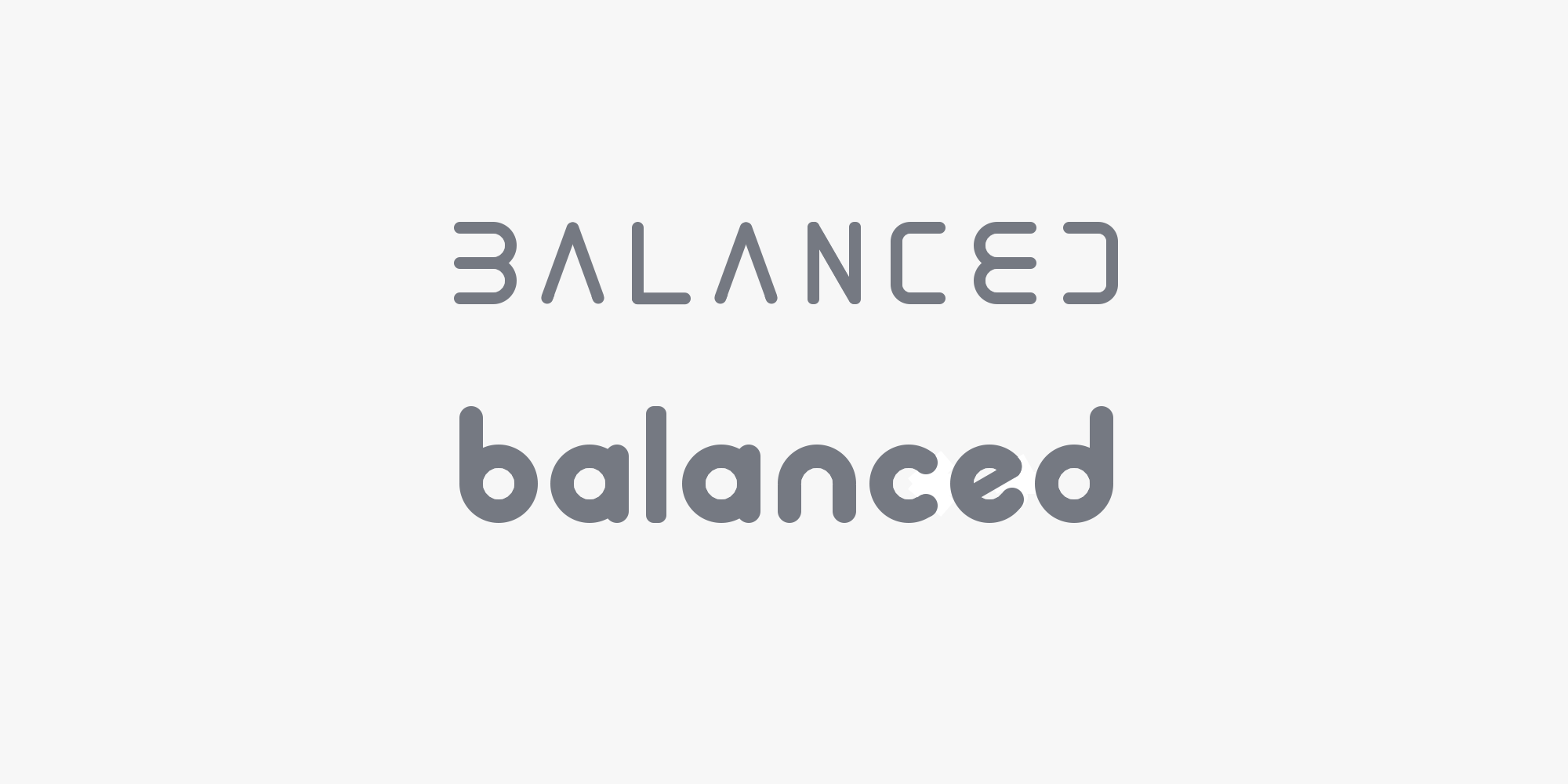
And we decided to go with the top left version for the first release, with a brand style dubbed Arctic.
We’ve made subtle adjustments to the logo since then, like colour modifications and a custom font, and evolved the style into what you see on balanced.network today.
As for the announcement website, it would serve as the default explanation of Balanced until launch. With no product defined yet, all we had to work with was a white paper draft, which required most of the first month to absorb, rewrite, and explain the core benefits in a way that non-technical readers could understand.
While it was a rush job, crypto has a low bar for quality so it was well-received. During the ~13 months it was available, over 1,000 people subscribed to receive updates of Balanced’s progress without any prompting.
The key benefit for us was that by the time the website went live, we’d distilled Balanced down to its core ideas and defined the brand style, so we were well-prepared for the next phase: designing the product itself.
Building a product from first principles
When we design a product, we avoid busywork like personas and card sorting. The standard UX process is designed to get buy-in from stakeholders, but it’s a formula for committee-driven design, not innovative software.
We prefer a simple approach: reduce time and effort as much as possible.
Our design process starts with a question:
“What is true? What absolutely has to be there?”
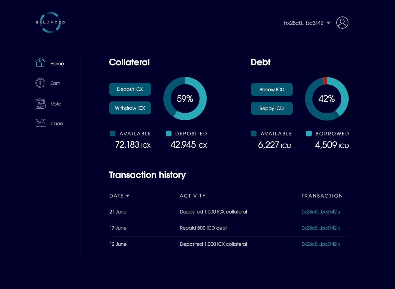
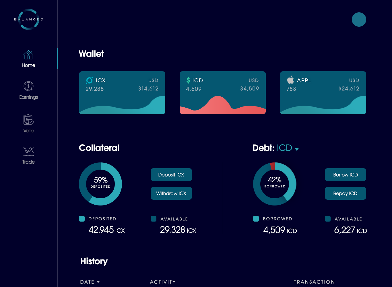
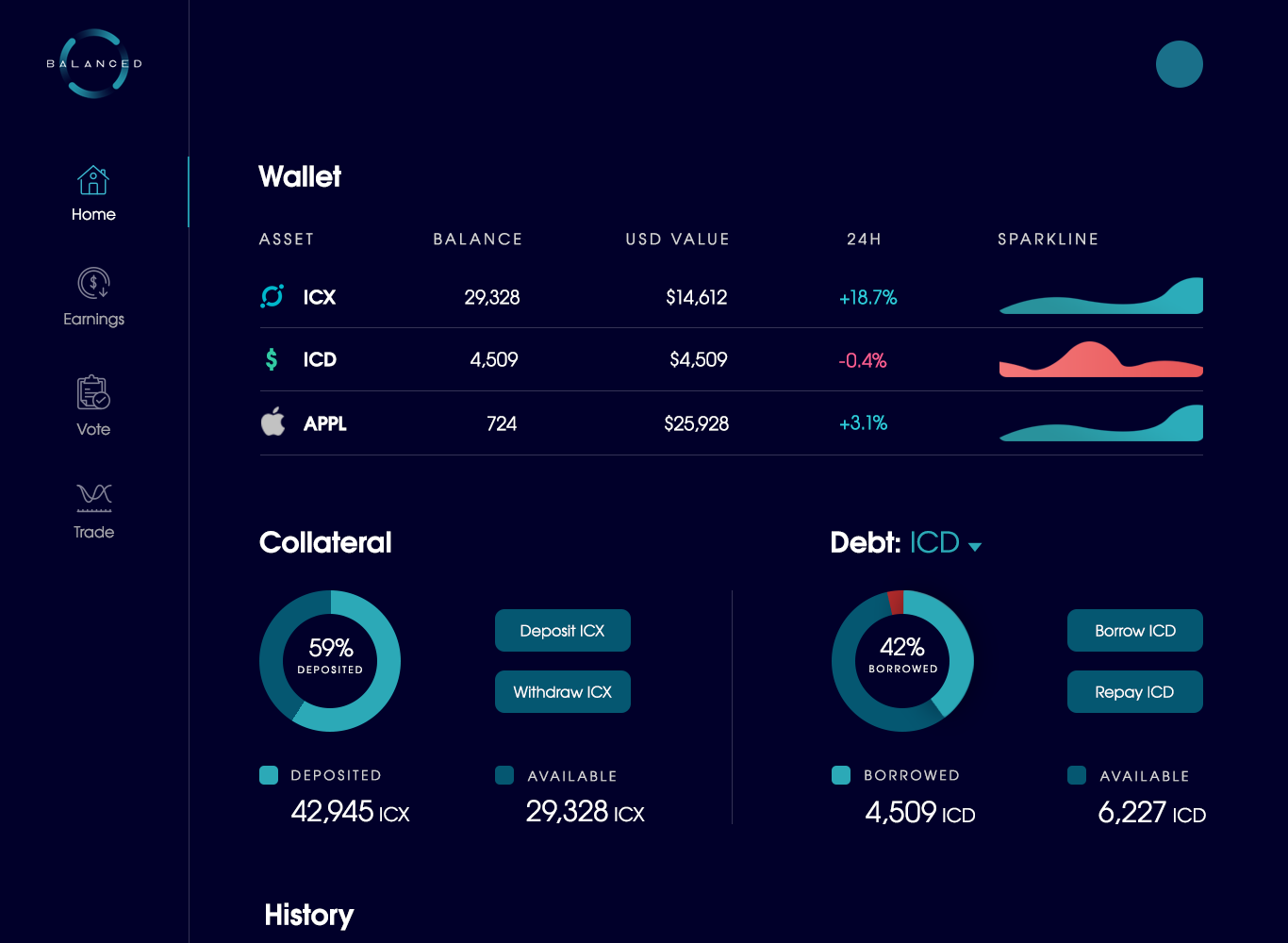
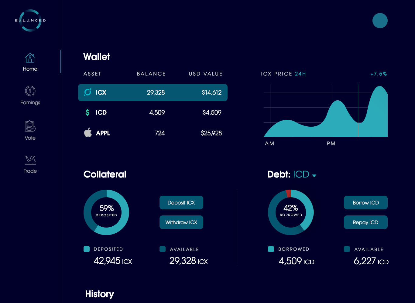
For the borrowing experience, that meant collateral, debt, and details about your position.
The next question was “How to present them?”.
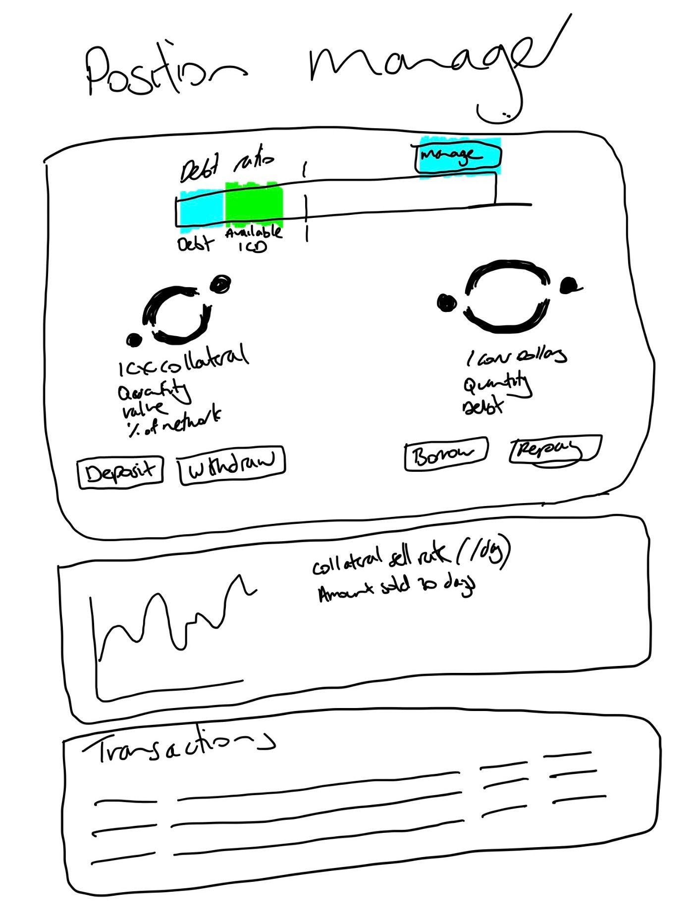
As crude as it may seem, this is the first sketch we ever drew of the Balanced UI:
And here are some higher resolution variations we explored:
But while our early concepts included the right actions, they didn’t improve our understanding of the product — at all. Even with an interface in front of us, we weren’t confident in our ability to use Balanced without error. And if we didn’t get it, how could we expect anyone else to?
As Steve Krug says in Don’t Make Me Think:
If something is usable — whether it’s a website, a remote control, or a revolving door — it means that:
A person of average (or even below average) ability and experience can figure out how to use the thing to accomplish something without it being more trouble than it’s worth.
It was time for a different approach.
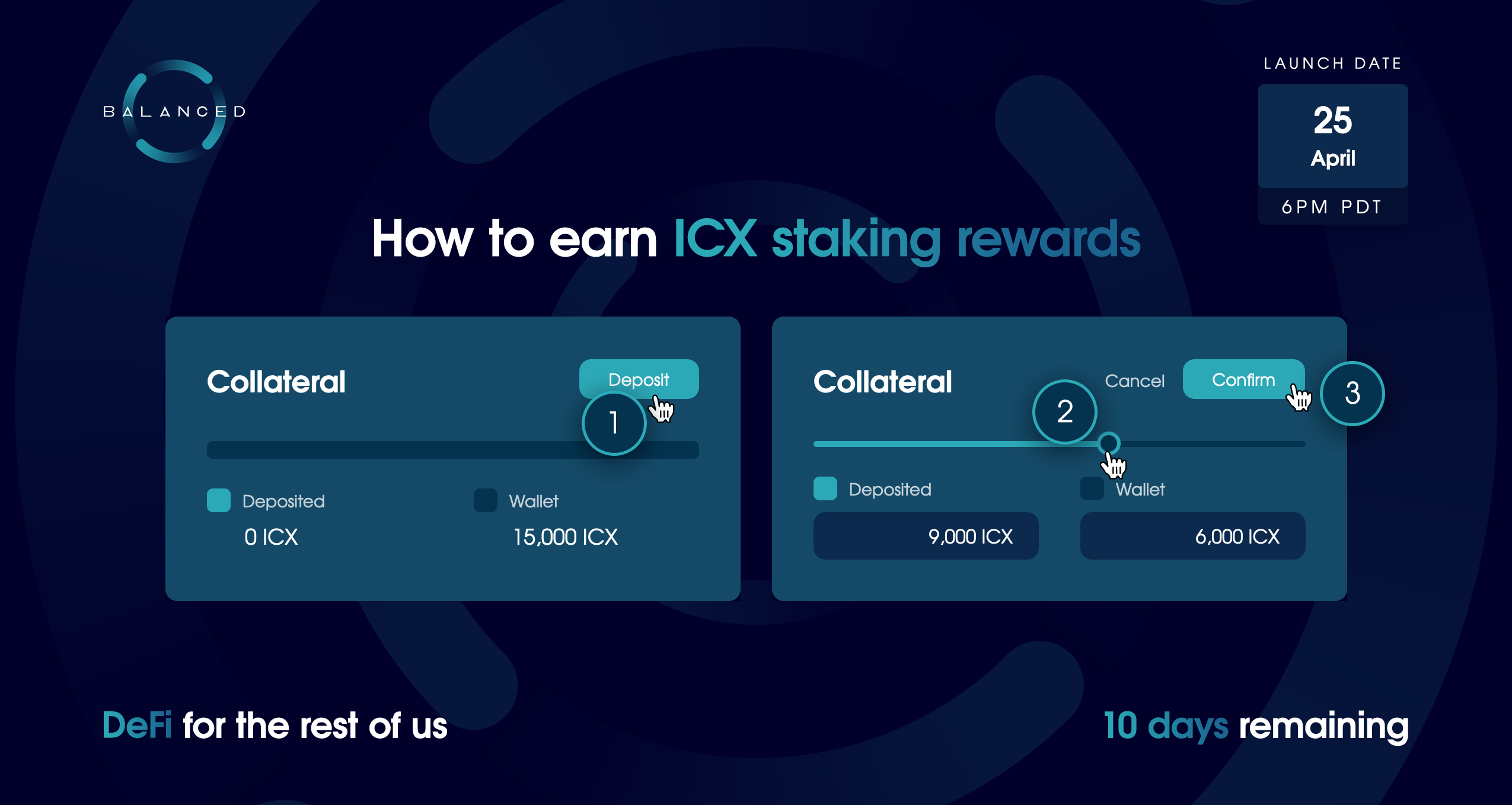
Simplifying complex interactions through sliders
During our research phase, we noticed opportunities to help our users that other products missed.
The most obvious problem was that they never let you see how your position would change based on the action you wanted to take (e.g. the risk to withdraw collateral or increase your loan). You’re expected to figure it out for yourself, or use a calculator on a separate website — completely out of context of your position. The cognitive burden was forced on the user, so only the most mathematically-minded could use these products with any degree of confidence.
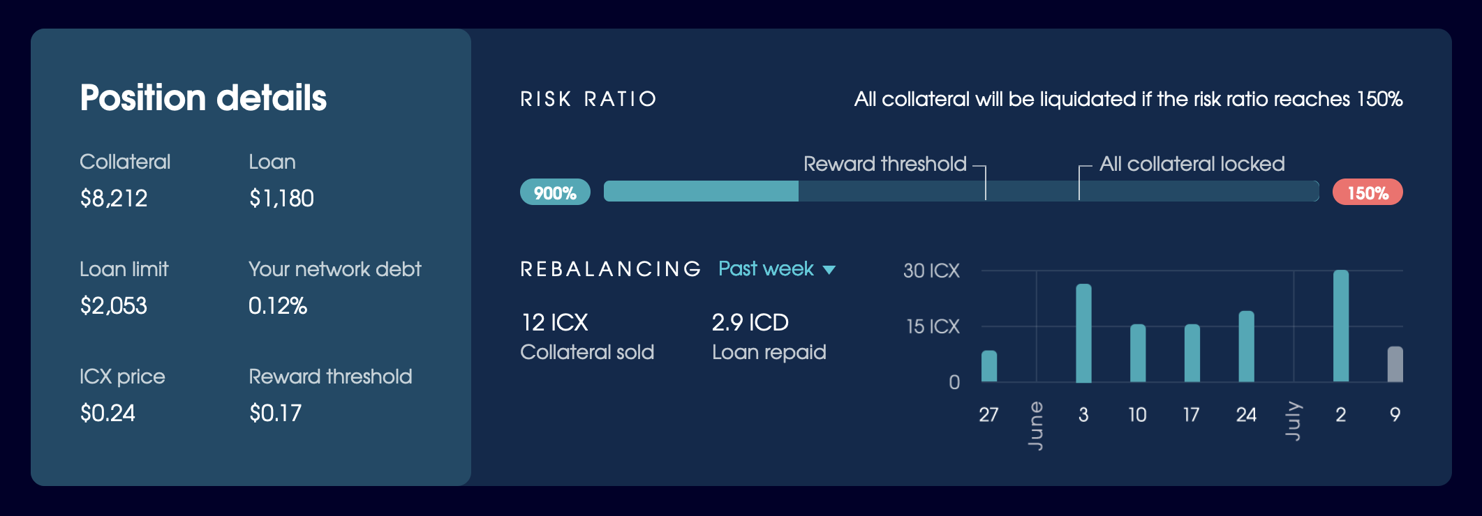
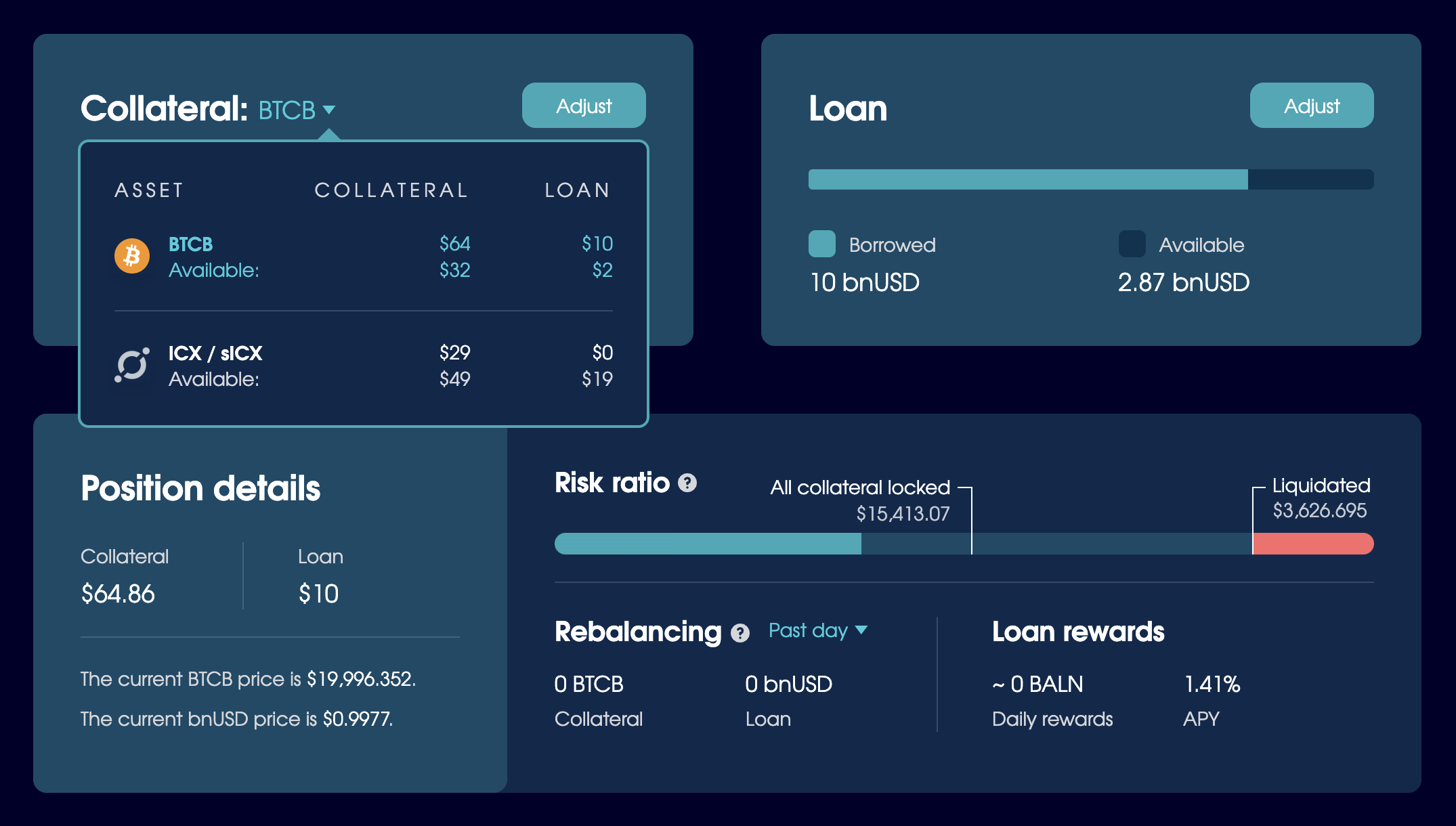
Balanced is an imprecise product. There are so many variables that it’s not reasonable to force the math onto anyone. Here’s what borrowers would need to keep in mind when performing an action:
- Their risk ratio, collateral value, reward threshold, and loan limit, which constantly fluctuate with the price of ICX
- The amount of collateral deposited, which gradually increases via ICX staking rewards
- The collateral and loan values, which both decrease (rebalance) if a trader retires (burns) bnUSD
Instead of fighting the chaos with precise input options (which sets the expectation that values will be constant), we designed a solution that used imprecision to its advantage:
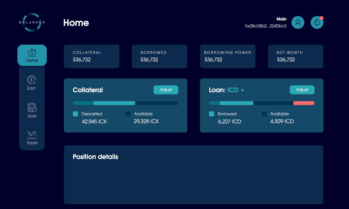
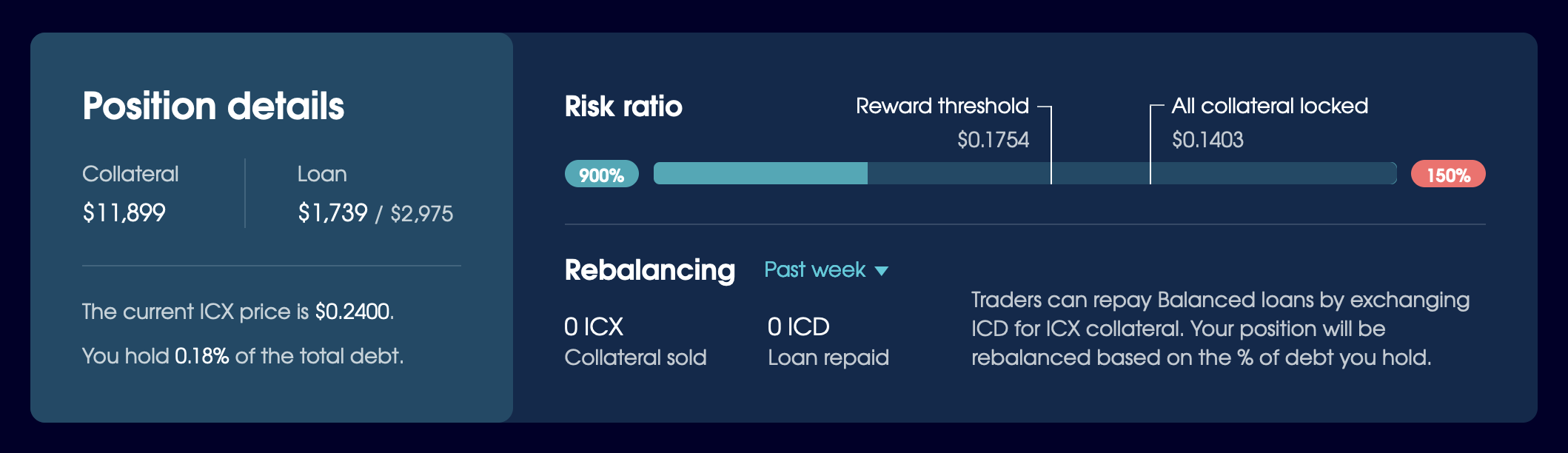
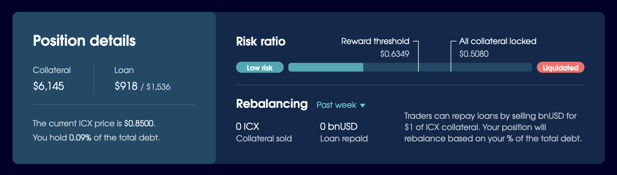
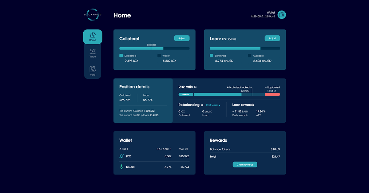
The sliders act like calculator inputs. They adjust values in the Collateral, Loan, and Position Details sections, so you can preview how your position will change before you complete the transaction — no math required.
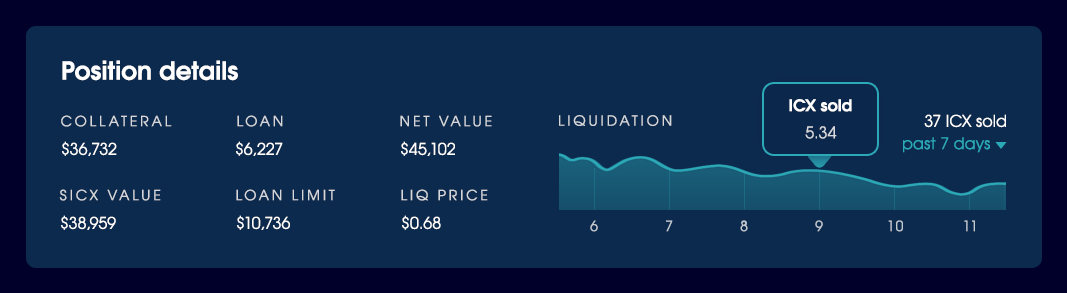
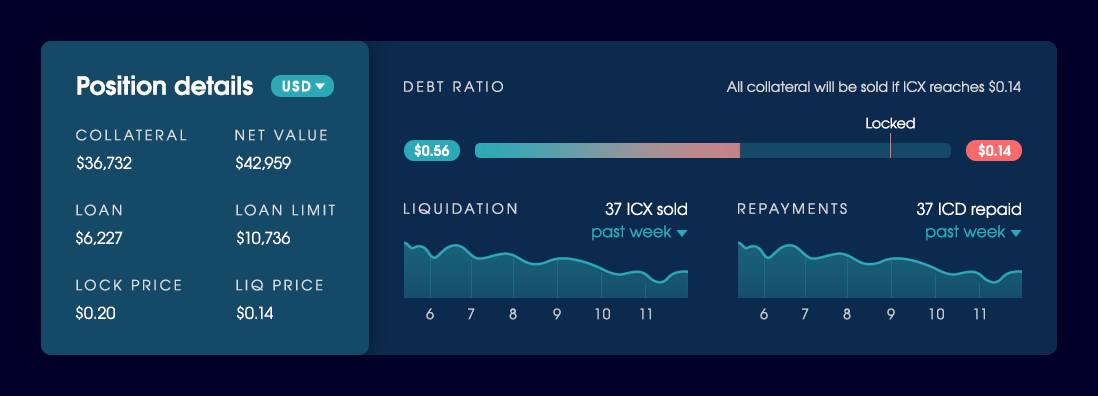
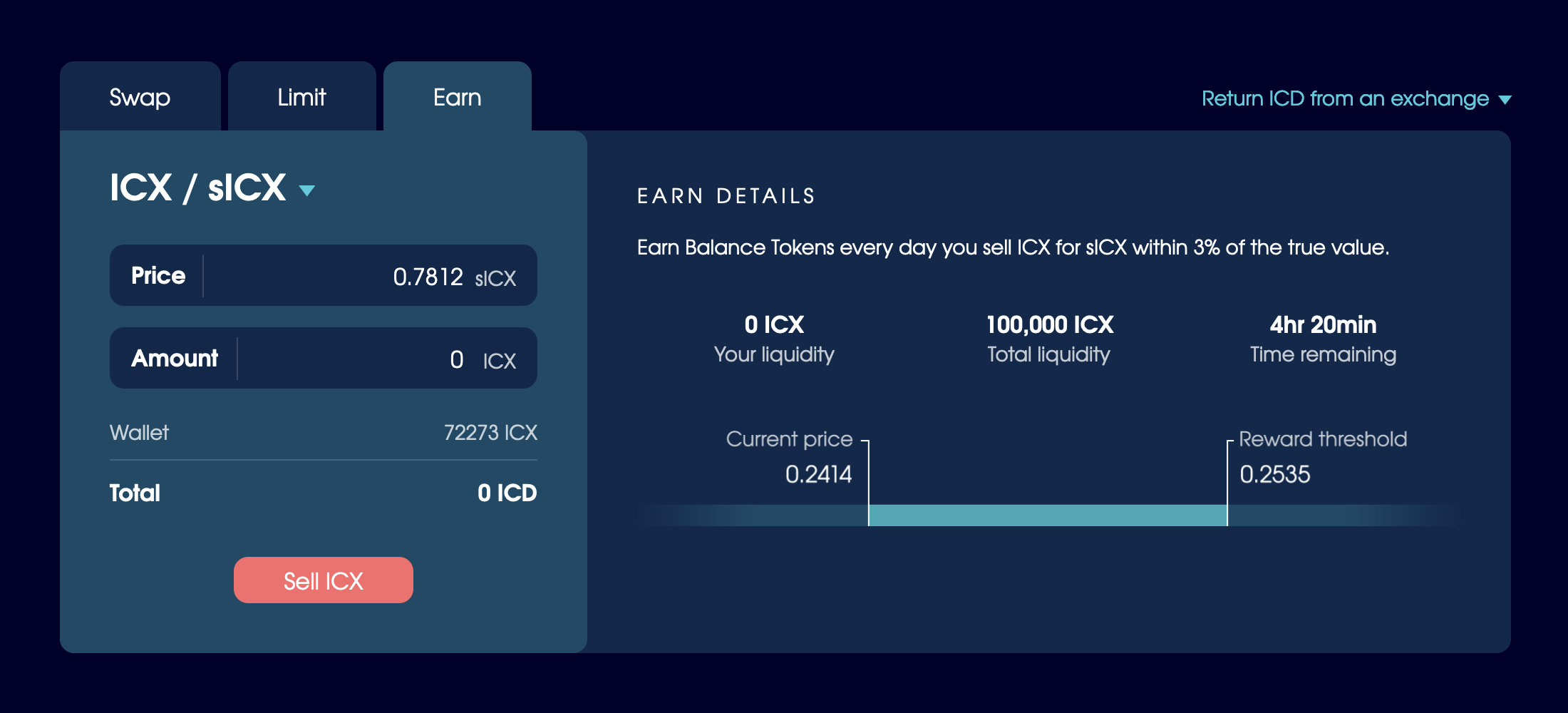
The Position Details section includes the price ICX needs to reach for your position to hit important levels, like when you no longer earn rewards and your collateral will be liquidated. The more bnUSD you borrow the more BALN you’ll earn, so the ability to set price alerts allows you to stay close to the reward threshold — without needing to check in on your position multiple times a day.
A close-up of the final Position Details section.
We cycled through multiple iterations of the Home page design before we created the Position Details section. Once it was in place, we continued to adjust the data and presentation until we landed on a variation that balanced information with clarity.
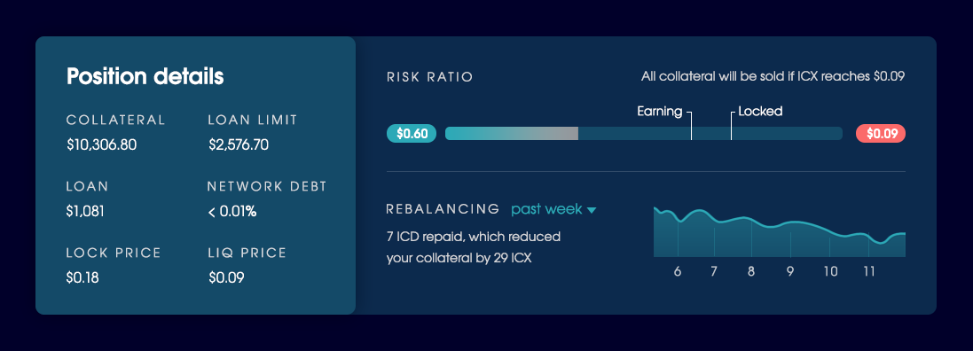
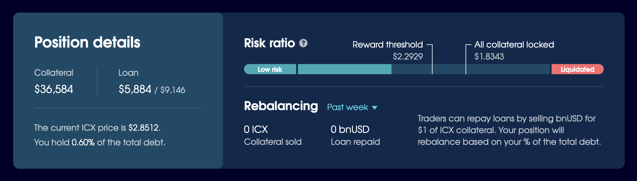
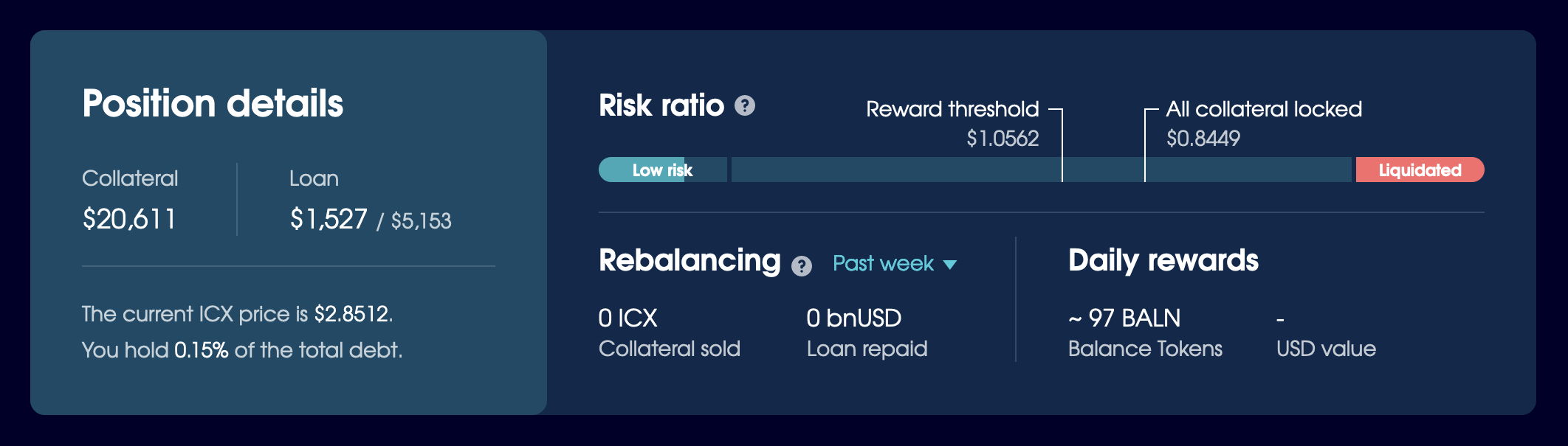
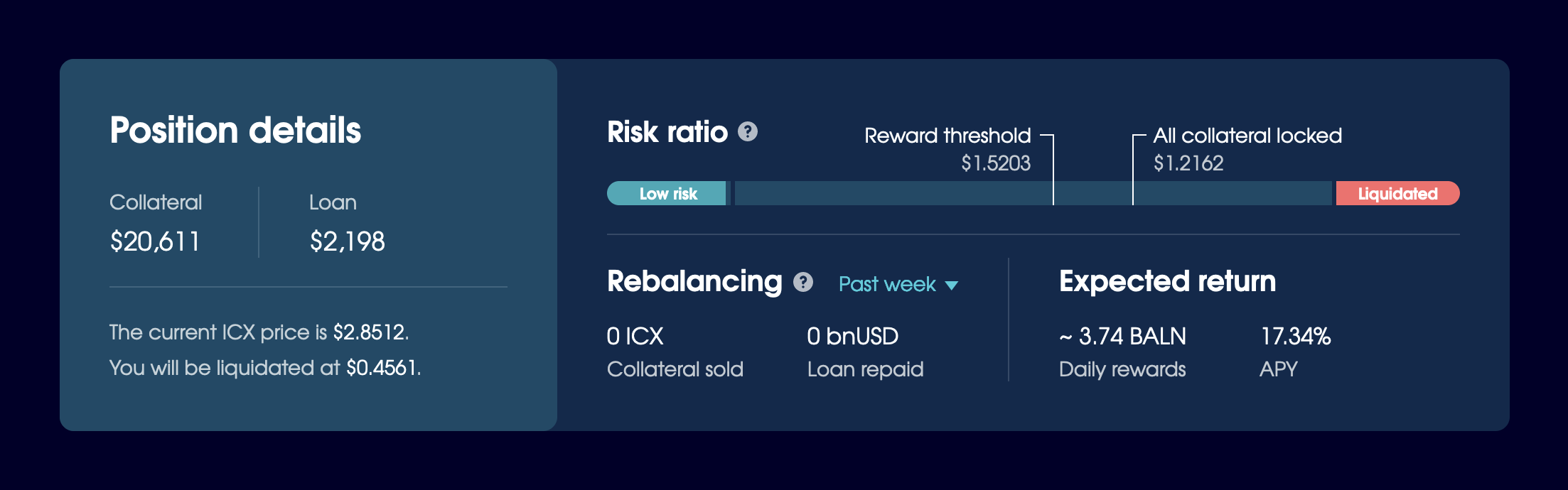
Multiple iterations of the Position Details section that experiment with ways to display information about a loan.
We received a lot of pushback for the sliders in the early stages. Some of our stakeholders thought they were too basic, not precise enough. Too different from other products. Optional. We had to build a fully-functional prototype to prove it would work.
During user testing, we found that people only needed to use the sliders once or twice to understand how Balanced worked, were able to set their position quickly, and kept coming back to make their position even more favourable. In a live environment, this would result in a large number of transactions and ICX burned through fees, both of which are beneficial for the ICON blockchain.
As our goal was to make “DeFi for the rest of us”, we did most of our testing with people new to crypto and/or DeFi. Our non-crypto testers were able to use it with ease:
For something that I don’t know anything about, that was really straightforward.
The sliders provided people with the information they needed upfront, so they could use Balanced with confidence — and without an instruction manual.
Onboarding people who won’t wait
When we shared the first interactive prototype with the ICON community, it raised some questions that made it difficult to test the validity of our design. The interface included mock data with a loan already active, so you didn’t get to experience the borrowing interaction from start to finish and learn how the UI worked — much like dropping you into the middle of a video game and expecting you to know exactly how to play.
It was time to define the onboarding flow.
But a typical app onboarding flow wouldn’t cut it. Most people skip them, they don’t improve task performance, and they increase perceived task difficulty. For many apps, the time would be better spent making the UI more intuitive.
Rather than interrupt people with a tutorial or nagging tooltips, we designed a progressive onboarding flow that makes the UI as understandable as possible, and tells people what to do if the action they want to perform isn’t available.
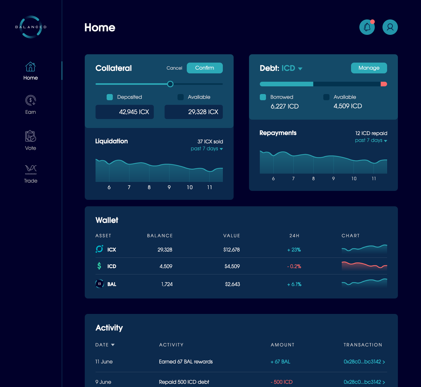
The core purpose of the Home page is to borrow Balanced Dollars. You need to deposit collateral first, so that’s the only action you’ll see available when you sign in. Even if your goal, as you see it, is to earn rewards or borrow bnUSD, the content in each section directs you where you need to go — without getting in your way.
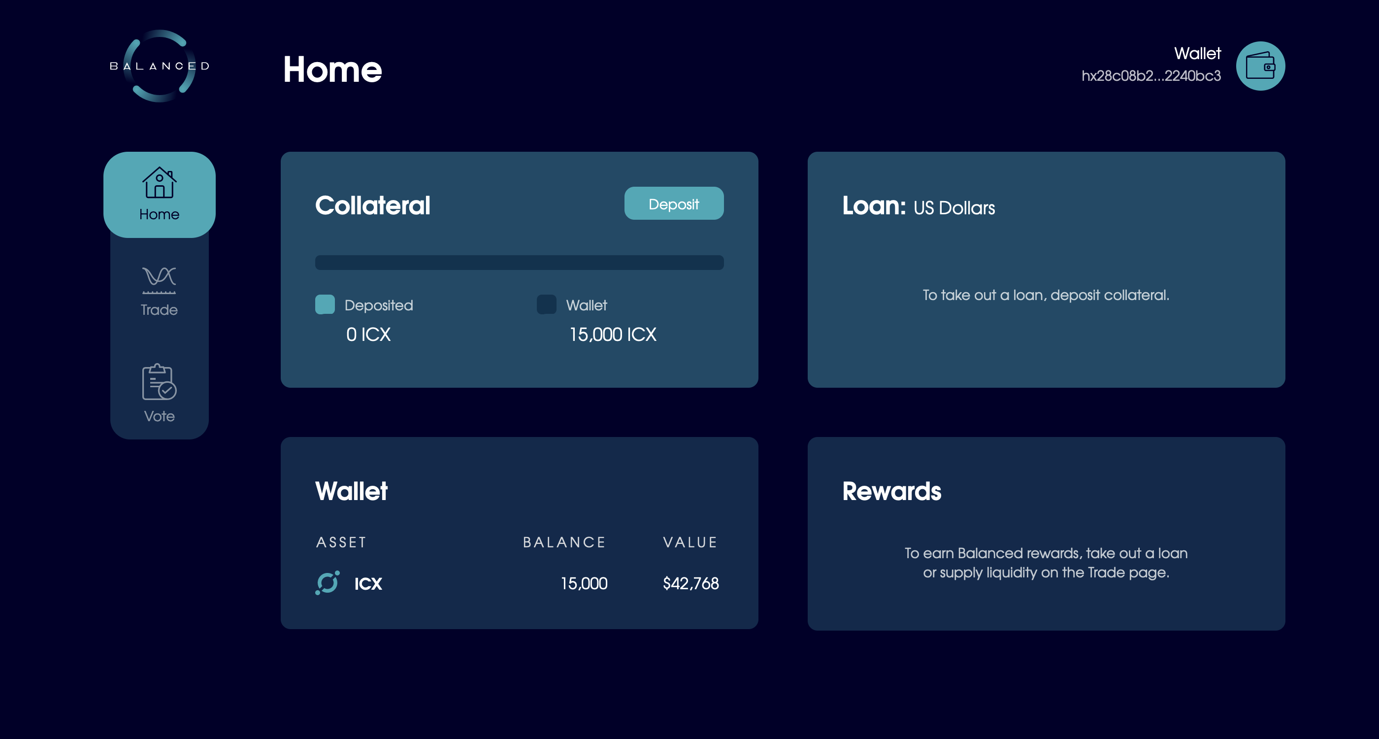
To reduce complexity, the Position Details section only appears when you begin to borrow bnUSD. You’re ready to handle new information once you’ve come this far, and its sudden appearance adds intentional friction: people should stop to consider the action they’re taking and the risk it poses to their collateral before they commit to it.
We knew that reward-earning opportunities would be the primary motivation to use Balanced in the beginning, so we added a Rewards section to the Home page where it plays a pivotal role in the onboarding flow.
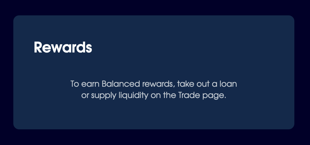
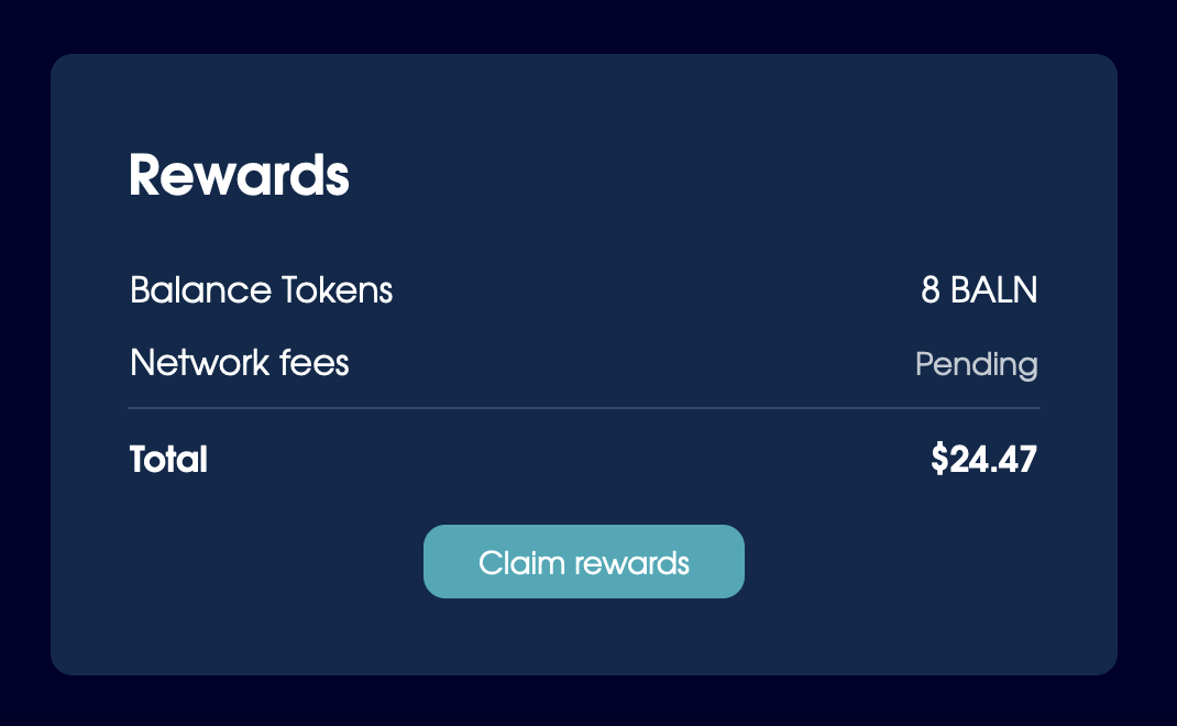
The onboarding and claim states for the Rewards section.
We used the onboarding prototype for most of our user testing, and found it to be an effective way to onboard new investors with minimal friction. Even DeFi beginners could take out a loan with ease and understanding. The Position Details section prompted them to pause and play around with the loan until they were comfortable with the risk ratio, even though no real money was involved.
Pretty simple with the way it’s set up if you know what you’re there for. Especially with the onboarding.
— User testing participant
To further facilitate the onboarding process, our website directed traffic to the prototype for 8 months prior to the launch. It gave people a way to try out the product ahead of time, so they effectively onboarded themselves long before they used it with their own money.
Try it for yourself here:
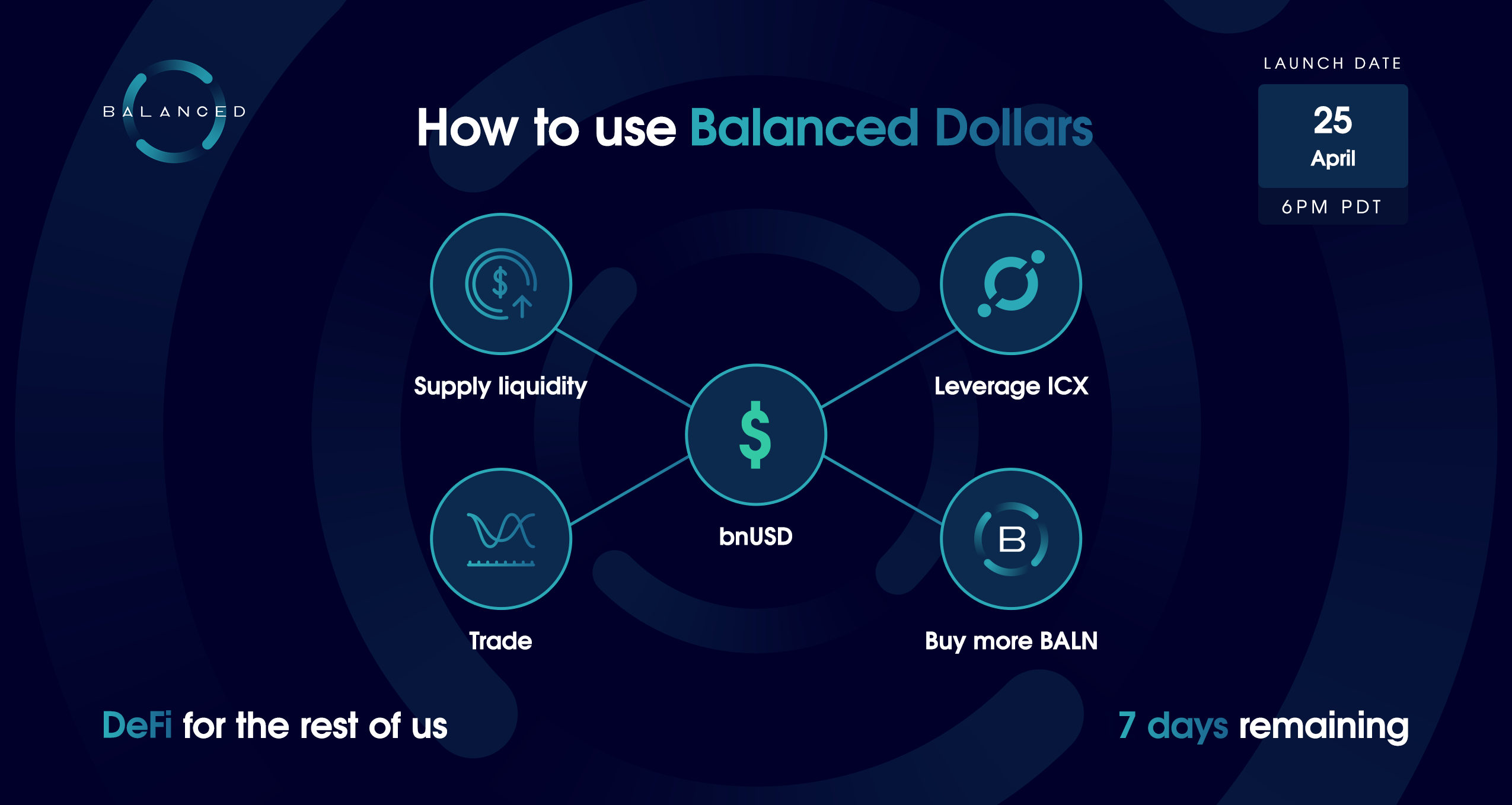
Empowering people to circulate bnUSD
Borrowers earn Balance Tokens (BALN) while they have a loan. But Balanced doesn’t incentivise people to borrow bnUSD just so they can keep it in their wallet. To be useful, bnUSD needs to be widely distributed and available to trade, so step 3 of the adoption process was to encourage people to use it.
Our approach to this was twofold:
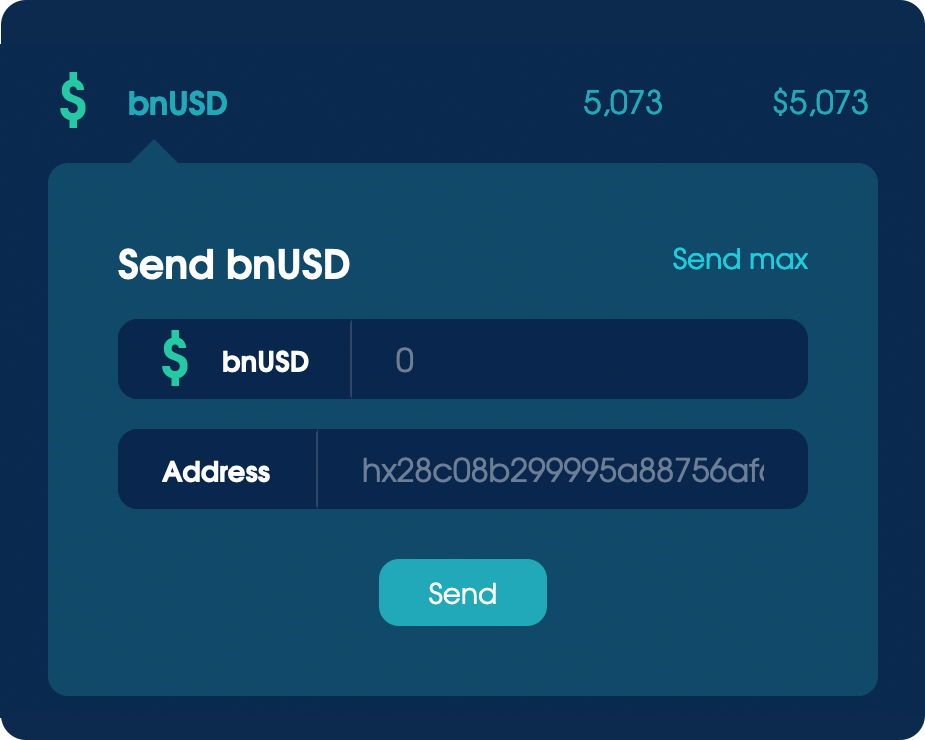
- Include wallet functionality to make bnUSD easy to send.
- Design a trading experience to buy and sell bnUSD.
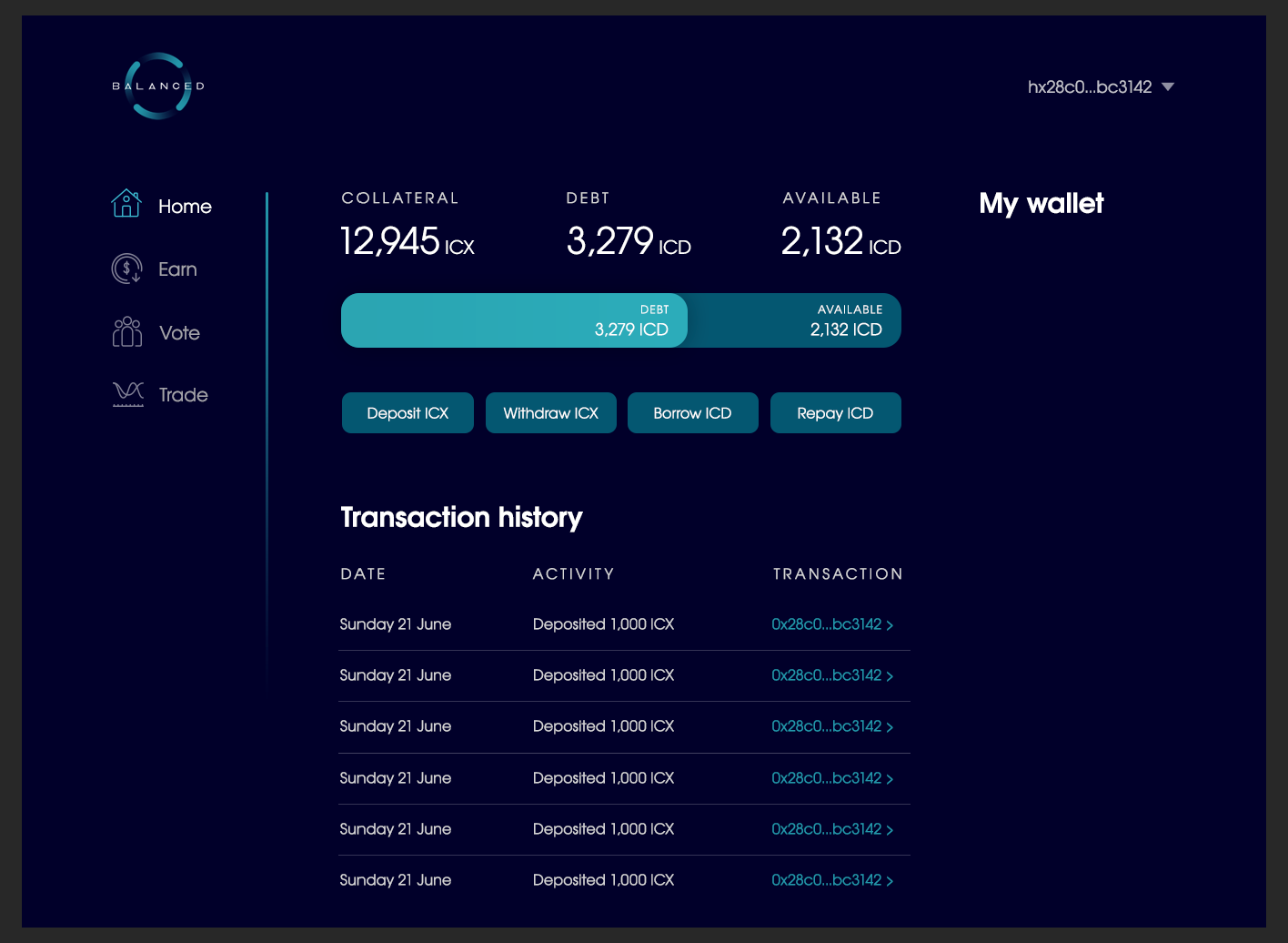
To make bnUSD easy to send, we included a Wallet section on the Home page. You can view and manage your assets inline, without losing context of your position.
The design was simple, but because it was so direct, it ended up being more popular than the wallet apps people used to sign in with.
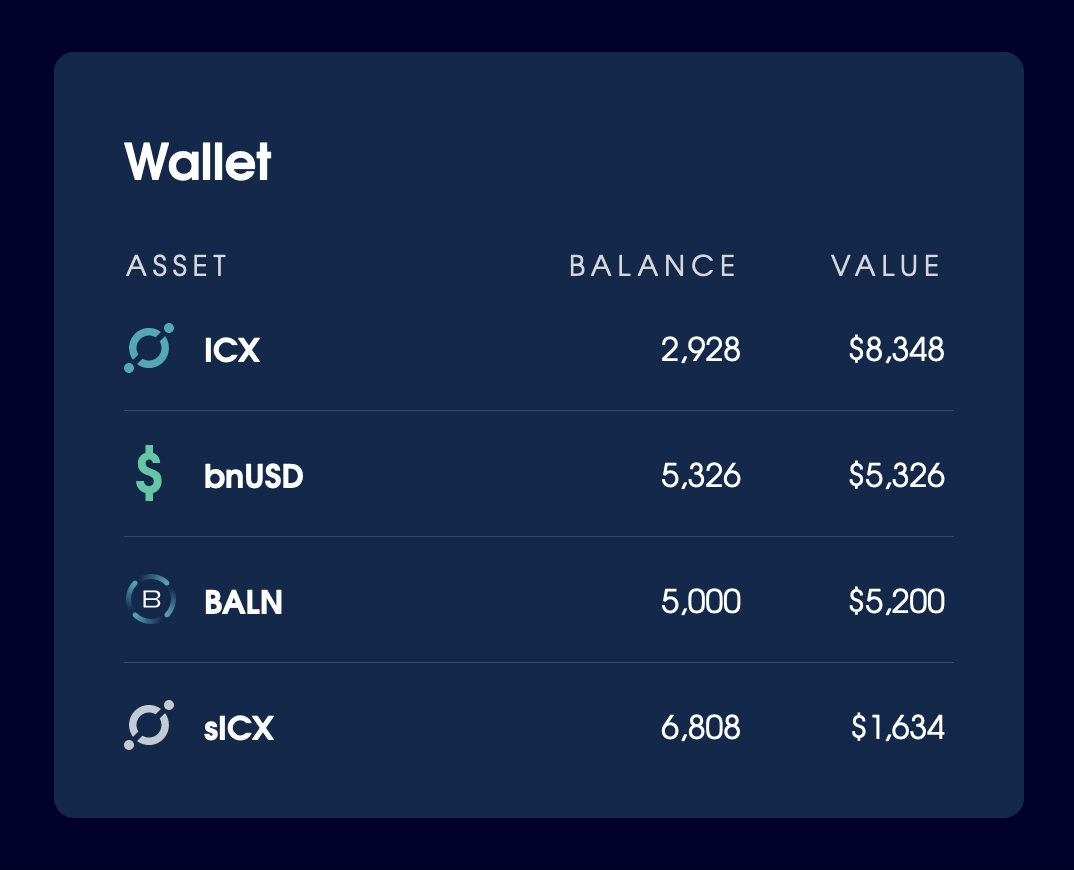
The wallet design we shipped with, which included expanded states with actions specific to each asset.
As for the trading experience, we designed an exchange to facilitate the circulation of Balanced assets... twice.
We initially created an order-book style exchange, where people could set specific buy and sell prices:
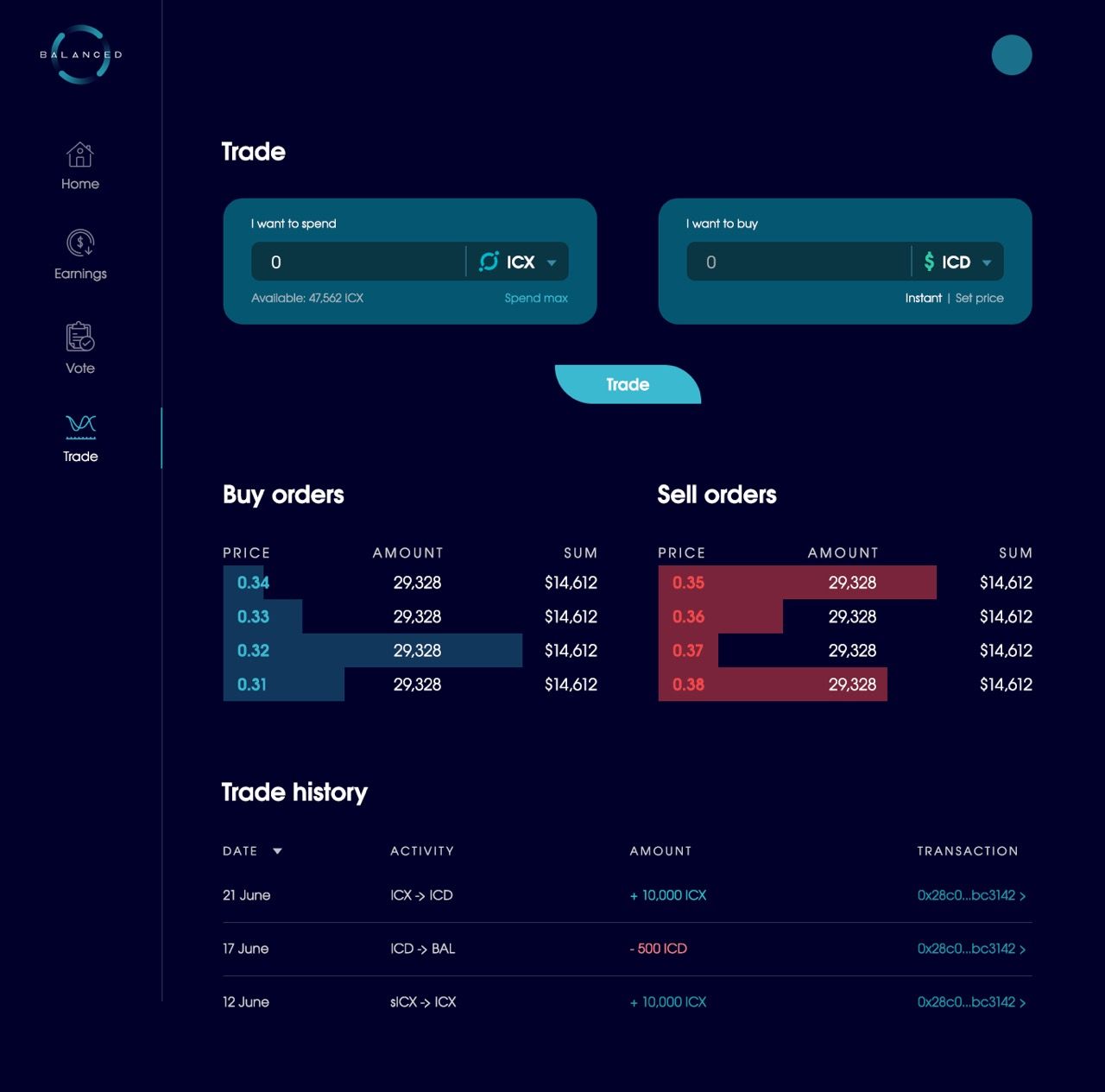
Initial concepts for an order book exchange, which was later scrapped.
But it wasn’t compatible with a reward model based on the amount of time assets are available to trade, so we pivoted to a liquidity pool format, often known as an Automated Market Maker (AMM).
Liquidity pools provide a better experience for the average trader, and a more passive way for liquidity providers to earn yield. You can swap between assets instantly — no need to set a specific price — and supply your assets to a liquidity pool to earn incentives and trading fees.
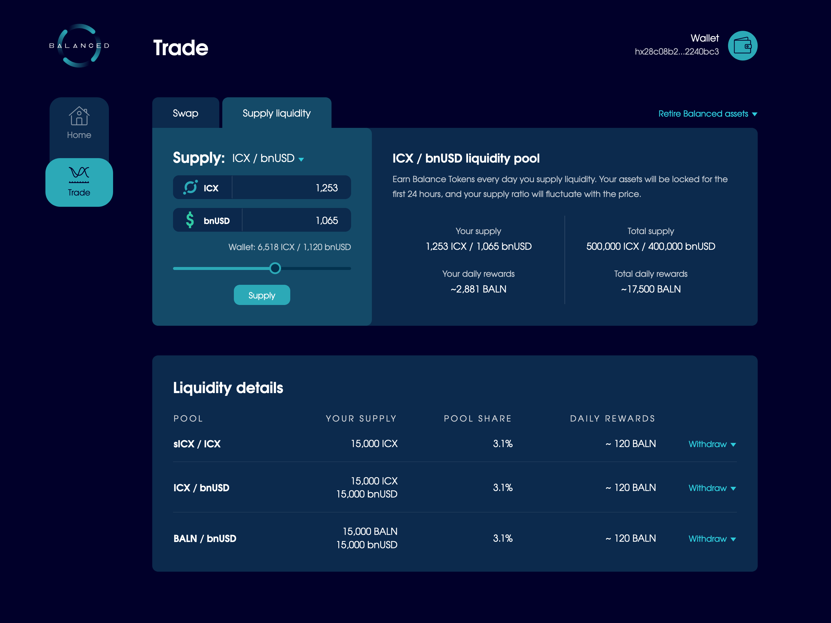
We knew that most DeFi participants swapped assets, some used leverage and took out loans, but very few supplied liquidity. It’s an advanced action, but our goal was to make it so easy that even people brand new to DeFi felt confident enough to participate.
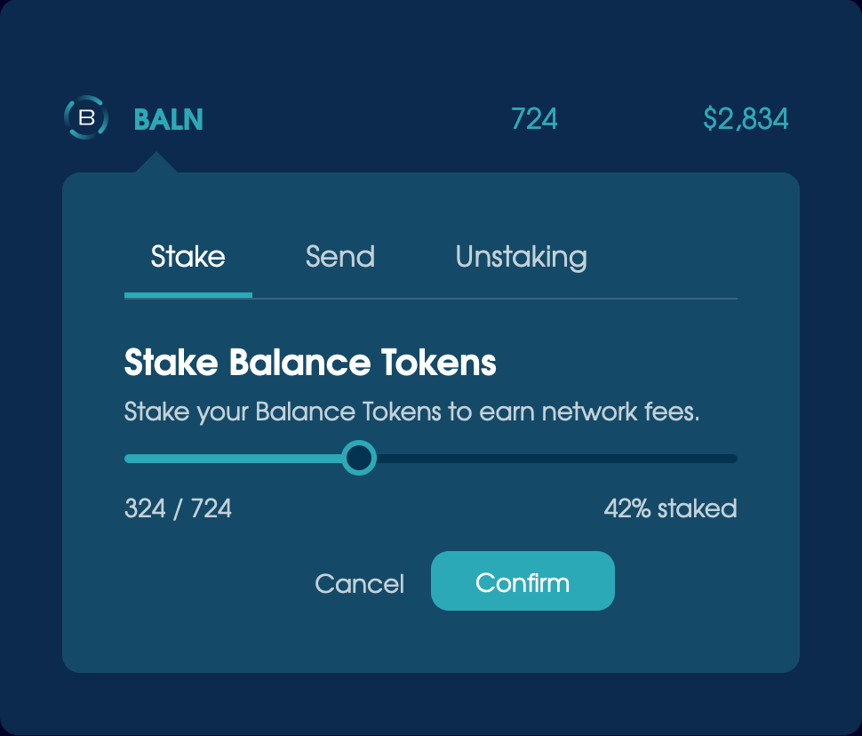
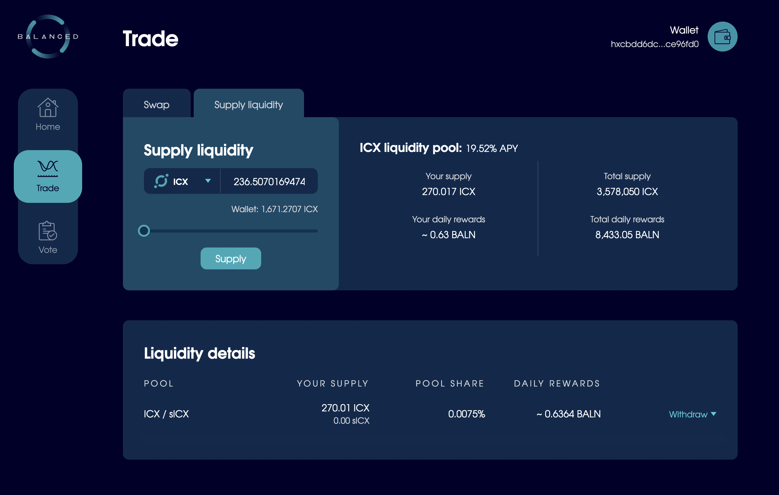
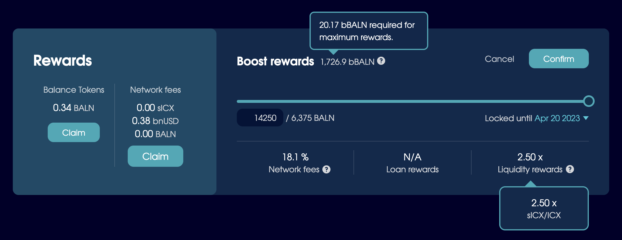
Liquidity providers are incentivised with BALN, which made it easier to attract interest. As for the design, we reused the slider-calculator functionality. Most liquidity pools require an even value of 2 assets, so you can use the slider to set the correct ratios and see an estimate for the amount of BALN you can earn daily.
Preview the amount of BALN you can earn before you supply liquidity.
The act of supplying liquidity requires 3 wallet transactions. Batching these together had too many downsides from a technical perspective, so we handled the transaction dance in a modal.
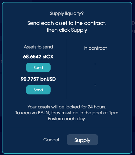
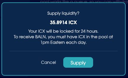
Two variations of the supply liquidity confirmation modal, which also warn you about the lock-up period and BALN reward requirements.
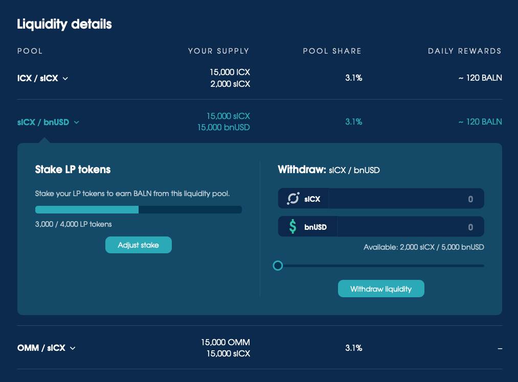
We also made it easy to monitor your liquidity and withdraw your assets when ready:
The only unresolved issue was related to a 24 hour lock-up period that limited abuse of the reward model. Due to how the smart contracts were set up, we couldn’t show people how much longer their liquidity was locked for — or even provide a helpful error message if they tried to withdraw their assets early. All we could do is tell them about the lock-up period when they supplied liquidity.
Many people reported transactions failing for no obvious reason, but the transaction fee was minimal and we eventually removed the lock-up period when the smart contracts were updated to a “continuous rewards” model.
Finalising the design for launch
We went through countless iterations of the app as the project progressed. The features and details often changed, and many were pushed off until after launch.
Here’s a snapshot of the prototype that informed the version we shipped with:
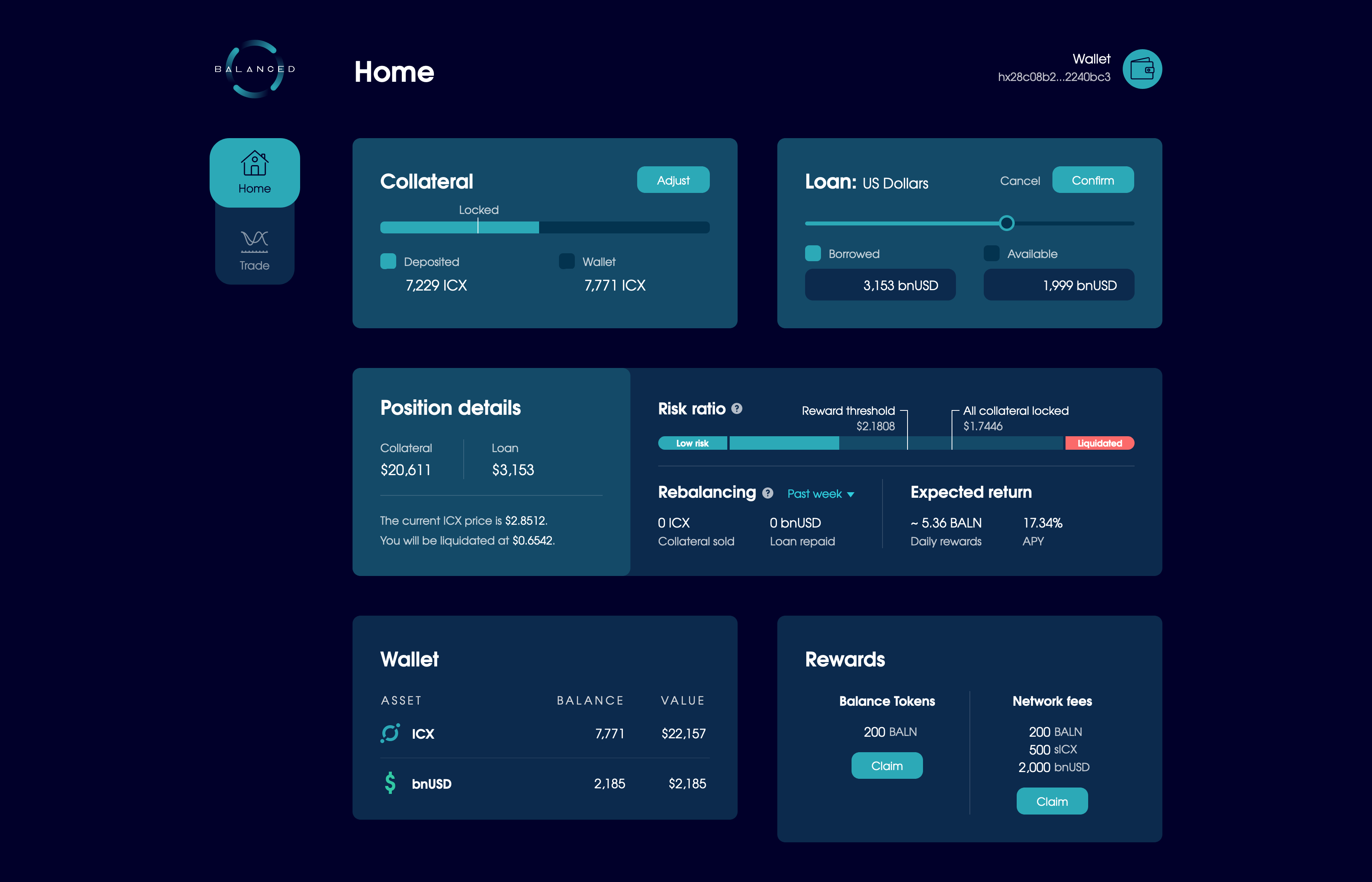
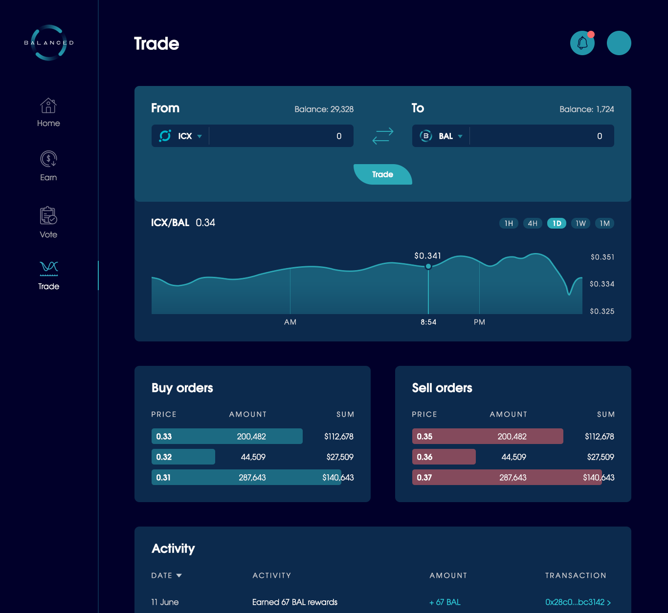
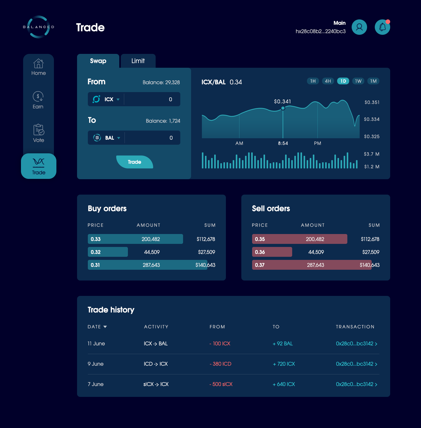
The launch version of the Home page.
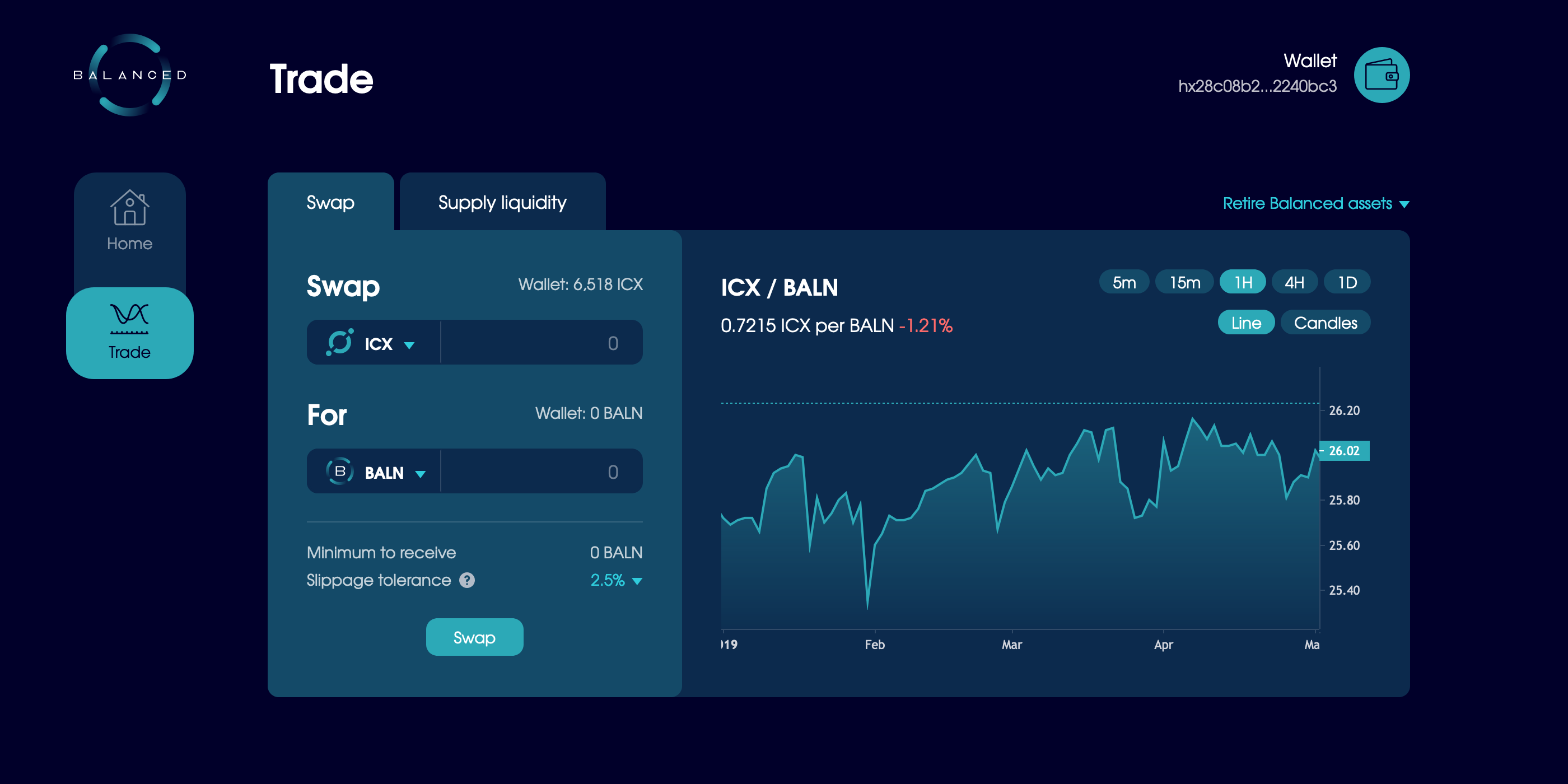
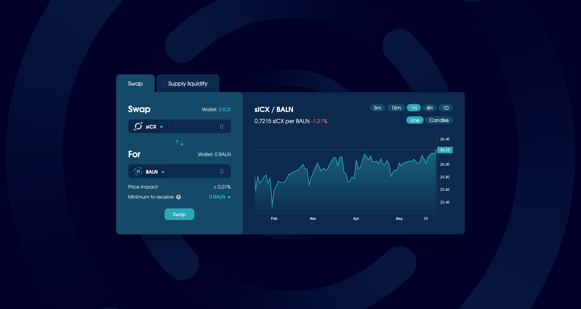
The launch version of the Trade page, with tabs set to Swap and Supply Liquidity.
Building hype with a launch campaign
While we built Balanced, we intentionally limited our marketing efforts. Every time we released an article or posted a tweet, people would join the Telegram group to see what Balanced was all about, then leave when we told them it wouldn’t launch for at least another 6 months. People have short attention spans, but crypto investors take it to the next level.
We started our marketing campaign when we announced the launch date, 14 days in advance. 14 days was still a long time for many investors to wait, but we chose this time frame because Balanced’s reward-earning opportunities would begin immediately, and our launch success relied on the volume of ICX deposited. Most people keep their ICX staked to earn interest, so we needed to give them enough time to learn about Balanced and initiate the 8-day unstaking period.
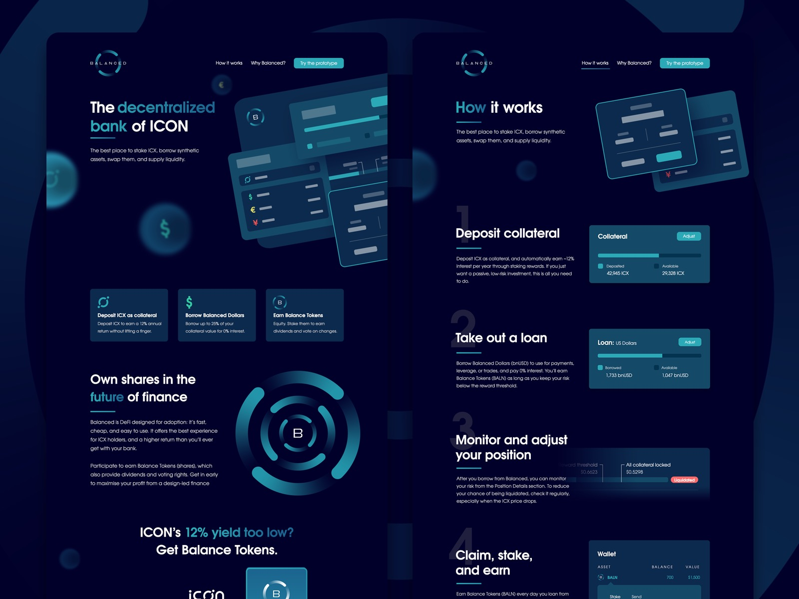
On the first day of the campaign, we released a new website that promoted the final product and emphasised the value of Balanced’s unique design. We positioned Balanced as “The decentralised bank of ICON”, and marketed a vision of “DeFi for the rest of us”.
The introduction sections we shipped for balanced.network and balanced.network/why.
It was so effective that many of our users still parrot the messaging today, even though we retired “The decentralised bank of ICON” after 9 months to avoid unnecessary regulatory issues.
Our marketing campaign took place on Twitter, where most crypto investors frequented, and was reposted to Reddit for increased visibility. We released new content every day at 1pm, all organised under #DeFiForTheRestOfUs.
We had a high-level draft for this content before we began, but most of it was done by the seat of our pants, finalised with less than 30 minutes to spare before the daily publication time. The pressure would be enough to put most people on edge, but we needed to be agile based on how people responded to each day’s content.
Every day, the content focused on a different theme. Included were topics like:
- How to perform specific actions (borrow, supply liquidity)
- How to earn rewards
- What to do with Balanced Dollars
- What to do with Balance Tokens
- The Balanced adoption strategy
- Balance Token distribution schedule
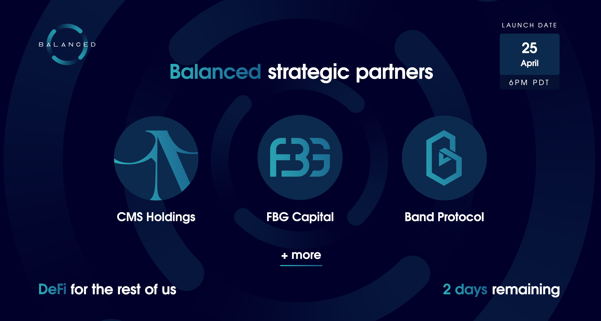
- Strategic partner announcement
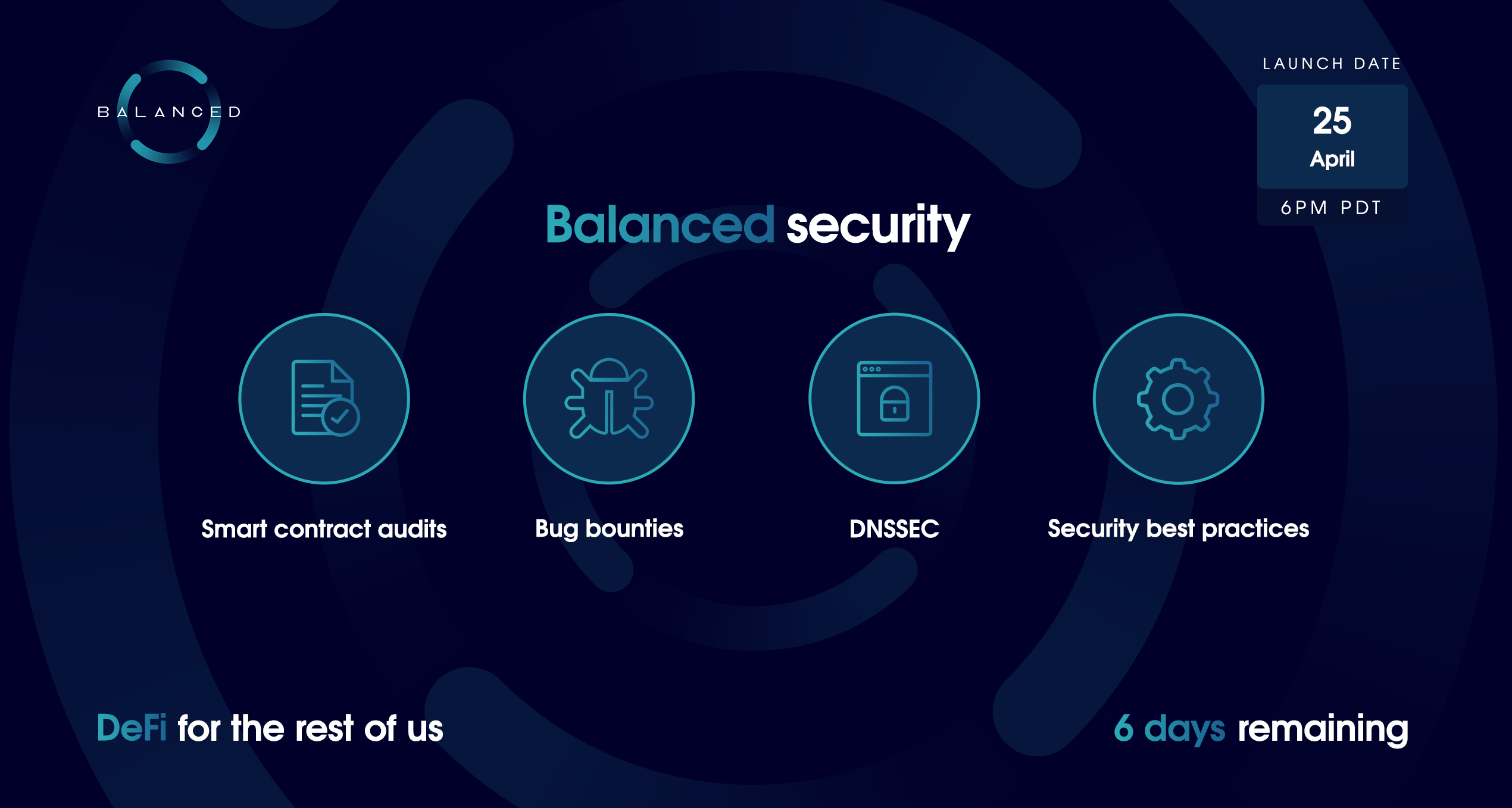
- Balanced security
- Feature roadmap
- An article series about sICX, rebalancing, Balance Tokens, and liquidity pools
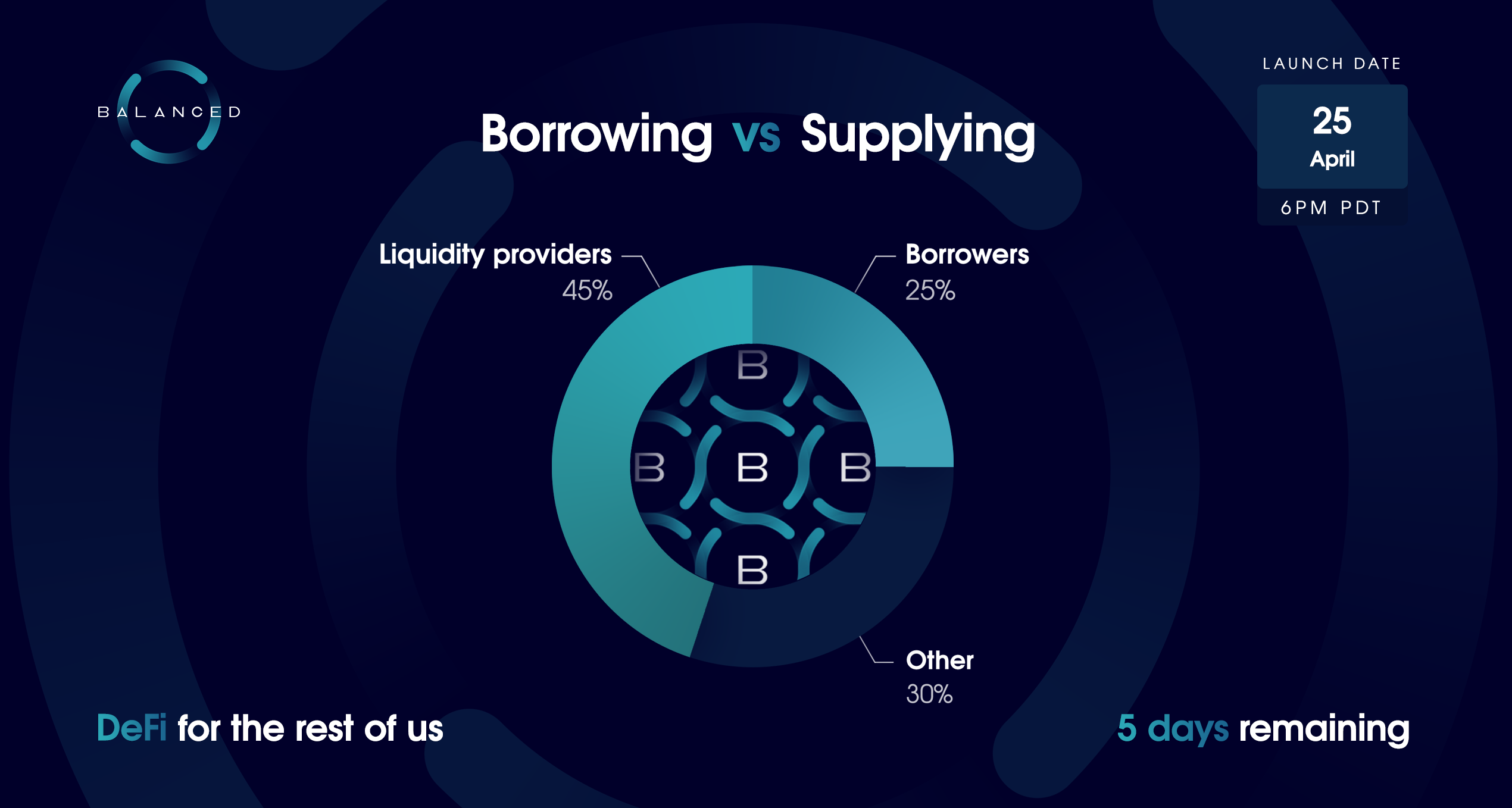
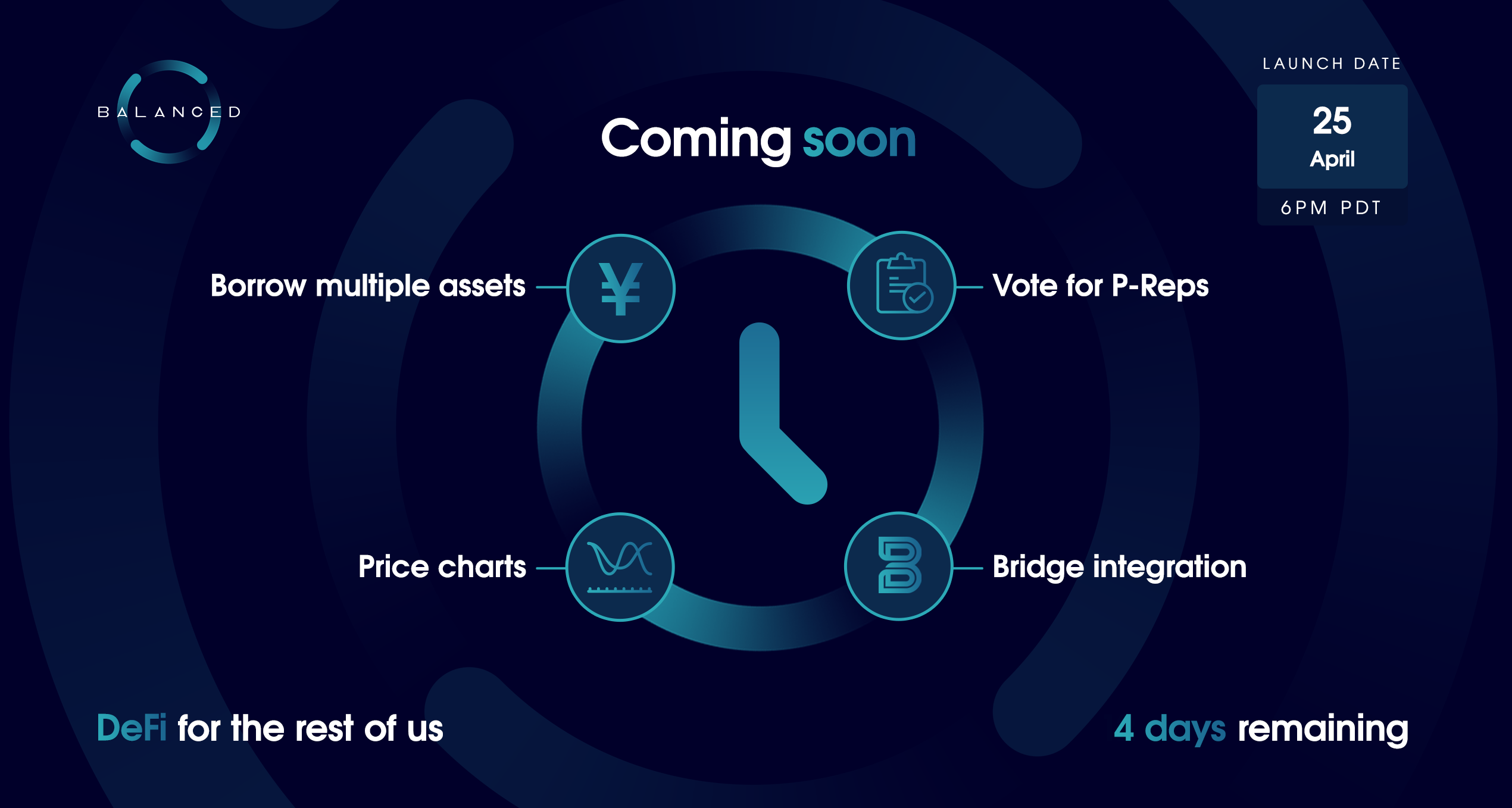
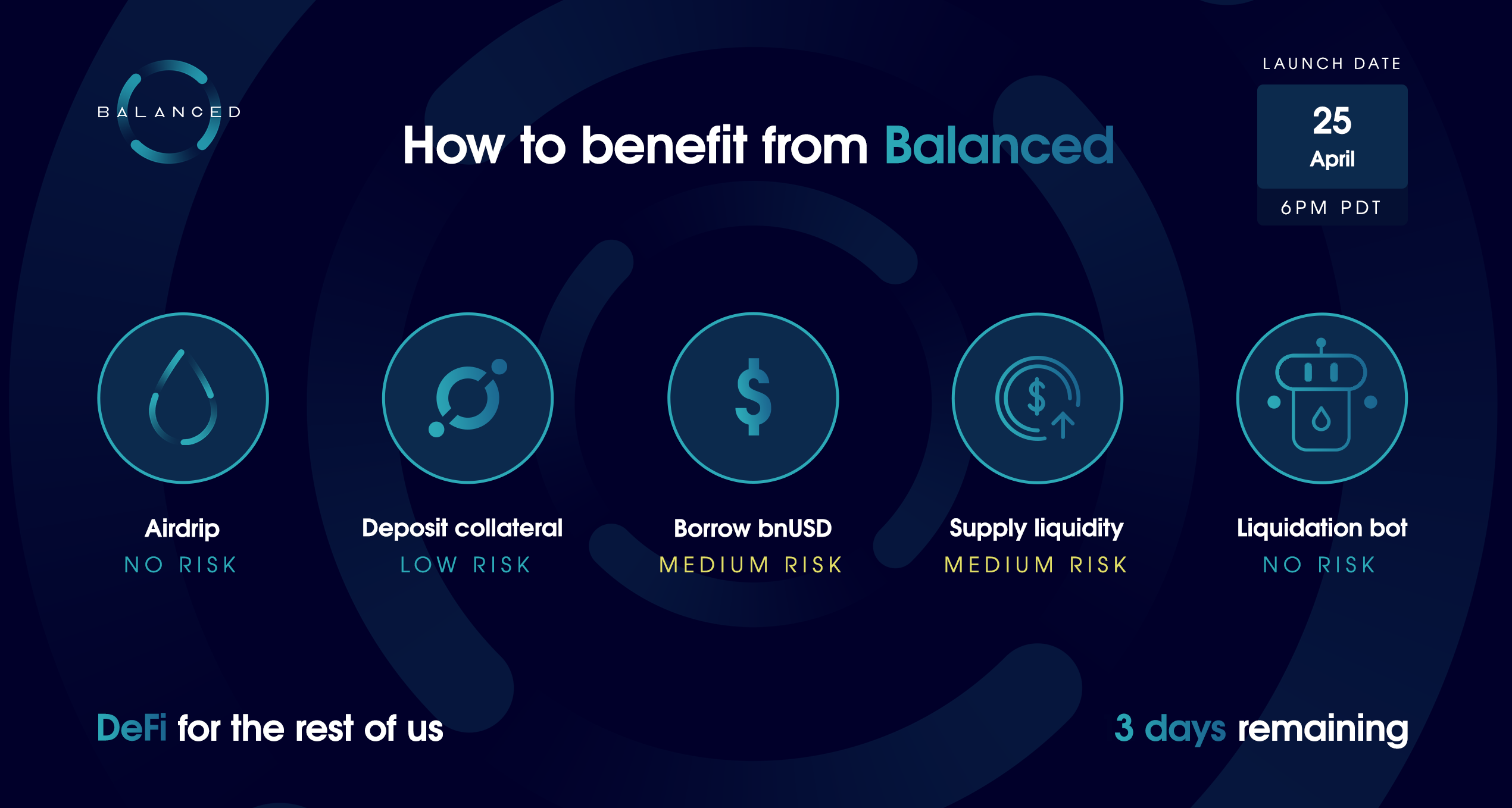
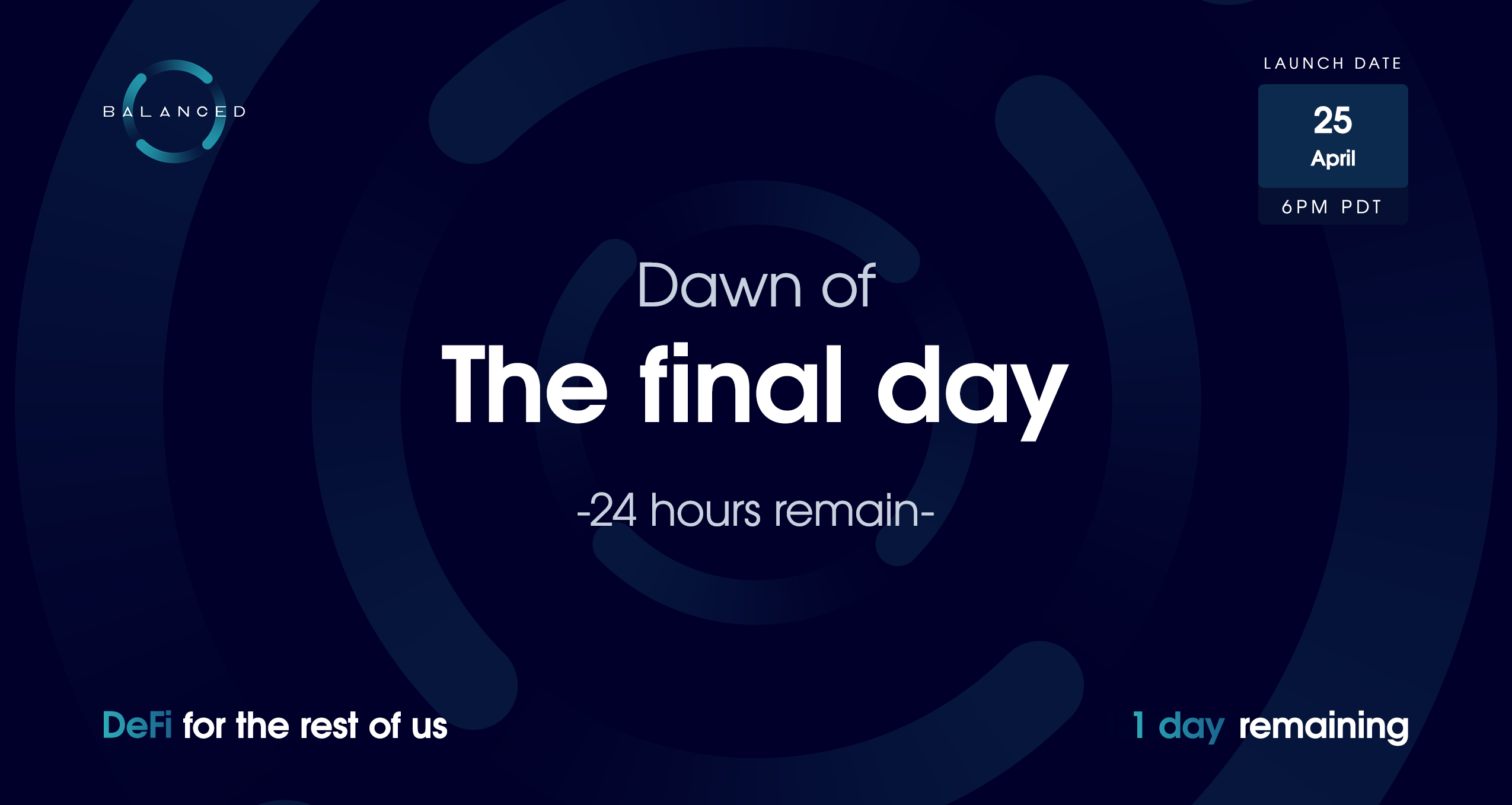
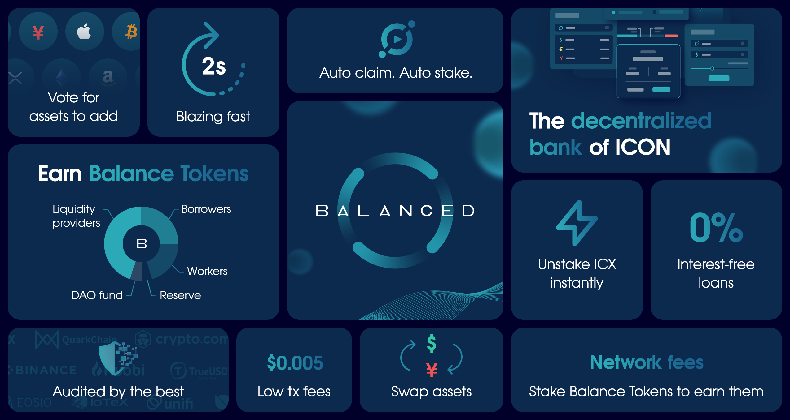
The headline images for each day of the launch countdown.
Overall, we managed to increase Balanced’s follower count from roughly 4,000 to 12,000 users, and saw record engagement rates every day of the campaign. We did not pay for any ads or promoted posts during this campaign, although some of our partners arranged for YouTube influencers to review Balanced soon after the launch.
For a closer look at the marketing we produced during the 14-day countdown campaign, take a look at this blog post:
 Balanced Official
Launch results
On April 25, 2021, the entire Balanced community gathered in our Telegram channel, eagerly awaiting word that the app was live.
We were inundated by thousands of messages as we completed the last of our testing. Some people were so impatient that they used the smart contracts to deposit over US$1 million as collateral before we even announced the app open to the public.
When Balanced officially launched, it opened the floodgates. Here are some of the major milestones we celebrated:
- 10 million bnUSD created within 50 hours
- $200 million locked up within 10 days
- $500,000 earned from fees within 10 days
- 25 million bnUSD created within 12 days
- 10% of the ICX circulating supply deposited as collateral within 16 days
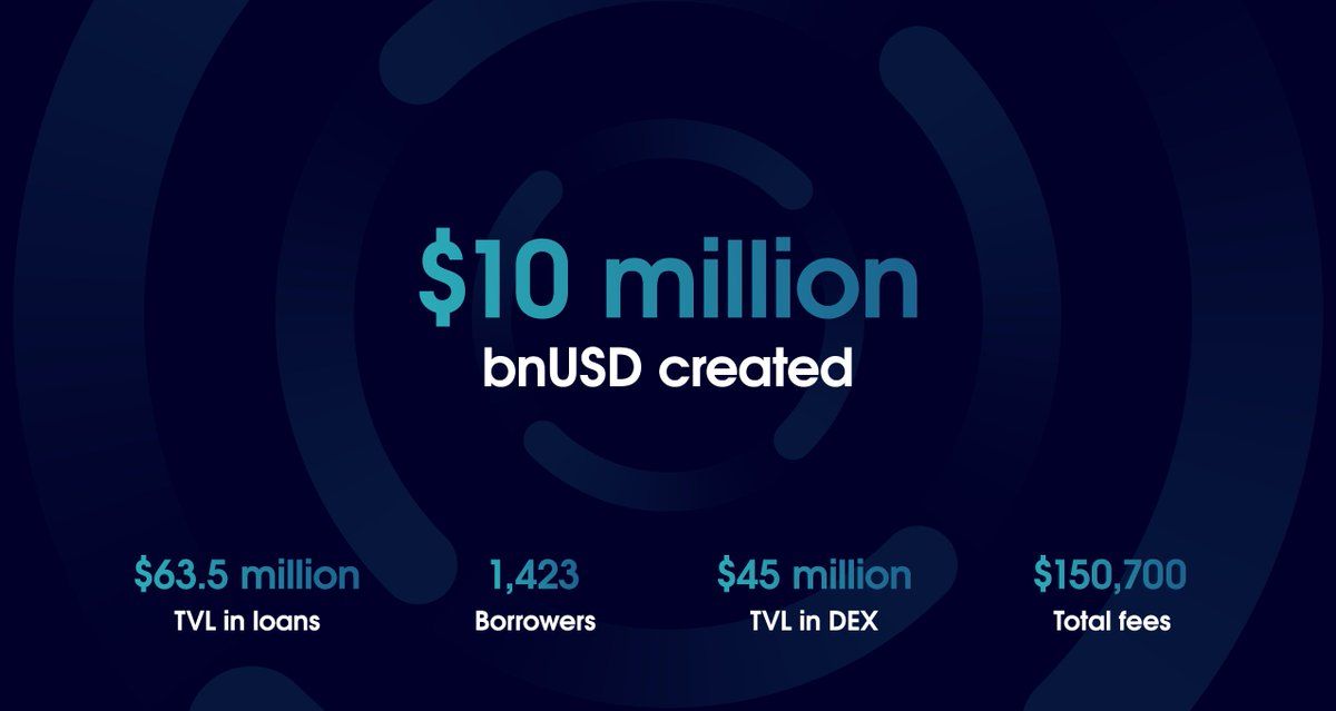
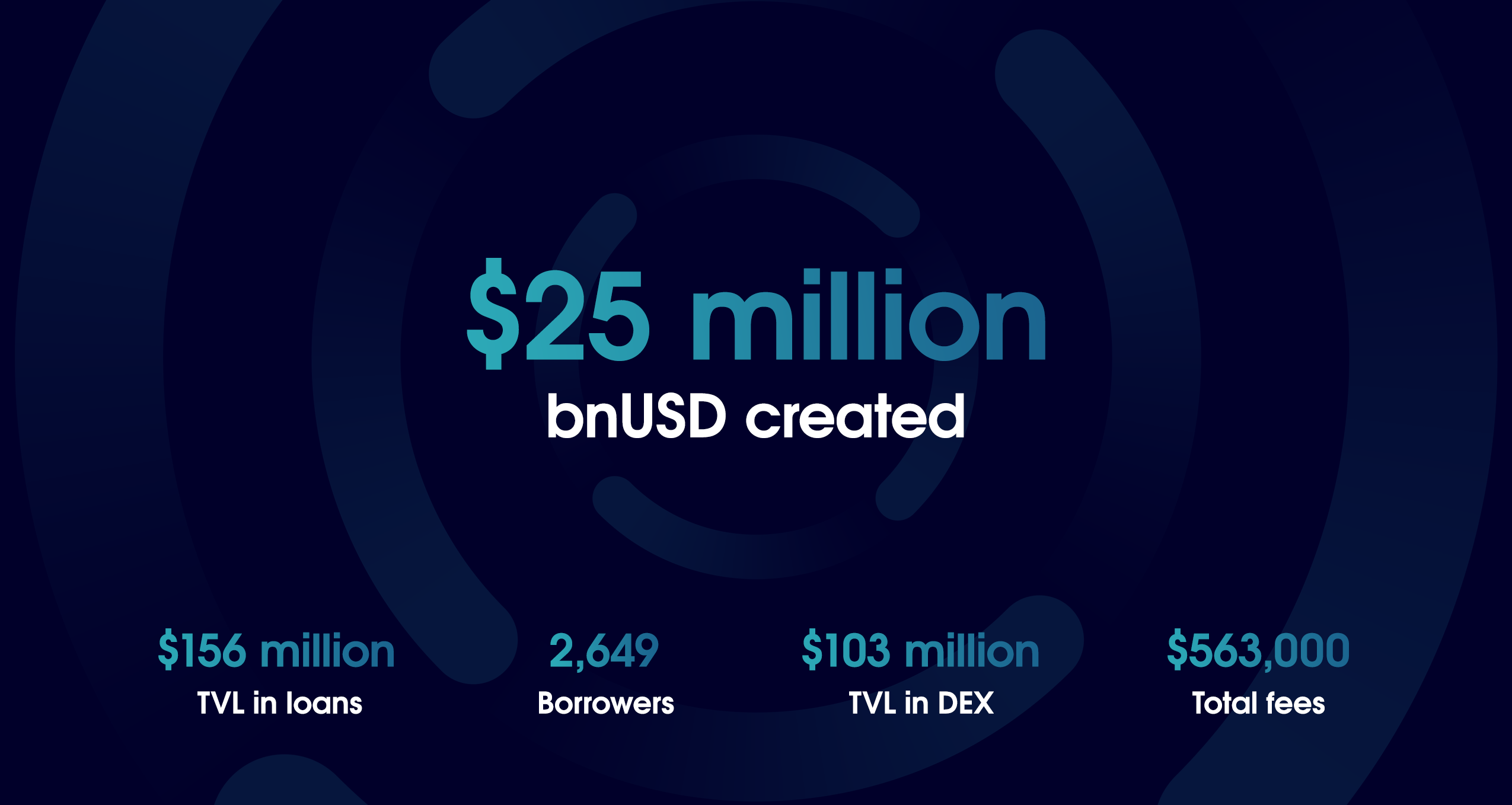
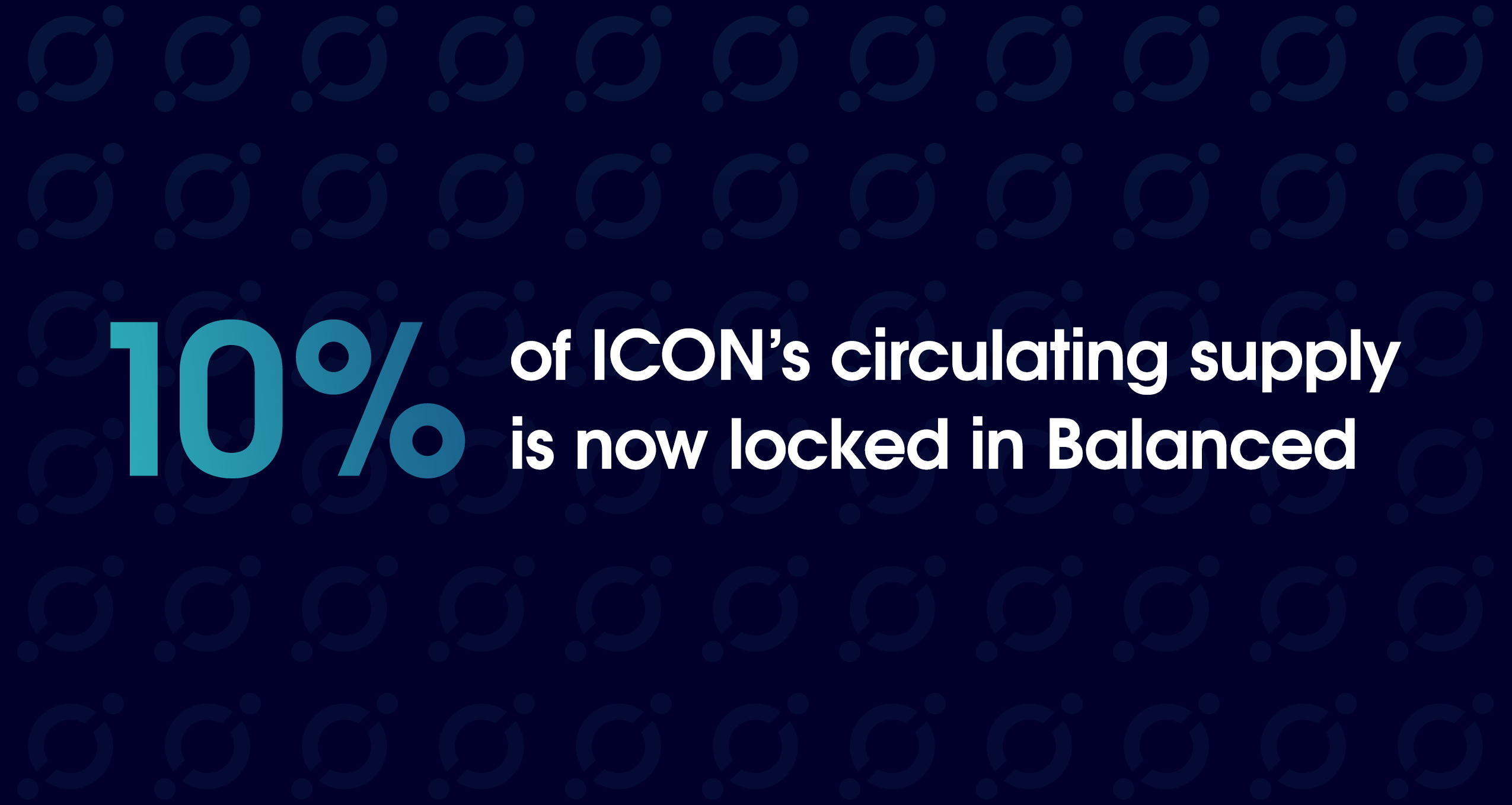
Some of the images used to highlight Balanced’s success during the first 2 weeks.
Those used to DeFi on larger blockchains may consider these numbers small, but the ICON blockchain was worth $1.5 billion at the time. And now Balanced was its flagship app.
The feedback poured in as people tried Balanced, many of them using a DeFi product for the first time.
This has got to be the easiest, [most] user friendly application I’ve ever had in cryptocurrency. Seriously.
It’s like watching the internet evolve.
@BalancedDAO just made the new wave of #DeFi. Shit isn’t even close.
I would try to do defi on other platforms like uni and honestly shit was intimidating. I said fuck it and left it alone.
Balanced UI/UX had me figuring this shit out and now i provide liquidity. #ILovelt 🙏🔥💯
Balanced’s simplicity, ease of use, stunning interface, and high yield have made it my one and only DeFi platform.
I was initially hesitant to use other DeFi services because they seemed complicated and I didn’t feel competent to use them effectively. After finding Balanced, I’ve been able to take out loans, supply liquidity, and earn staking rewards at the same time, easily and confidently.
I’ll never use anything else.
By the people for the people. Best UI, tailored for your average user.
Even your grandparents will be able to navigate this defi.
@BalancedDAO Has cured my UniSwap PTSD. Such a pleasure to use.
Been using Maker/Oasis for a couple years and @BalancedDAO UX is in a league of its own
I’ve used almost everything on Ethereum, Solana, and Terra, and nothing beats @BalancedDAO in terms of UX.
@BalancedDAO it is ridiculously easy. great work. It only took a few minutes to understand it all. providing liquidity now.
Gotta say, been around some these defi apps and most are so confusing and difficult to use. But the team have pulled off something special here, Balanced by far is the easiest to use defi platform l've seen.
Something about the way @BalancedDAO is built makes you want to check in at least once a day, hence the high participation rate.
A really engaging platform 👏👏
You can find even more appreciation on the Balanced Reviews page.
But no product launch is perfect, and Balanced was no exception. We launched without governance functionality (important for a decentralised product) or price charts for the exchange. The app was buggier than we’d have liked, and not properly optimised at mobile.
We wanted to delay the launch until we’d straightened out the bugs and could ship with all the intended features. But after 15 months without funding, there was mounting pressure to ship something. So we had to compromise.
Thankfully, the bar in crypto is set so low that no one seemed to notice or mind as much as we did, and we were able to add governance functionality, price charts, and fix most of the bugs within the first 2 months.
Design is iterative
We may have spent thousands of hours preparing Balanced for its debut, but our work was far from over. Balanced has received countless updates since launch, including many smart contract upgrades that required significant changes to the app.
We were able to accommodate these changes because we took the time to lay a solid foundation, but some features required a delicate approach to avoid overwhelming our users with complexity.
A compilation of some of the many features Balanced has shipped since launch.
When we started Balanced, we expected bnUSD to be the first of many synthetic assets. But over time it became clear that it would be better to focus on managing the stability of a single asset. As this is a new financial arena, many synthetic asset protocols had also received regulatory scrutiny, which we wanted to avoid in order to keep our focus on the product. We’d hoped to one day mint an NZD stablecoin, so it was with great hesitation that we turned away from this path.
Balanced is now more than 2 years old, yet it’s still one of the easiest, most unique DeFi apps on the market. While everyone else adopts a “good enough” attitude and releases yet another Uniswap clone, we’ve doubled down on our mission to create DeFi for the rest of us.
Balanced has outgrown the ICON blockchain, but it hasn’t reached its ceiling.
Our next mission: take on the dominant players in a cross-chain DeFi ecosystem.