How to design a blockchain website that converts
How to design a blockchain website that converts

The thought process behind WhyICX, our sales pitch and onboarding funnel for the ICON Network.

Balanced and Omm look nice, but I don’t own ICX. Why invest in another blockchain?”

Many product teams in crypto face a unique challenge: people need to use the blockchain an app is built on before it even has a chance to convert them.

To make the ICON blockchain look more enticing, we created whyicx.com.
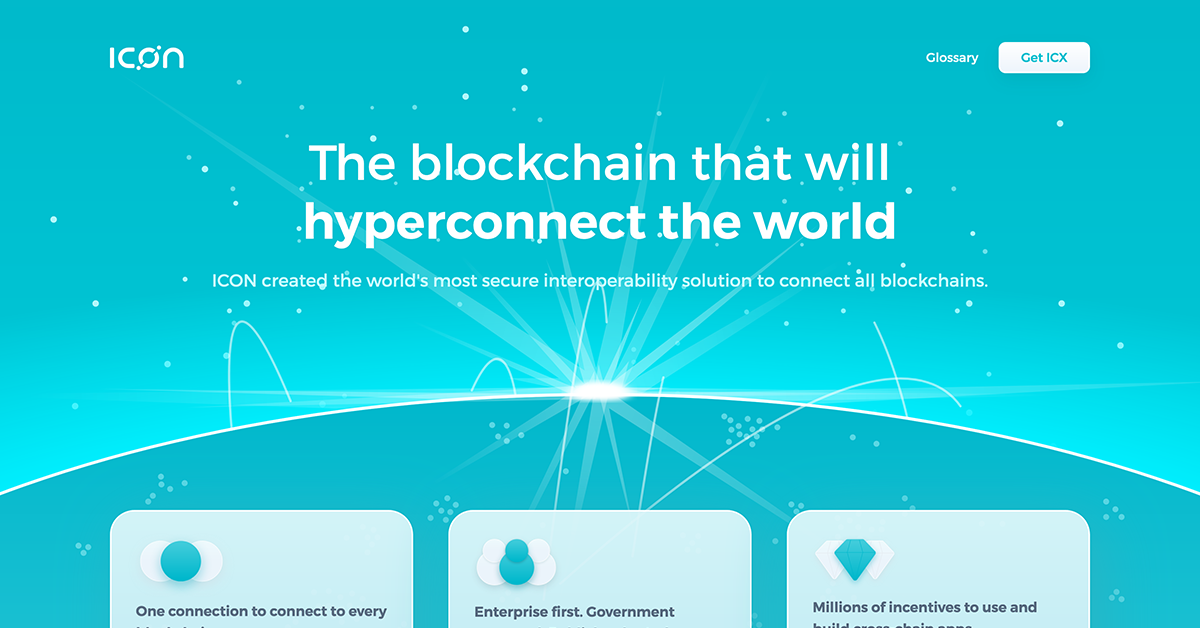
The blockchain that will hyperconnect the world | Why ICX
ICON created the world’s most secure interoperability solution to connect all blockchains.

What follows is a high-level overview of what we did and why it was necessary (adapted from this Twitter thread).


The purpose of a website is to attract and convert users.

But most crypto sites act like every visitor has already converted and onboarded themselves. So they don’t really try.

Crypto is a high-friction industry, and this attitude limits their audience.


The blockchain industry has a trust problem.

75% of people judge a project’s trustworthiness by the quality of its website.

High-quality sites increase trust. Low-quality sites destroy it.

If your crypto website is low-quality, people will assume it’s a scam — and you won’t convert them.


Most websites say what their blockchain does, but few bother to explain why it matters. Why should people care enough to invest their precious time, money, and energy?

Every Simon Sinek fan will understand why this is a big problem for adoption.


Without a “why”, there’s nothing for people to get excited over.

No vision to unite behind.

Many look to their competitors for inspiration, and become so focused on what they’re doing that they lose their own identity.

Their brand becomes generic, homogeneous.

Forgettable.
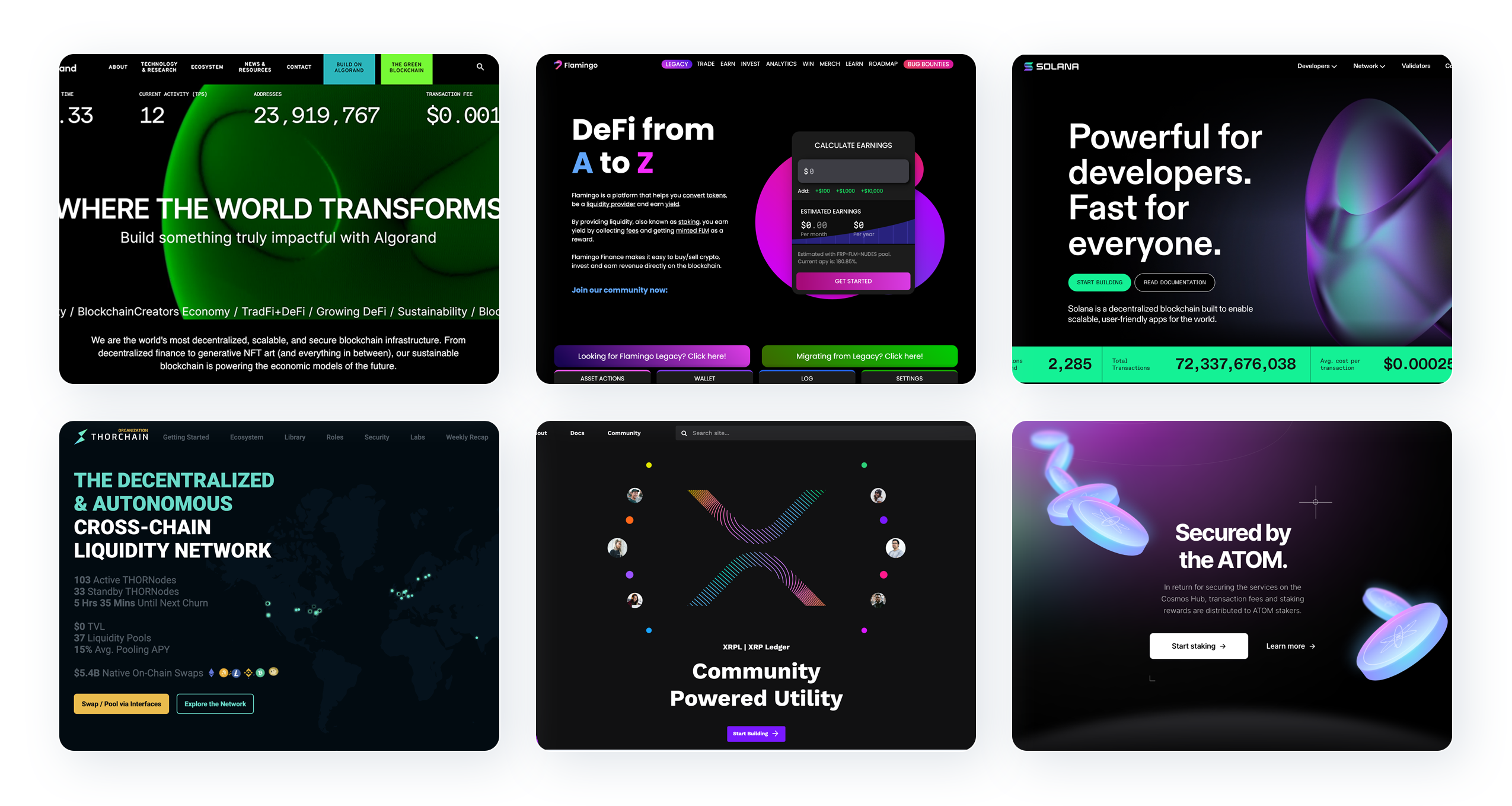
A compilation of blockchain websites that use a generic “dark mode” style brand: Algorand, Flamingo, Solana, Thorchain, Ripple, and Cosmos.

Effective marketing stands out.

It embraces the entire brand, not just the logo.

It uses colour consistently.

A signature colour increases brand recognition by 80%, and consistent brands are 3.5x more likely to be remembered.

Blending in with the crowd will get you nowhere.

ICON doesn’t get enough praise for its brand.

Its colours are so distinctive and recognisable, you can identify it even without the logo.

It can’t help but stand out against the competition.
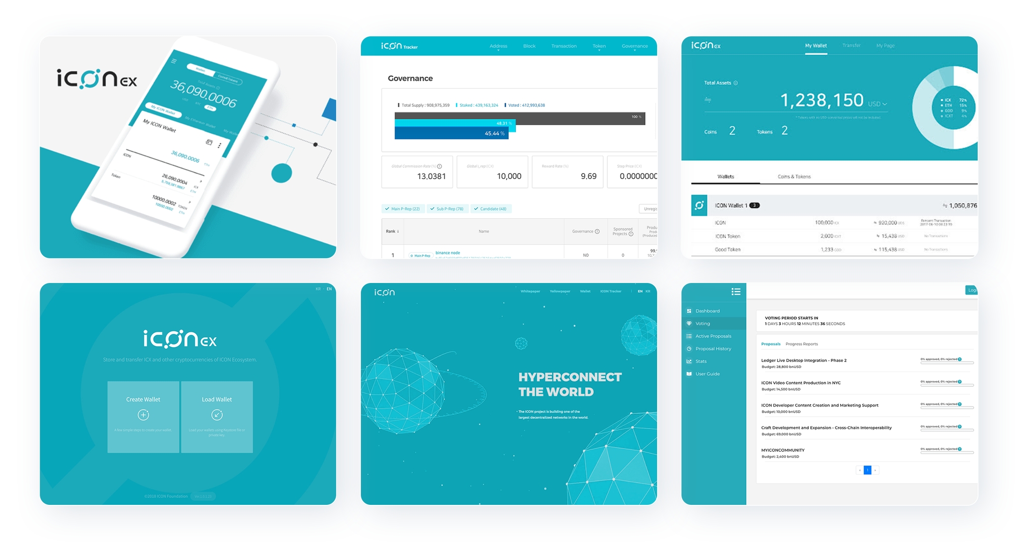
A compilation of the ICON brand, as seen in the ICON wallet (ICONex), the ICON tracker, the original website, and ICON’s Contribution Proposal System.

ICON’s brand identity was strongest in 2017–18, at the height of its popularity.

Now that ICON is about to fulfil its vision of interoperability, it’s crucial to double down on this identity, to leverage brand recall so people know it’s still here, still building — bull or bear.


But for ICON, a strong brand isn’t enough.

Many investors were pissed that they couldn’t trade in their ICX for a lambo within 6 months.

Blockchain bridges have lost over $1 billion from hacks in 2022 alone, so it was crucial that ICON take the time to get it right.

Some don’t see it that way.


When your reputation is tainted, you don’t throw in the towel. You just have to try harder than everyone else.

You can’t copy your competitors or make contributions that are “good enough”.

You need to be better.

To stand out, you need to be outstanding.

Avis knows:
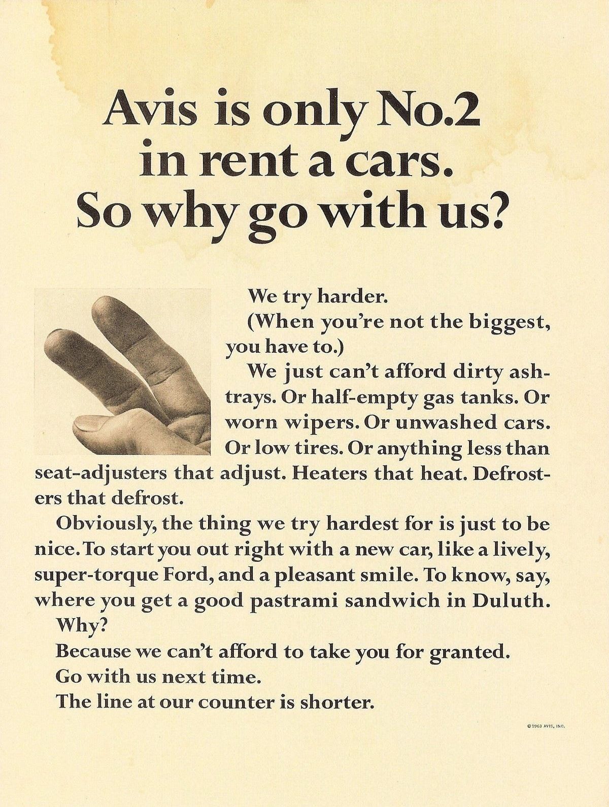
An advertisement from Avis in 1963:  Avis is only No.2 in rent a cars. So why go with us? We try harder. (When you’re not the biggest, you have to.) We just can’t afford dirty ashtrays. Or half-empty gas tanks. Or worn wipers. Or unwashed cars. Or low tires. Or anything less than seat-adjusters that adjust. Heaters that heat. Defrosters that defrost. Obviously, the thing we try hardest for is just to be nice. To start you out right with a new car, like a lively, super-torque Ford, and a pleasant smile. To know, say, where you get a good pastrami sandwich in Duluth. Why? Because we can't afford to take you for granted. Go with us next time. The line at our counter is shorter.
An advertisement from Avis car rentals in 1963 about why it’s better to go with second best.

That doesn’t mean you should tear down the competition.

After all, ICON was designed to connect them all, not outcompete them all.

As David Ogilvy says, you just need to say what’s good about your product — and do a clearer, more honest, more informative job of saying it.
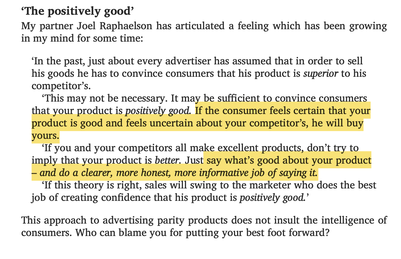
"The positively good”: an excerpt from ‘Ogilvy on Advertising’.  “In the past, just about every advertiser has assumed that in order to sell his goods he has to convince consumers that his product is *superior* to his competitor's.  “This may not be necessary. It may be sufficient to convince consumers that your product is *positively good*. If the consumer feels certain that your product is good and feels uncertain about your competitor's, he will buy yours.  “If you and your competitors all make excellent products, don’t try to imply that your product is better. Just say what’s good about your product — and do a clearer, more honest, more informative job of saying it.  “If this theory is right, sales will swing to the marketer who does the best job of creating confidence that his product is *positively good*.”  This approach to advertising parity products does not insult the intelligence of consumers. Who can blame you for putting your best foot forward?
An Excerpt from Ogilvy on Advertising.

It’s easy to be clearer, more honest, and more informative when most blockchain sites take 20+ pages to say anything useful.

We just had to do the exact opposite.

Fewer pages:

Gerry [McGovern] recommends organisations delete up to 90% of their content. When he started working with the US Department of Health, they had 200,000 web pages. They deleted 150,000 of them, and nobody noticed. Norwegian telecommunications company Telenor deleted 80% to 90% of their content, and their sales and customer satisfaction went up significantly, while support calls went down 25%.
An excerpt from Delivering a Better Customer Experience with Gerry McGovern's Top Tasks about deleting most pages from a website.

More content:

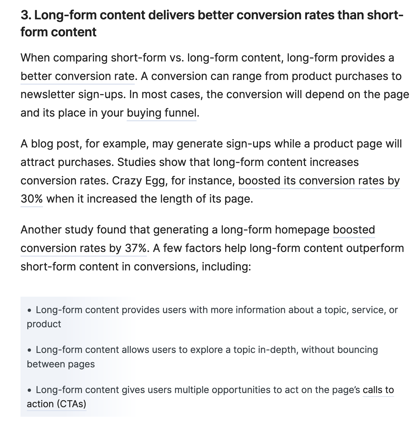
Long-form content delivers better conversion rates than short-form content… A conversion can range from product purchases to newsletter sign-ups. In most cases, the conversion will depend on the page and its place in your buying funnel. A blog post, for example, may generate sign-ups while a product page will attract purchases... Crazy Egg boosted its conversion rates by 30% when it increased the length of its page. Another study found that a long-form homepage boosted conversion rates by 37%.
An excerpt from Long-Form vs. Short-Form Content that compares the conversion rates of long vs short-form content.

Maximum readability:

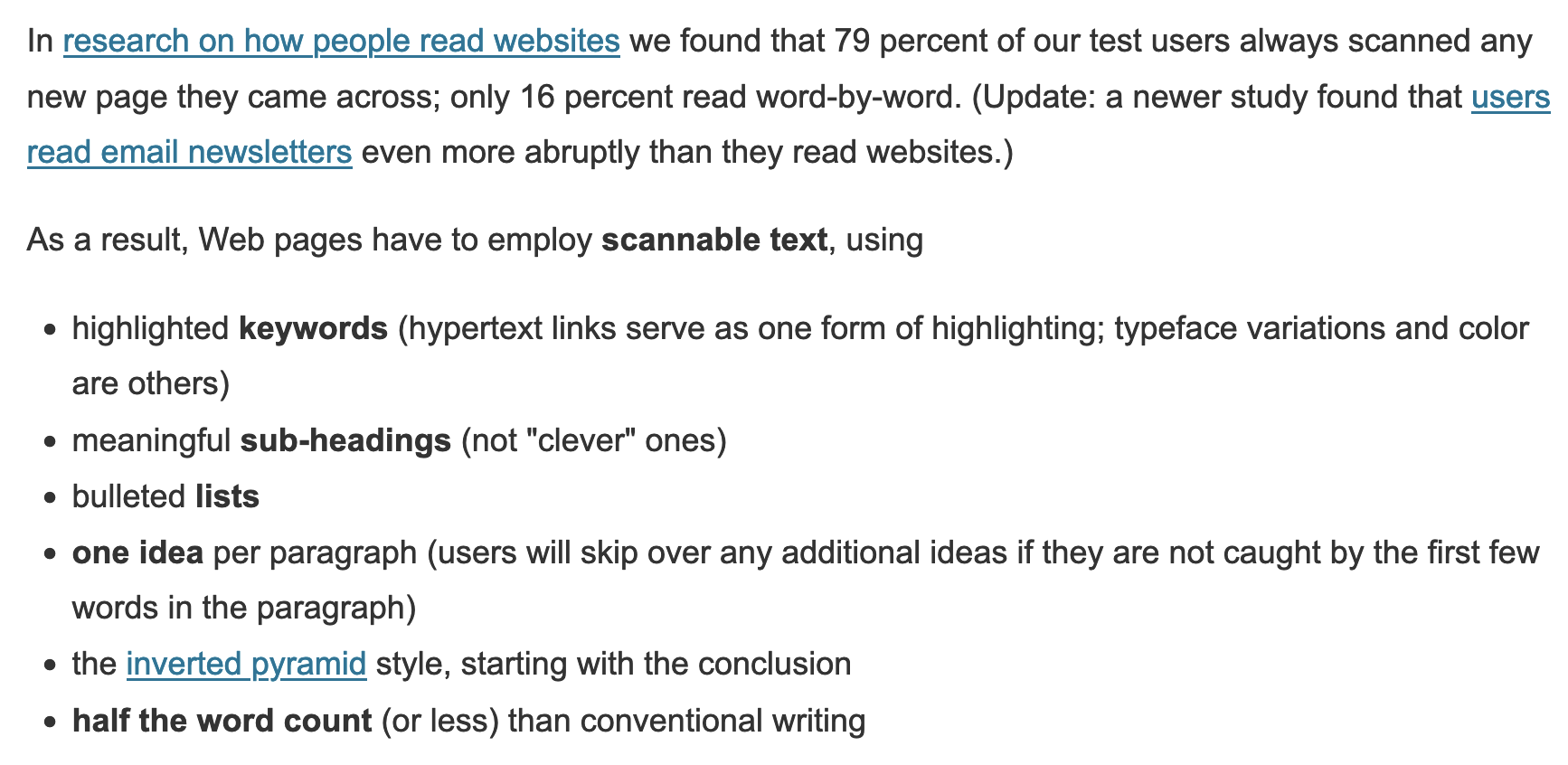
In research on how people read websites we found that 79 percent of our test users always scanned any new page they came across; only 16 percent read word-by-word. As a result, Web pages have to employ scannable text, using highlighted keywords, meaningful sub-headings (not "clever" ones), bulleted lists, one idea per paragraph, the inverted pyramid style (start with the conclusion), and half the word count (or less) than conventional writing.
An excerpt from How Users Read on the Web that discusses online reading behaviour and how to write for it.

We took advantage of what people do naturally: scroll.


Let’s start with the H1.

Most crypto sites say things like:

  • Reimagine your world.
  • Powerful for developers. Fast for everyone.
  • WHERE THE WORLD TRANSFORMS
  • Welcome to Multiverse
  • Community Powered Utility

Who do they belong to? What do they offer?

... Are you motivated to find out?


Your website title should clearly state what you do — and why people should care.

It should be uniquely your own.

For ICON, this was obvious: a variation of “hyperconnect the world”.

5 years later, this 3-word slogan still guides ICON’s efforts. We just needed to define the what and how:

The hero for whyicx.com.  The blockchain that will hyperconnect the world ICON created the world's most secure interoperability solution to connect all blockchains.
The hero for whyicx.com.

What problem do you solve? Why do you exist?

If you can’t sell the problem, you can’t expect people to buy your solution.

So why is ICON focused on interoperability?

Because most blockchains can’t interact with each other.

No jargon. It must be simple and to the point.
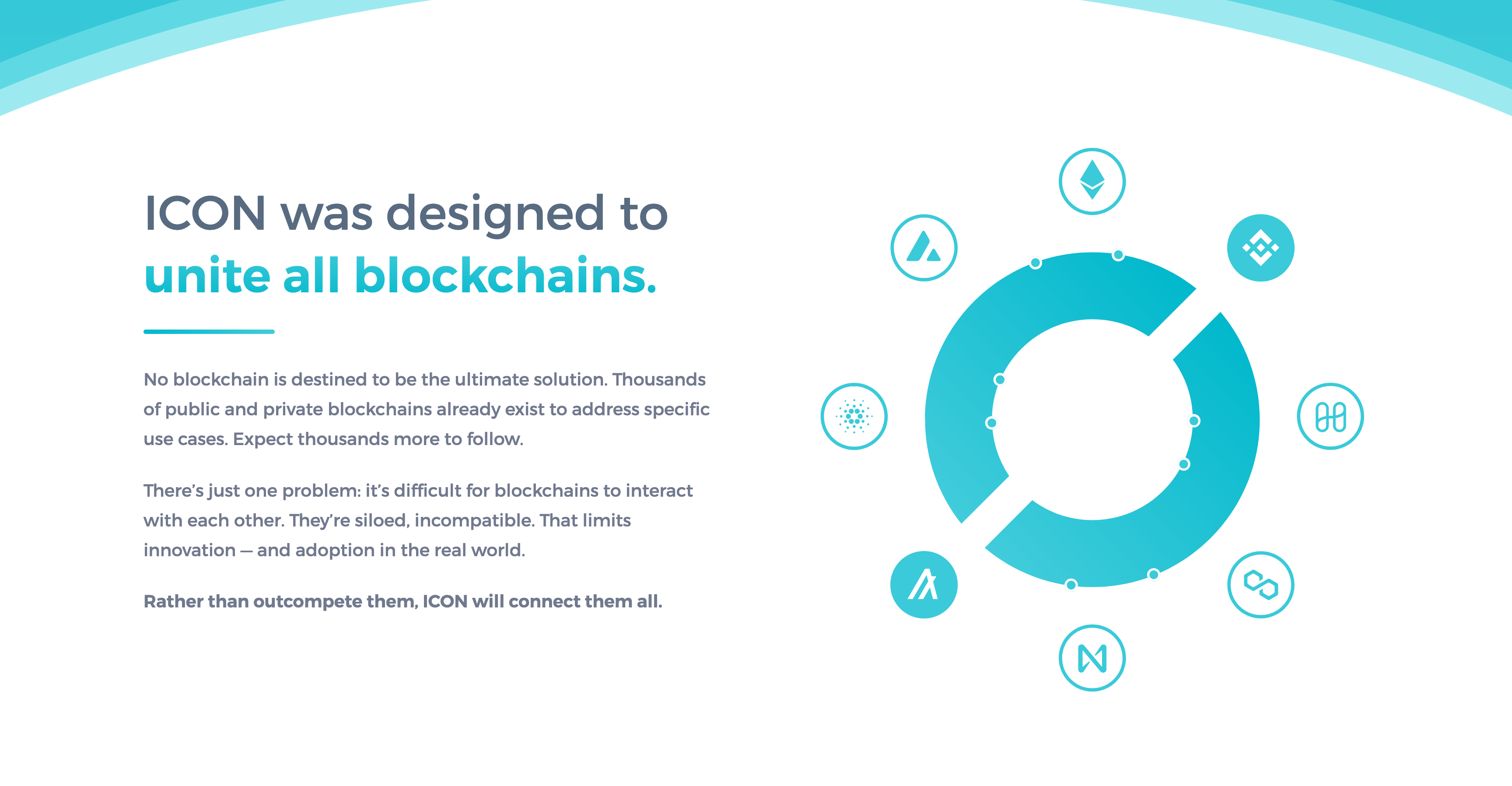
The intro section for whyicx.com.  ICON was designed to unite all blockchains.  No blockchain is destined to be the ultimate solution. Thousands of public and private blockchains already exist to address specific use cases. Expect thousands more to follow.  There's just one problem: it's difficult for blockchains to interact with each other. They're siloed, incompatible. That limits innovation — and adoption in the real world.  Rather than outcompete them, ICON will connect them all.
The intro section for whyicx.com.

The Blockchain Transmission Protocol (BTP) is the core of ICON’s hyperconnected vision.

In simple language, BTP is an interoperability solution that is:

  • Secure
  • Decentralised
  • Scalable
  • Adoptable

BTP is so important for ICON, we took up 1/3 of the page to explain it.
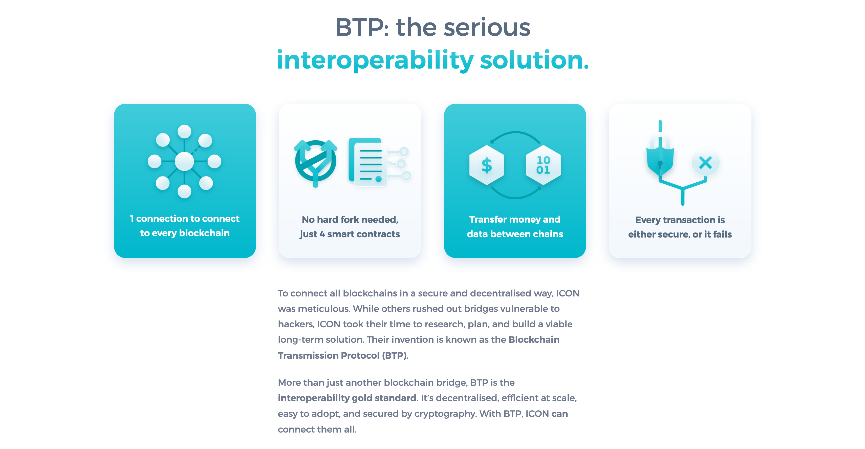
The Too Long; Didn't Read for BTP on whyicx.com.  BTP: the serious interoperability solution.  - 1 connection to connect to every blockchain - No hard fork needed, just 4 smart contracts - Transfer money and data between chains - Every transaction is either secure, or it fails  To connect all blockchains in a secure and decentralised way, ICON was meticulous. While others rushed out bridges vulnerable to hackers, ICON took their time to research, plan, and build a viable long-term solution. Their invention is known as the Blockchain Transmission Protocol (BTP).  More than just another blockchain bridge, BTP is the interoperability gold standard. It’s decentralised, efficient at scale, easy to adopt, and secured by cryptography. With BTP, ICON can connect them all.
The interoperability overview on whyicx.com.

ICON began as a blockchain for enterprises.

While focused on Korea, ICONLOOP’s private blockchains, business partnerships, and real-world adoption of MyID are worthy of applause.

As are their accolades.

It adds an aura of legitimacy ICON wouldn’t have without them.
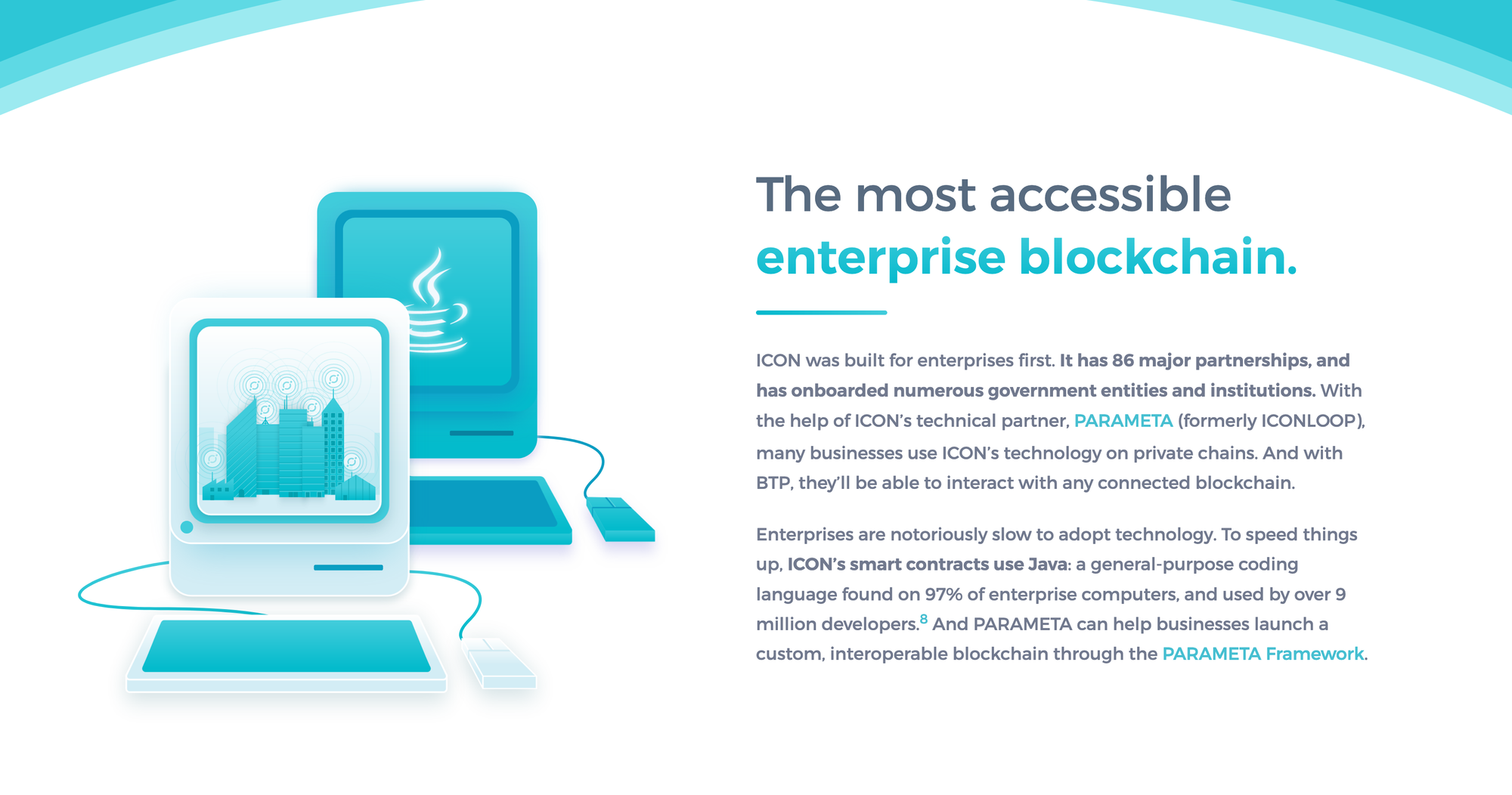
ICON was built for enterprises first. It has 86 major partnerships, and has onboarded numerous government entities and institutions. With the help of ICON's technical partner, PARAMETA (formerly ICONLOOP), many businesses use ICON's technology on private chains. And with BTP, they'll be able to interact with any connected blockchain. Enterprises are notoriously slow to adopt technology. To speed things up, ICON's smart contracts use Java: a general-purpose coding language found on 97% of enterprise computers, and used by over 9 million developers.& And PARAMETA can help businesses launch a custom, interoperable blockchain through the PARAMETA Framework.
The enterprise section on whyicx.com.
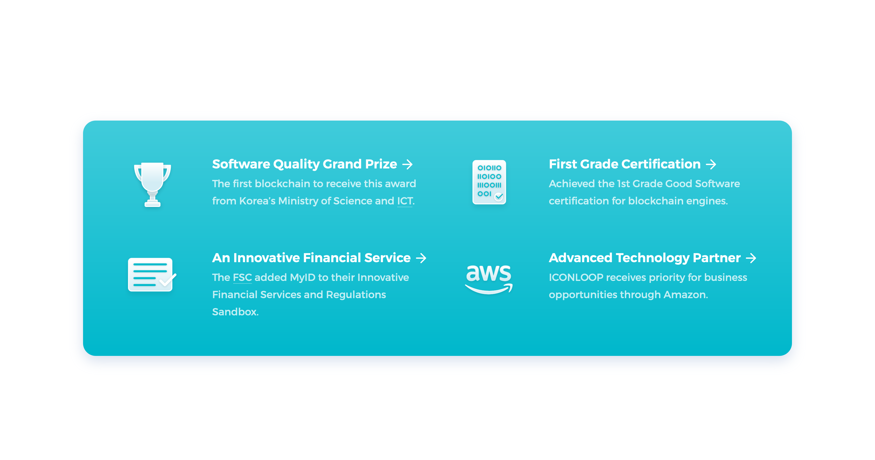
A collection of notable awards and support ICON's enterprise intiatives have received, including the Software Quality Grand Prize from Korea's Ministry of Science and CIT, First Grade Certification from Good Software, and an Amazon Advanced Technology Partner.
The accolades section on whyicx.com.

Most people interact with the public chain, so it was crucial to promote:

  • The app ecosystem (in a way that sells each one)
  • How to build on ICON and get paid for it
  • The native token

Unlike other sites, ICX isn’t mentioned until the end — when people are ready to take the next step.
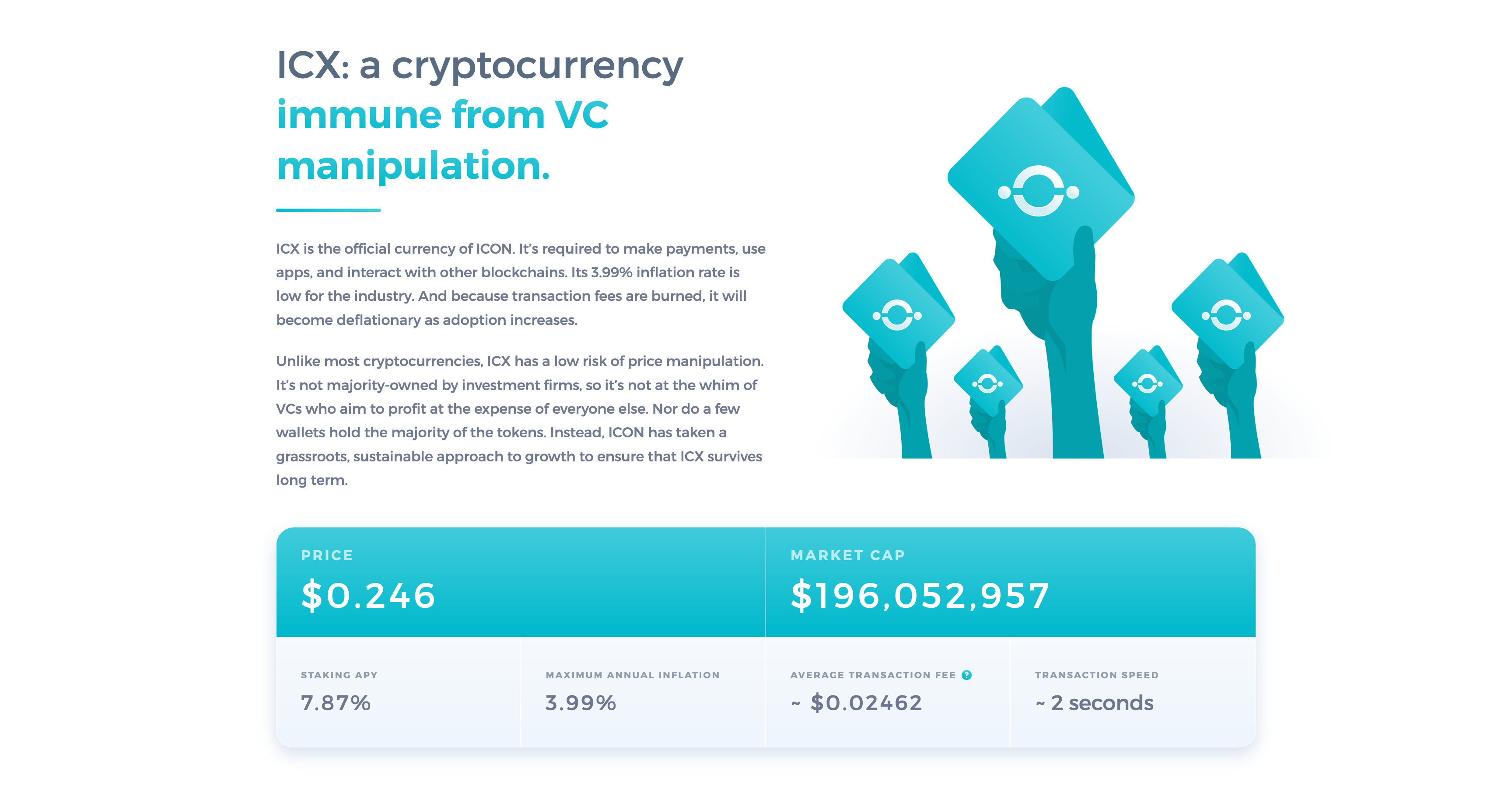
The ICX section on whyicx.com.  ICX: a cryptocurrency immune from VC manipulation.  ICX is the official currency of ICON. It’s required to make payments, use apps, and interact with other blockchains. Its 3.99% inflation rate is low for the industry. And because transaction fees are burned, it will become deflationary as adoption increases.  Unlike most cryptocurrencies, ICX has a low risk of price manipulation. It’s not majority-owned by investment firms, so it’s not at the whim of VCs who aim to profit at the expense of everyone else. Nor do a few wallets hold the majority of the tokens. Instead, ICON has taken a grassroots, sustainable approach to growth to ensure that ICX survives long term.
The ICX section on whyicx.com.

The Get ICX page is designed to help people buy ICX and explore the ICON ecosystem.

Most people don’t have an ICON wallet, and have never used an exchange. Too much friction will stop them in their tracks.

So the content holds their hand, and the widget makes it easy to buy.
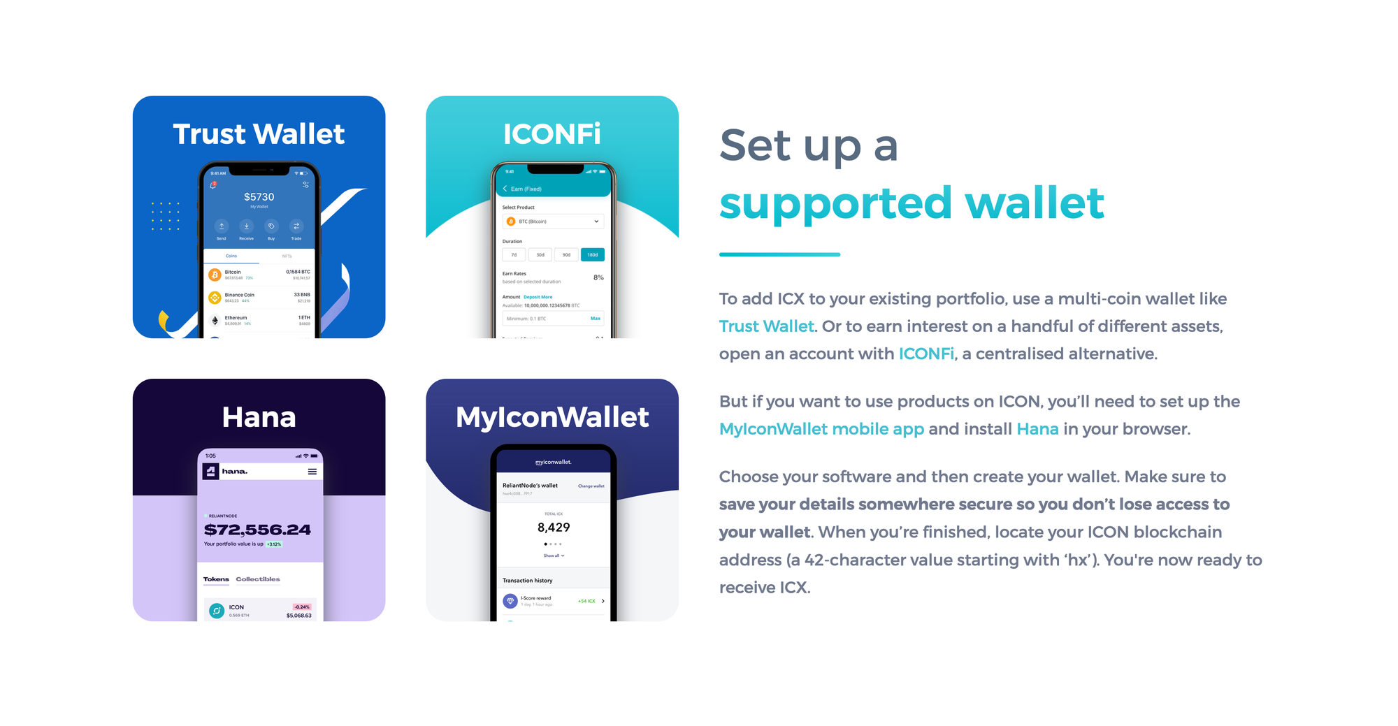
The wallet section on whyicx.com/get-icx.  Set up a supported wallet  To add ICX to your existing portfolio, use a multi-coin wallet like Trust Wallet. Or to earn interest on a handful of different assets, open an account with ICONFi, a centralised alternative.  But if you want to use products on ICON, you’ll need to set up the MyIconWallet mobile app and install Hana in your browser.  Choose your software and then create your wallet. Make sure to save your details somewhere secure so you don’t lose access to your wallet. When you’re finished, locate your ICON blockchain address (a 42-character value starting with ‘hx’). You're now ready to receive ICX.
The wallet section on whyicx.com/get-icx.
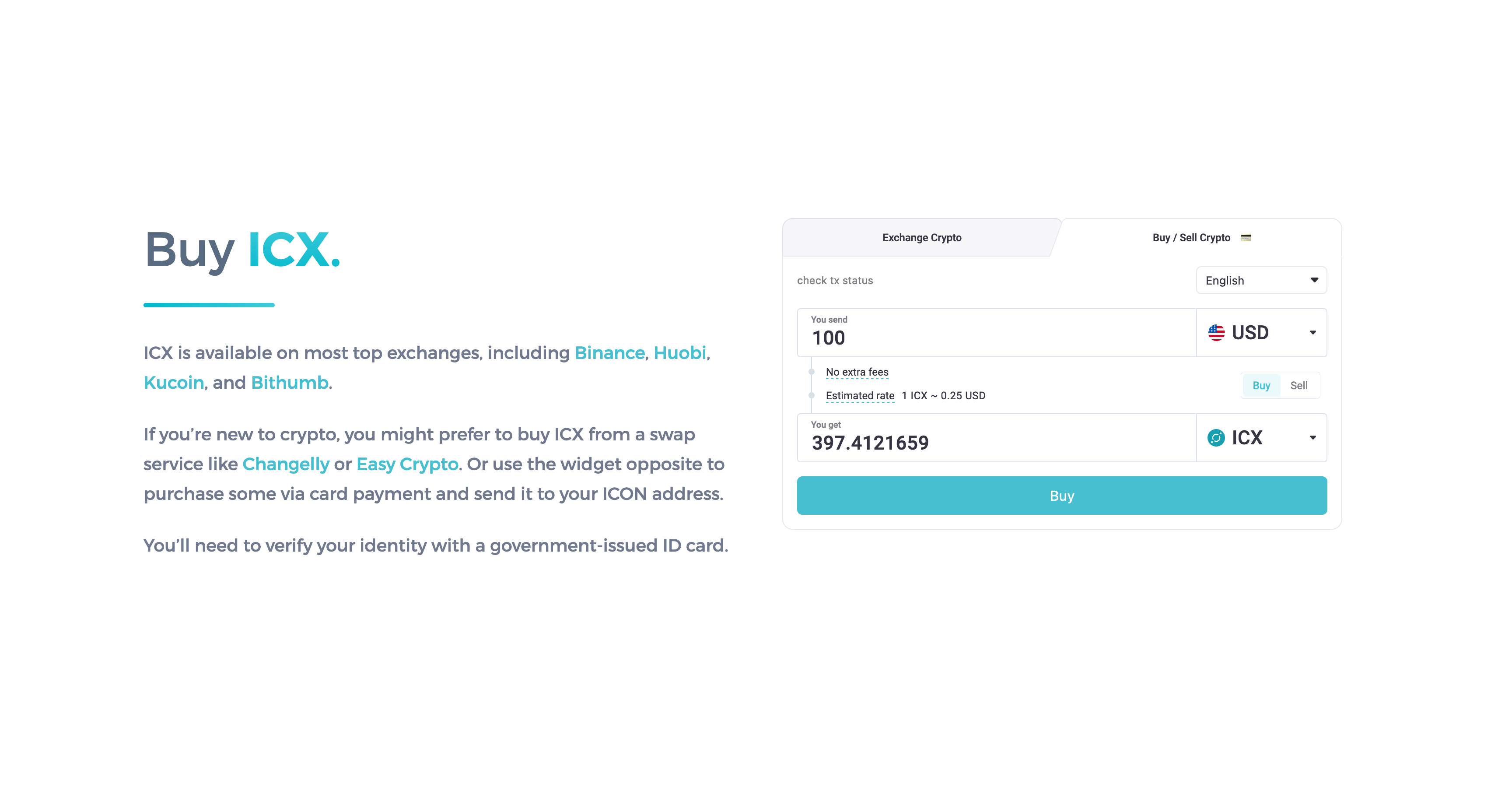
The crypto buy/sell widget on whyicx.com/get-icx.

The blockchain industry is filled with jargon. It’s overwhelming for newcomers and many veteran investors.

To demystify common terms, the glossary includes 300+ entries.

It doubles as an SEO strategy to reach a wider audience through search results.
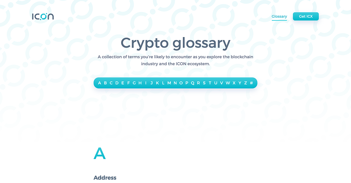
Crypto glossary | Why ICX
A collection of terms you’re likely to encounter as you explore the blockchain industry and the ICON ecosystem.

So now that we have an onboarding funnel in place, what’s next?

What else can we do to make ICON look more appealing?

To build a reputation of quality, we need to improve all the tools people will interact with as they use the ecosystem.


Every touchpoint should feel consistent.

To achieve this, we’ve started redesigning ICON’s core utilities from the ground up.

We’re approaching each with the mindset of “How can we make the best, most usable version of x?”

These projects are still a work in progress, but we can’t wait for you to try them.
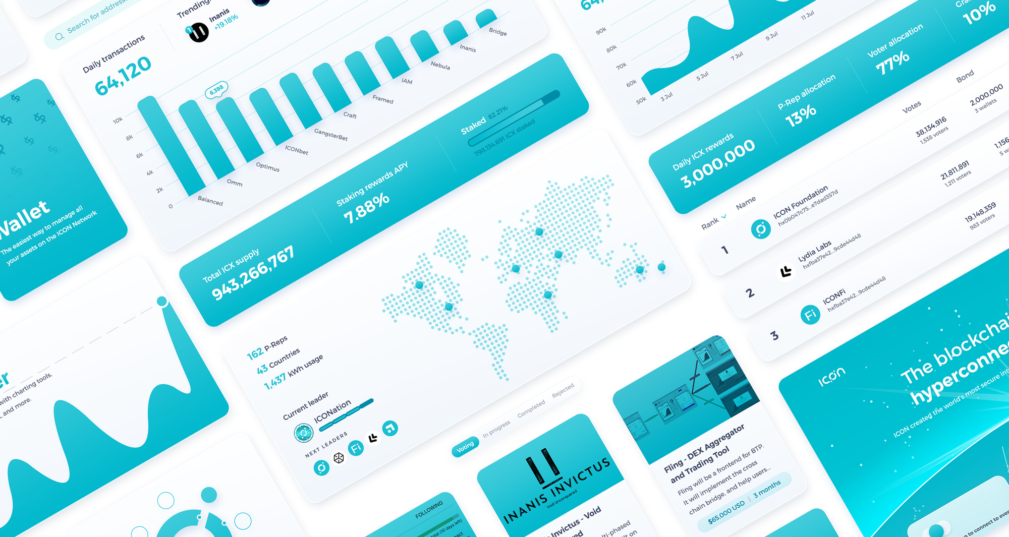
A collection of design elements taken from our early work on ICON’s core utilities.