How to redesign Steam for maximum exploration
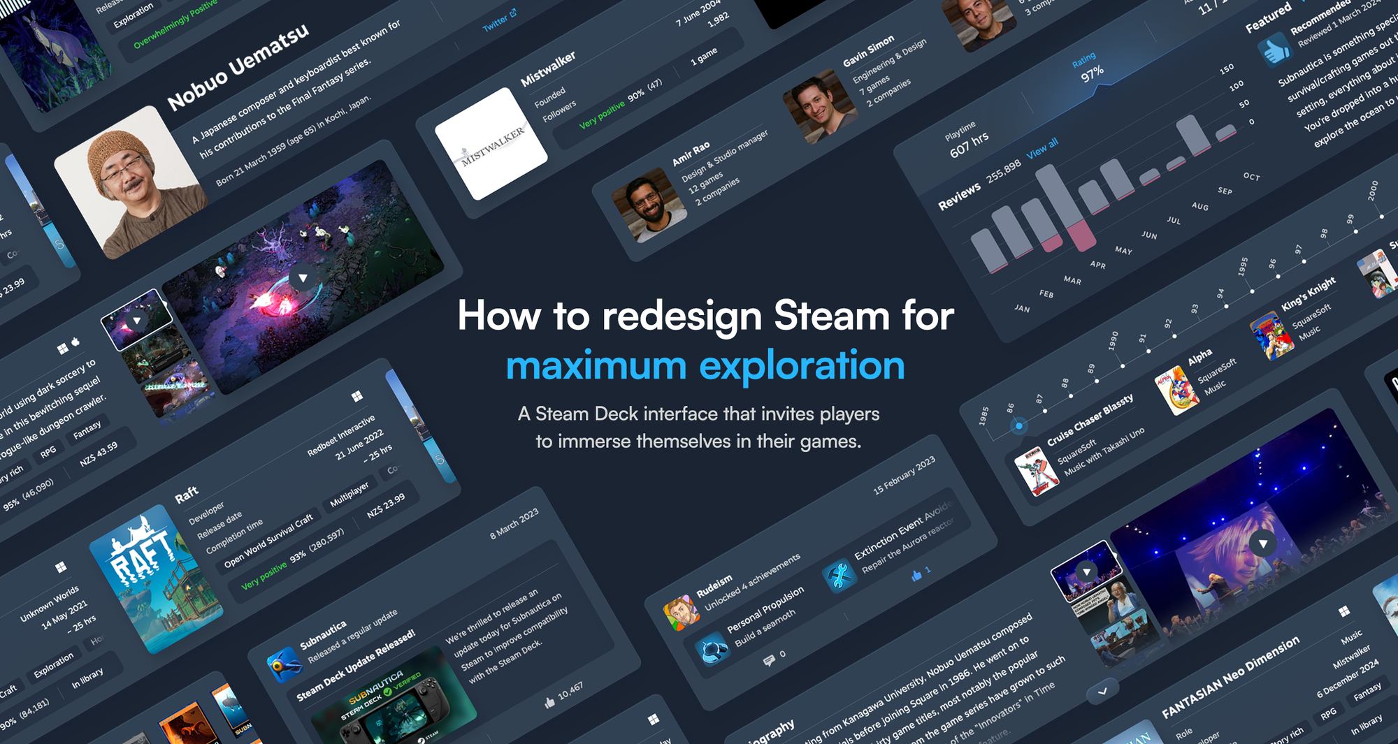
A Steam Deck interface that invites players to immerse themselves in their games.
The hardware business is hard. It’s expensive, time-consuming, and few can do it well. That’s why premium hardware, like Valve’s Steam Deck, deserves recognition. It’s a well-crafted handheld gaming device that demonstrates the team’s devotion to quality – and doubles as a rallying cry for those few driven to do great work.
Of the many consoles we’ve collected over the years, the Steam Deck beats them all.
But to the user, the interface is the product. And the Steam interface lets it down.
It’s great for power users, but it fumbles the fundamentals.
As software designers and PC gamers, we’ve long wished for a better Steam interface – one that realises its true potential. Valve has made incremental improvements over time, but each update left us underwhelmed, disappointed they didn’t push the boundaries to create a best-in-class gaming experience.
So we decided to do it ourselves.
What follows isn’t personal; we just want to make Steam better.
Consider this our love letter.
The design direction
Steam is already the dominant gaming platform, why even bother with a redesign?
Its success has more to do with superior strategy and lacklustre competition than exceptional interface design. But rest on your laurels with a “good enough” approach and eventually, others could catch up.
Steam has democratised the gaming industry, so it’s adored by millions of gamers and developers alike. If a game is good, people will buy it on Steam – even if that means they have to pay more for it.
In fact, Steam users enjoy buying games so much that they face a problem unheard of on any other gaming platform: too many games remain unplayed. Known as the Steam Pile of Shame, most gamers don’t play at least 25% of the games they buy.
Steam’s frequent sales are only partly to blame.
With too many games to choose from and a launcher that doesn’t encourage exploration, it’s easier to fall back on the same overplayed defaults. Don’t make me think.
Our goal was clear: make it easier for people to engage with the games in their library.
The result is a redesign that organises Steam’s extensive features into a modular layout that’s information-dense, easy to read, and more appealing to interact with. Inspired by IMDb and Plex, it introduces new items of interest that invite you to lose yourself in your games.
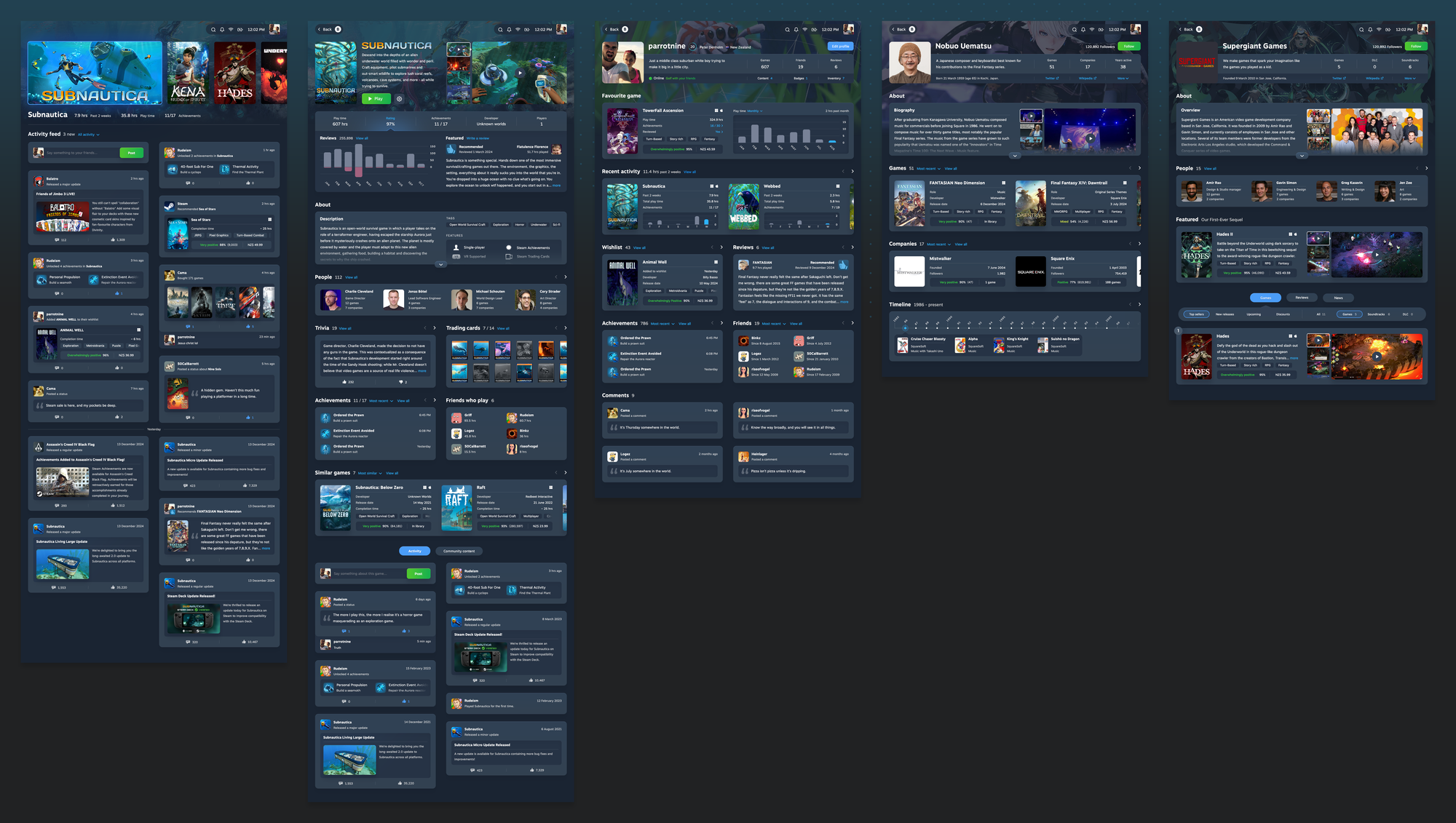
The entire Steam experience demands attention, so we limited the scope to four core pages for the Steam Deck:
And we created a Contributor page for a complete end-to-end experience.
Let’s begin.
Home page
The Steam Home page is a launchpad, built for speed. It exists to get you into a game as fast as possible, with a functional layout that’s common among gaming systems:
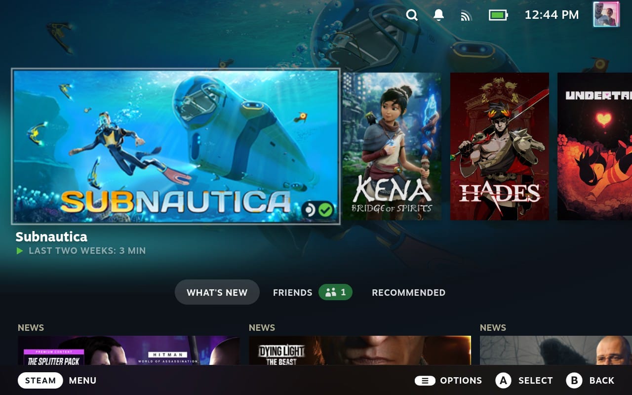
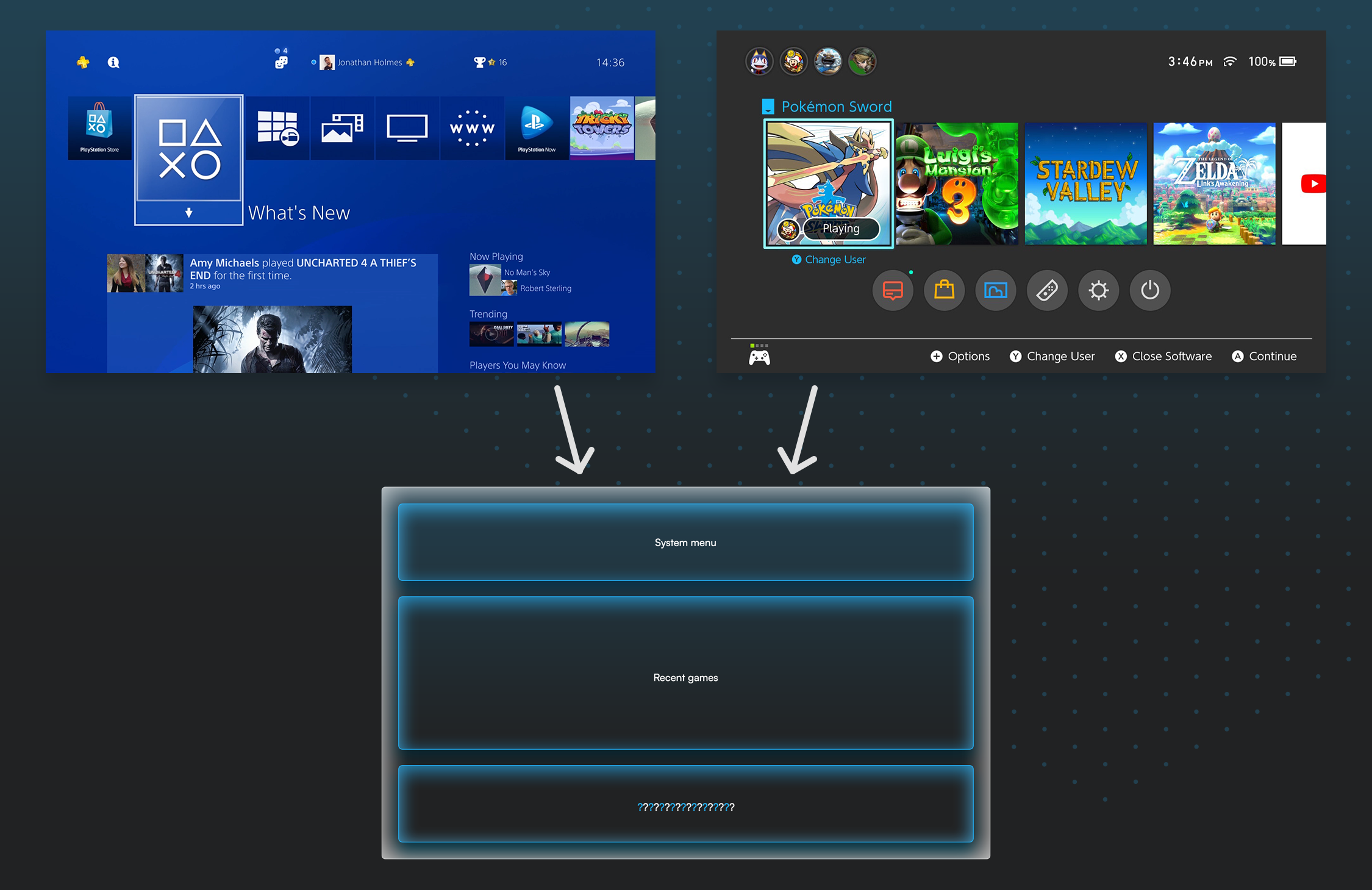
Many console gamers struggle with the switch to PC gaming, so familiarity was key. The Home page was not the place to reinvent the wheel (at least not in this case study), so we pulled more information into focus and updated the design style to reflect the inner pages.
While necessary to discuss first, it’s the least remarkable page.
Recent games
The “Recent games” section demonstrates an understanding most streaming platforms still lack: you’re more likely to resume a game/movie/TV show than start a new one.
But while task-oriented, Steam’s implementation is not engaging. It relies on a single data point to do all the heavy lifting, as though your last two weeks of play time is the only convincer you need to pick it up again.
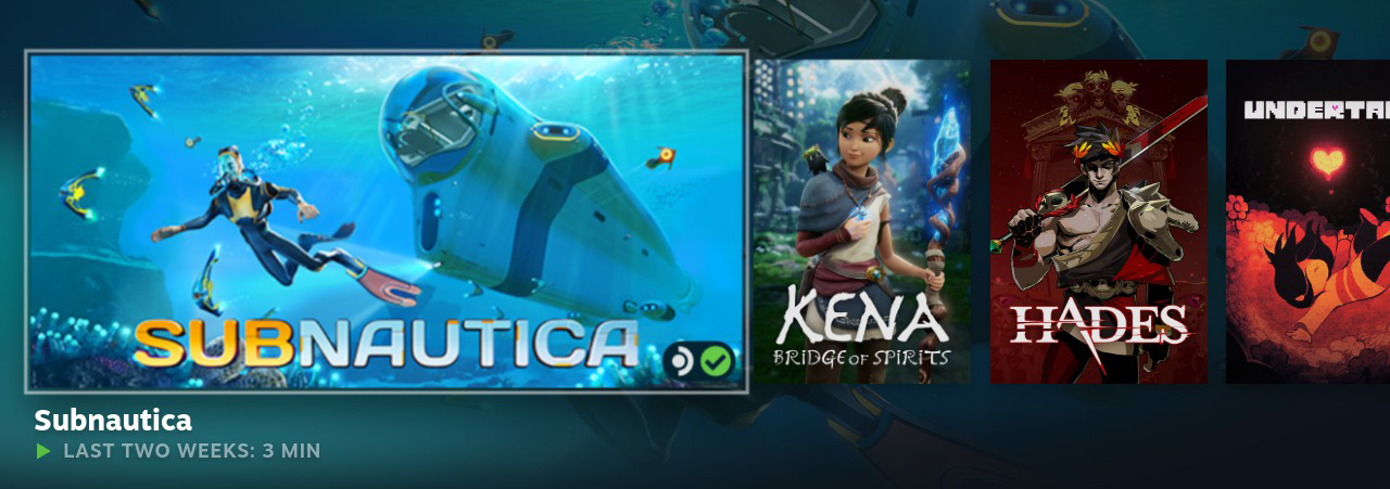
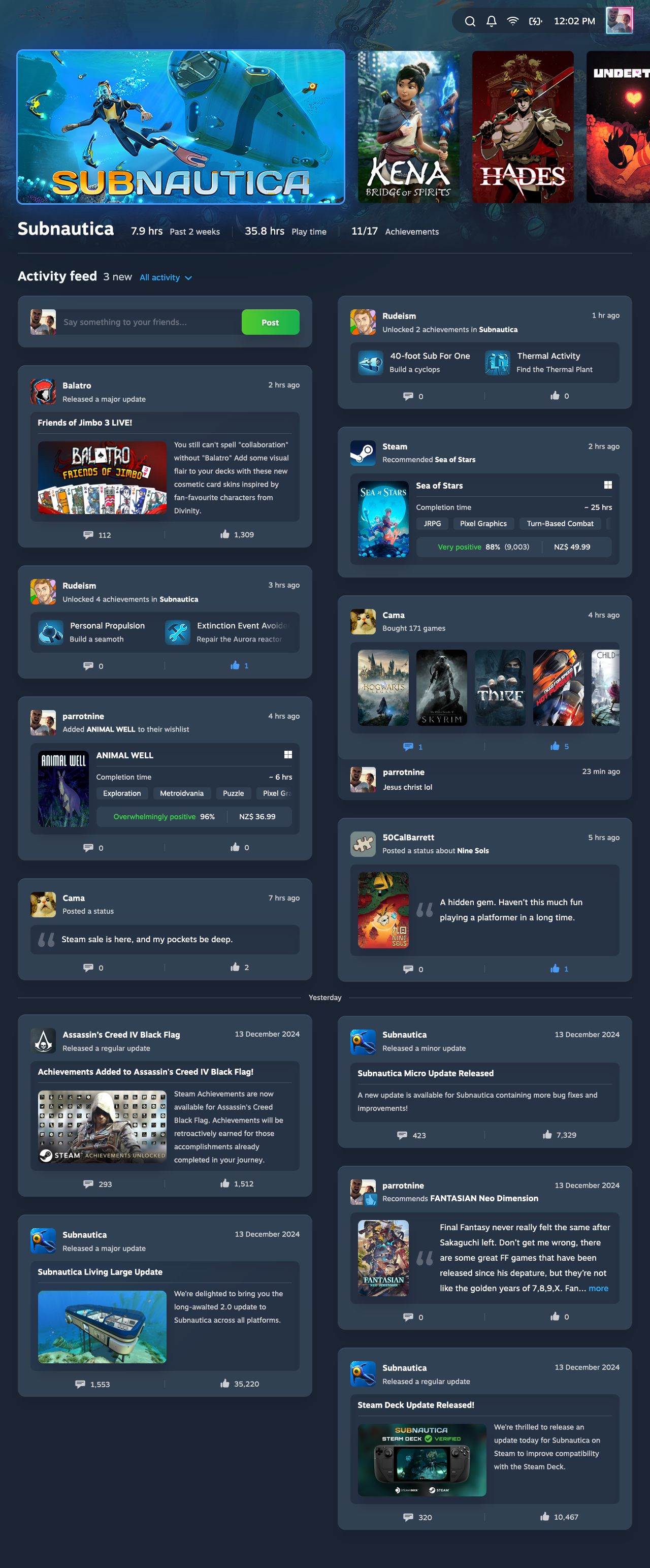
Our updated design adds your total play time and achievements, so you have a clearer view of your activity:

We considered a variety of different layouts to balance the information, and settled on a format that only needs to truncate game titles that get carried away with their declarations of Remastered HD Game of the Year Definitive Edition.
Activity feed
The final section of the Home page varies on each gaming system, but ultimately, it comes down to taste.
Steam uses it to present a variety of content across three tabs: What’s New, Friends, and Recommended. Most elements are oversized and under-detailed, with only one row fully visible on the Steam Deck at a time.
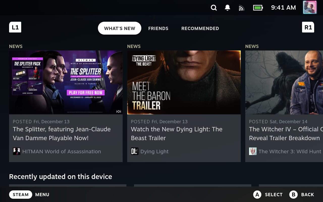
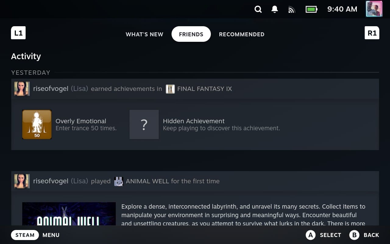
The What’s New and Friends tabs on the Home page.
The Recommended tab includes a feeble prod to play another game in your library. But you can only partially see them on the Steam Deck, so you’re more likely to shop for new games than re-engage with existing ones.
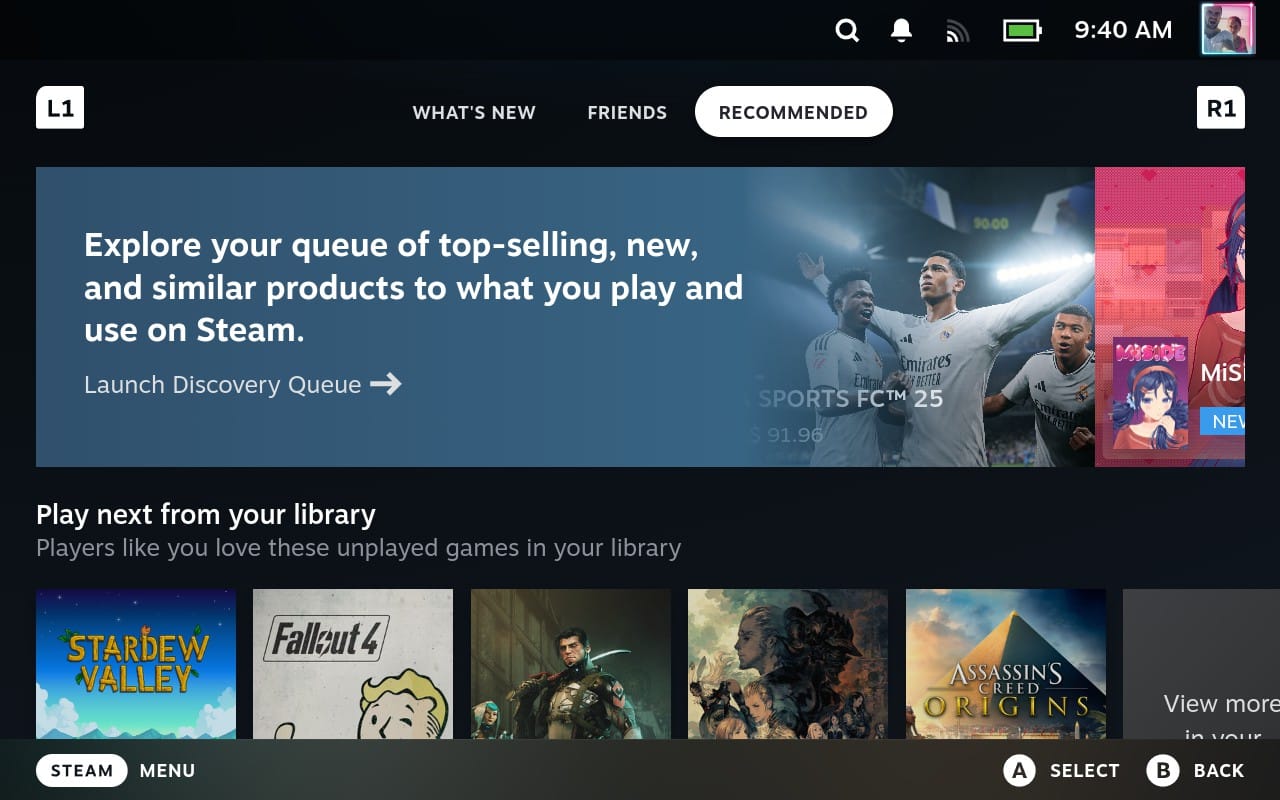
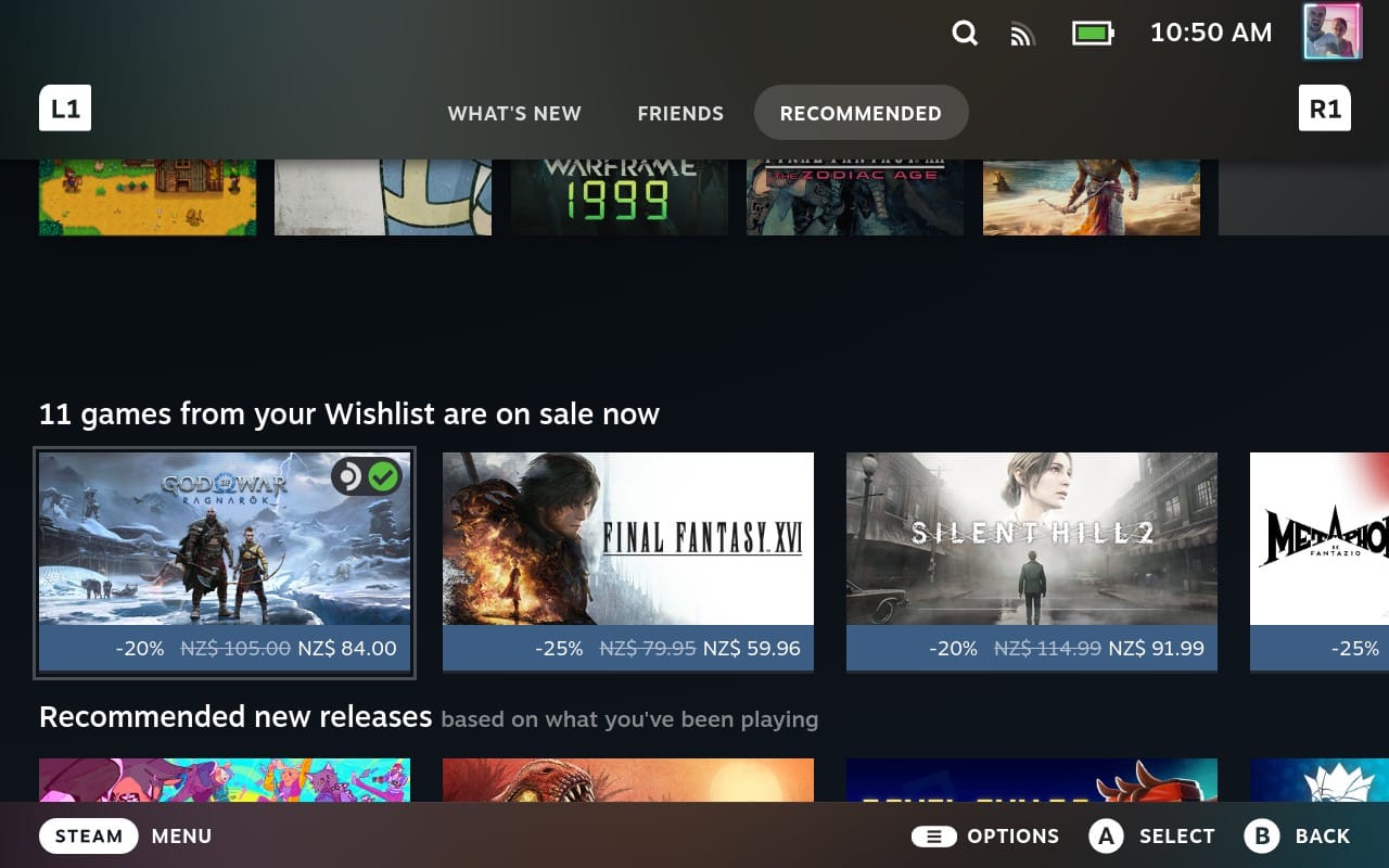
The Recommended tab, where you can never quite view the games Steam suggests to play next.
To improve it, we consolidated the content under a single “Activity feed” section, with a two-column layout you can scroll to your heart’s content.
It includes the number of new updates alongside a filter you can use to reduce the noise. Only want to see activity from your friends? Don’t care about game events or minor updates? Adjust the list to suit your preference.
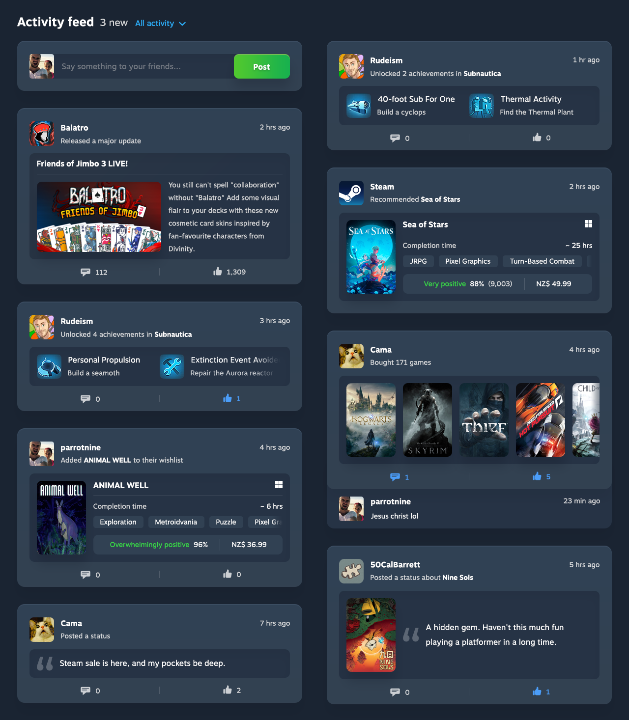
Home page | Before vs. after
Profile page
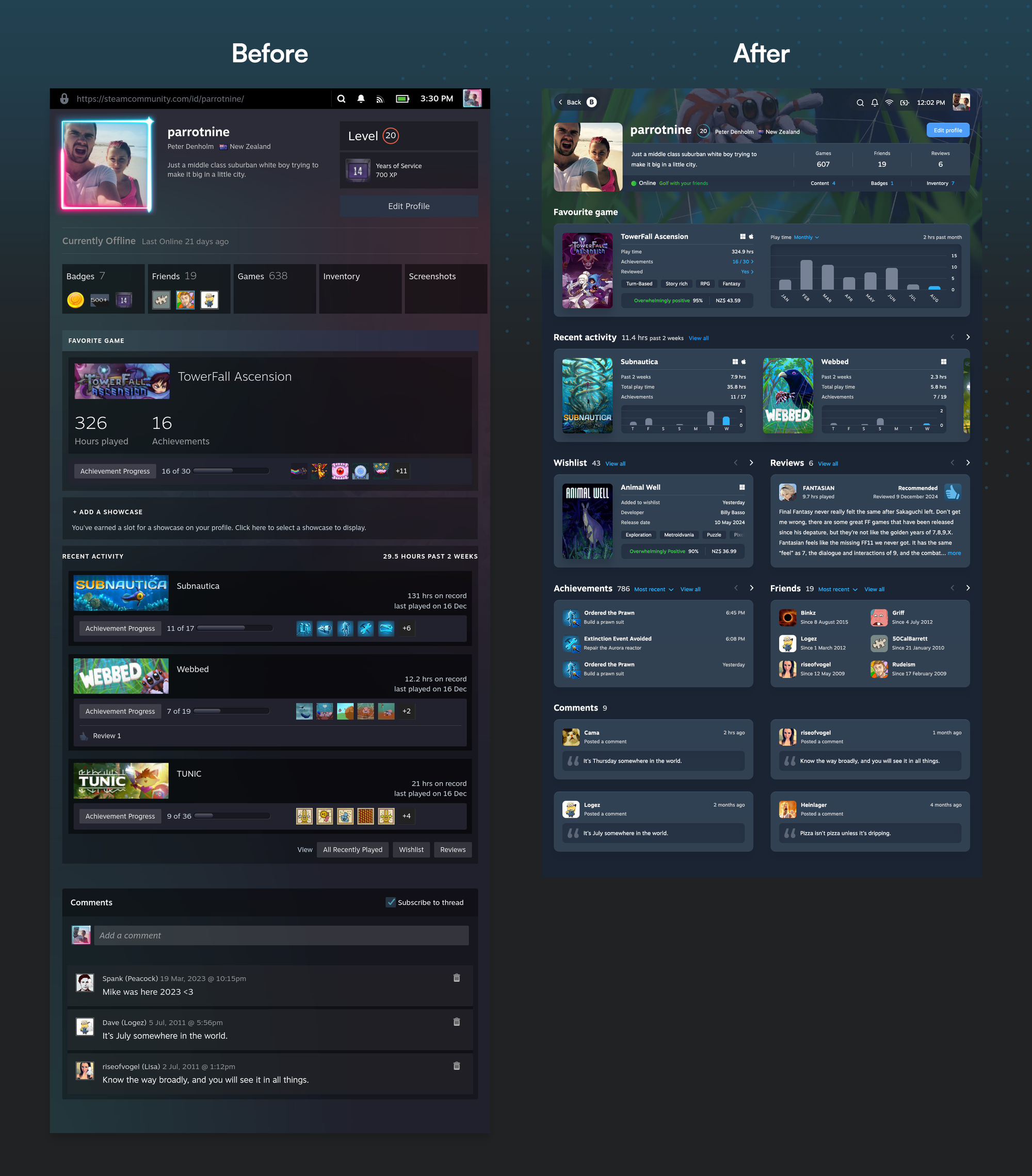
Friends are a major catalyst for game discovery (and rediscovery), so the Profile page should treat everyone like a game curator. See which games have someone hooked, find out what they want to play next, and get a sense of their gaming style so you know if their preferences align with yours.
But the existing Profile page makes no attempt to hook the viewer. The minimal features it contains are presented in a way that feels unconsidered and uninteresting. The page lacks hierarchy due to the poor use of colour, size, and space, like it’s an Excel spreadsheet that exists to show data and nothing more.
Profile overview
Like any profile, the page should begin with an overview of the person that entices you to explore further.
But unless they have a profile description (most don’t), there are few points of interest:
- Location
- Level
- Online status
- Number of friends and groups
- Number of games
These details provide some context, but you’ll have to scroll to learn about their gaming habits and preferences.
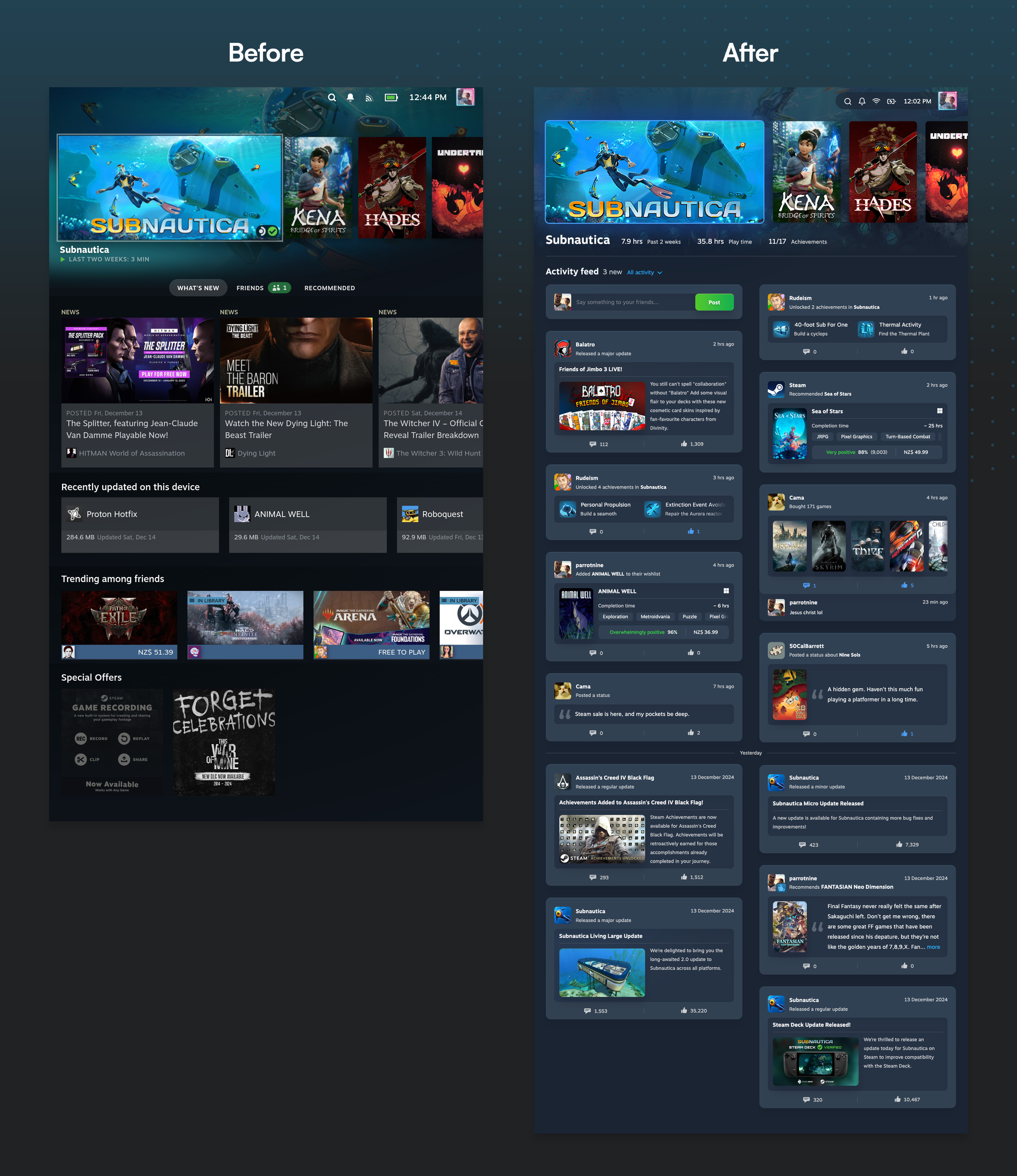
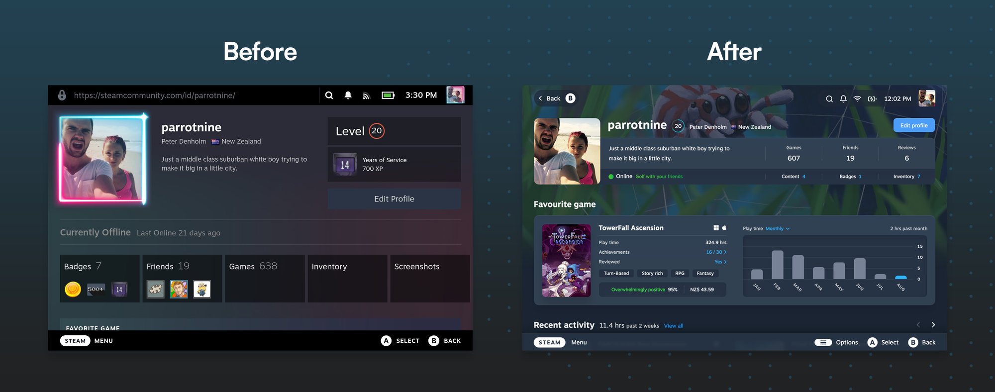
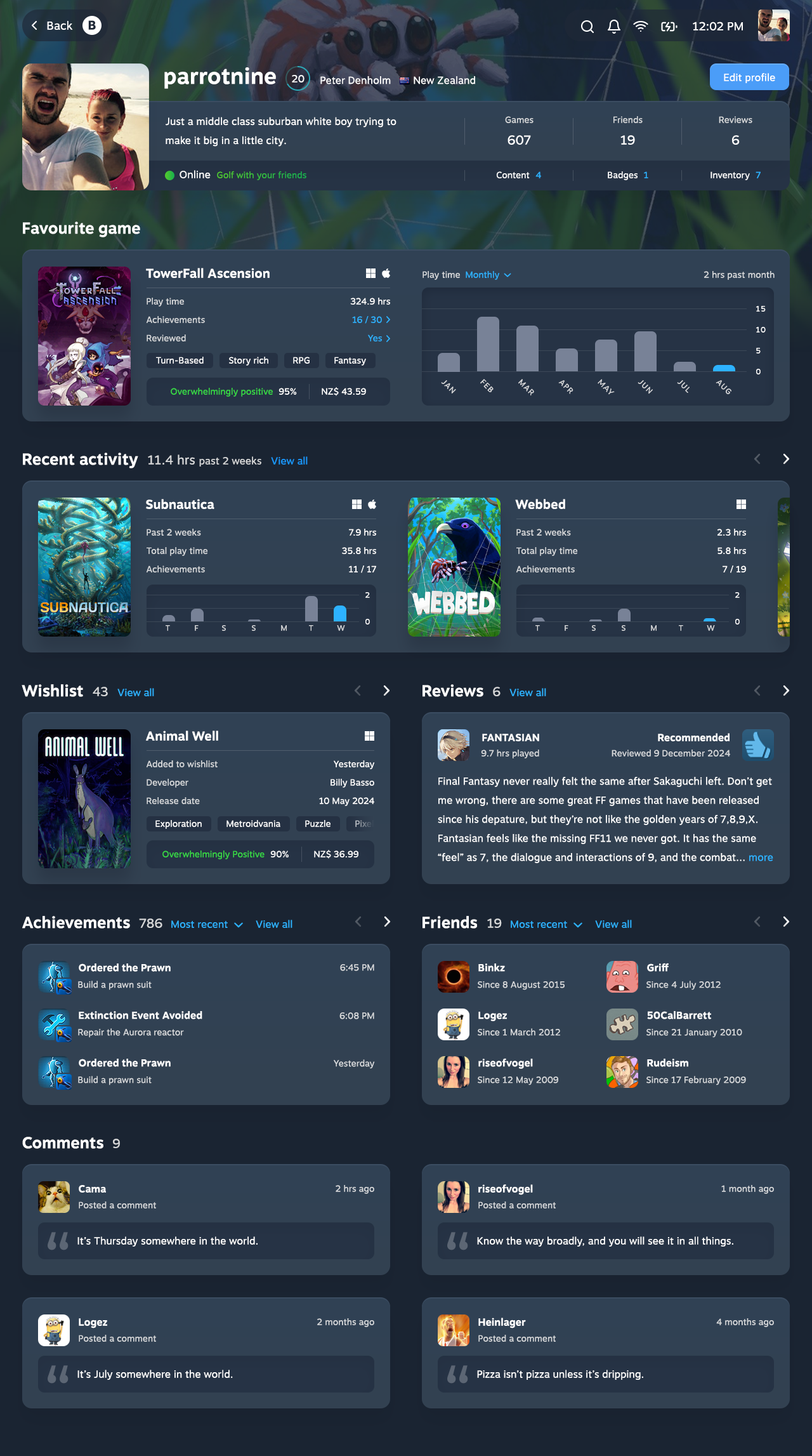
To change that, we designed an Overview section that only uses a fraction of the viewport and leaves space for more interesting content underneath.

The level provides context of a player’s usage, so it appears next to the username within a circle that indicates how close they are to levelling up. The categories now appear to the right of the profile summary, in an orderly format that’s easy to scan.
We kept the profile picture square, but rounded the corners. While circular profiles are the standard, changing them would break the borders and artwork many gamers use to decorate them, and there was nothing to gain by doing so.

Profile pages on the Steam Deck miss an opportunity for customisation that desktop users enjoy: background artwork. To make them more personal, gamers can now decorate their profiles with an image they’ve unlocked or purchased through Steam.
Showcases
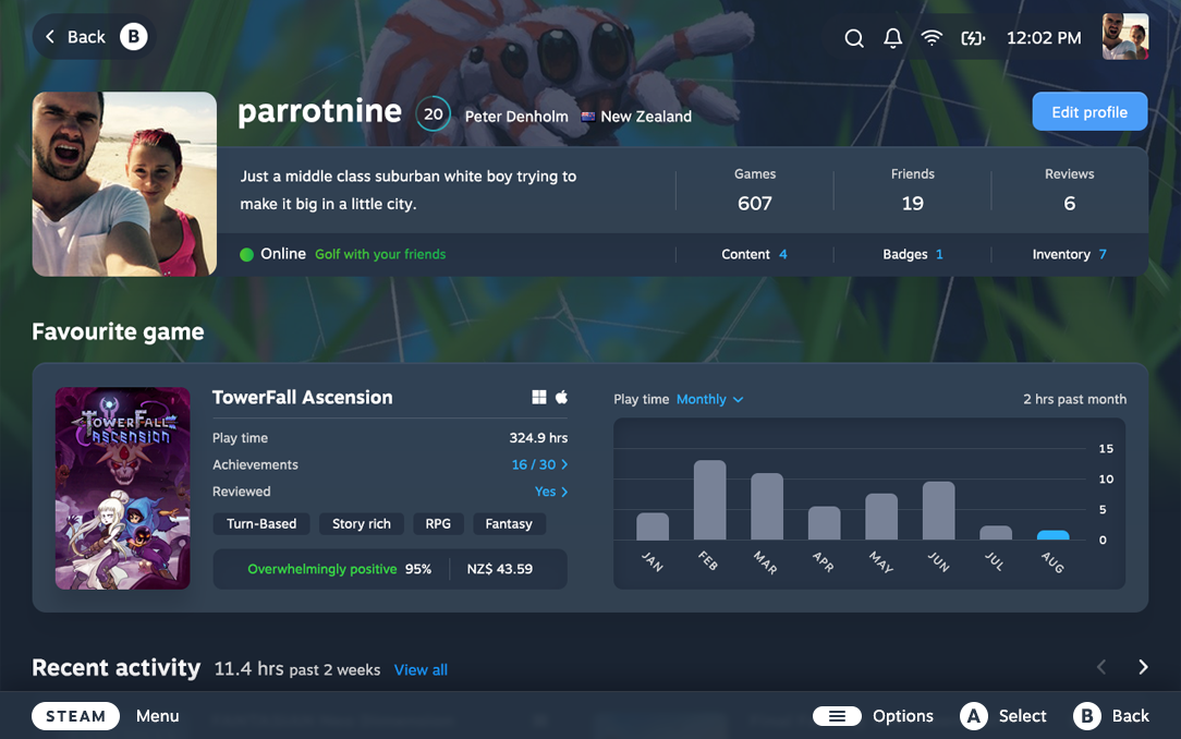
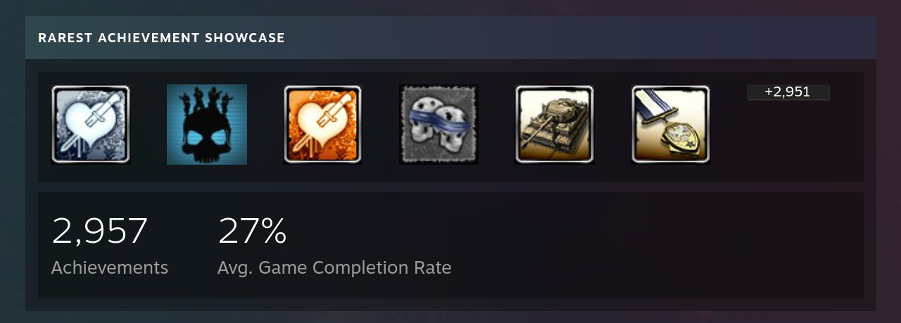
You can learn a lot about a gamer by the items they choose to feature on their profile. Steam showcases reveal which aspect of the gaming experience they care about most ... but they don’t showcase much.
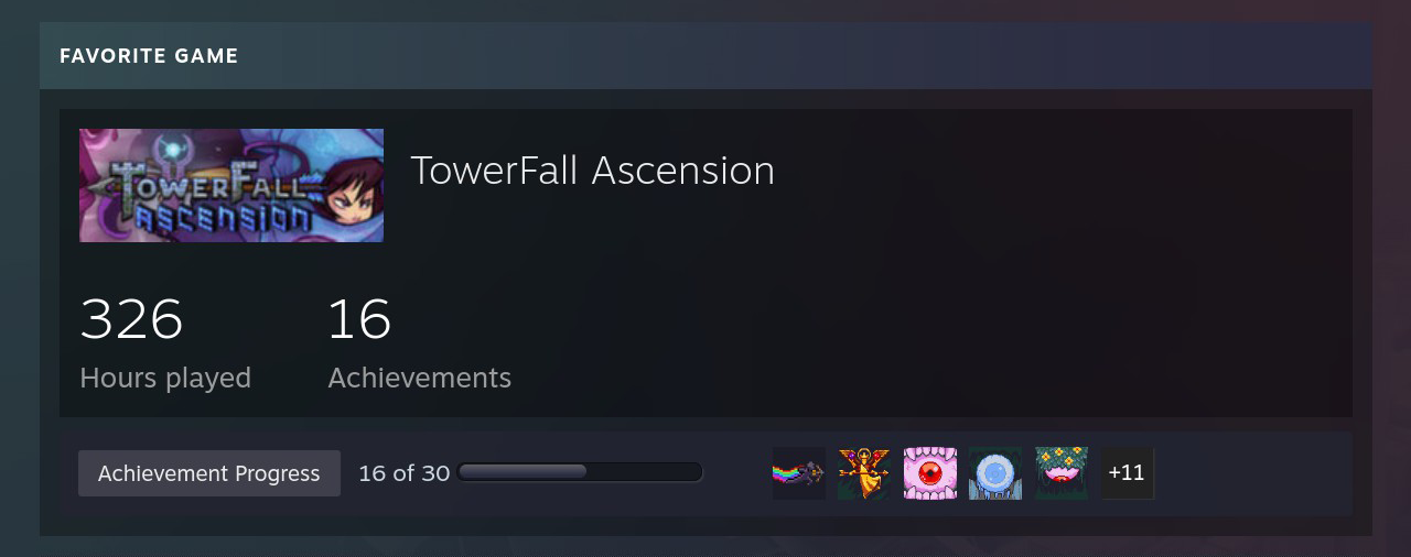
Aside from total hours played, the Favourite Game showcase merely repeats a person’s achievements in a variety of ways. Showcases like Rarest Achievement and Game Collector present more information, but they’re less engaging than they could be.

So we created showcases worth showcasing.
Thanks to efficient use of space and thoughtful information design, the new showcases reveal more about their subject in a way that’s visually appealing and easy to read at a glance.


Even better: it fits perfectly into the space freed up under the Overview section, allowing a full showcase to pique your interest before you even lift a thumb.
Recent activity
A person’s recent play time provides a window into their gaming habits. Steam opts for a two-week time frame, the Goldilocks period between one week and one month that captures a balanced view of someone’s usage. But the game breakdown underneath only shows the total play time for each game, so you have no idea which game they spent the most time with.
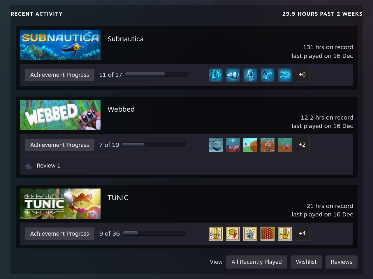
The updated section uses a two-column format you can scroll horizontally with LB/RB. It provides more context about their recent usage, including their total and past two weeks of play time, and a chart that lets you see whether the game hooked them once or had them coming back for more.

Wishlist and reviews
In the bottom right corner of Steam’s Recent Activity section, there’s an option to view a gamer’s wishlist and reviews. These features deserve sections of their own, but instead, they’re treated like an afterthought. The buttons are so small that unless you’re looking out for them, you won’t notice them at all.

The wishlist reveals what someone wants to play in the future, while the reviews highlight what they liked in the past. To bring more of what matters into focus, each now has its own dedicated section.

The wishlist displays games they’d like to collect, presented in a way that draws the interest of the viewer and reminds the player browsing their own profile why they added it in the first place.
Most people don’t make a habit of writing reviews, but those who do have strong feelings about a game. The opinions of others shape our buying decisions, so you can now read them all with minimal effort.
Achievements, friends, and comments
Achievements provide more context about someone’s game activity, yet the Profile page lacks a standalone Achievements section. We added one in the new design, with the ability to sort by rarest or most recent.
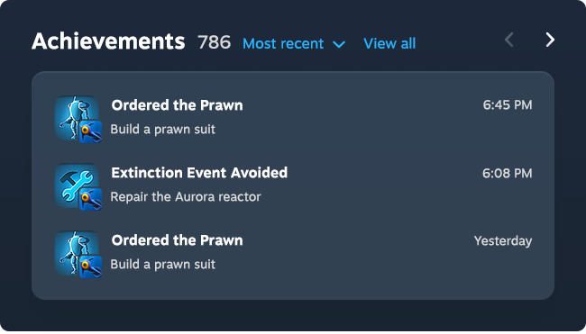
To view someone’s friends on Steam, you have to dig deeper into the categories at the top of the page. It’s fun to be voyeuristic, so we added a Friends section that includes their name, profile picture, and when they became friends.

If someone’s profile has a lot of commentary, you’ll need to scroll through numerous pages to view it all.
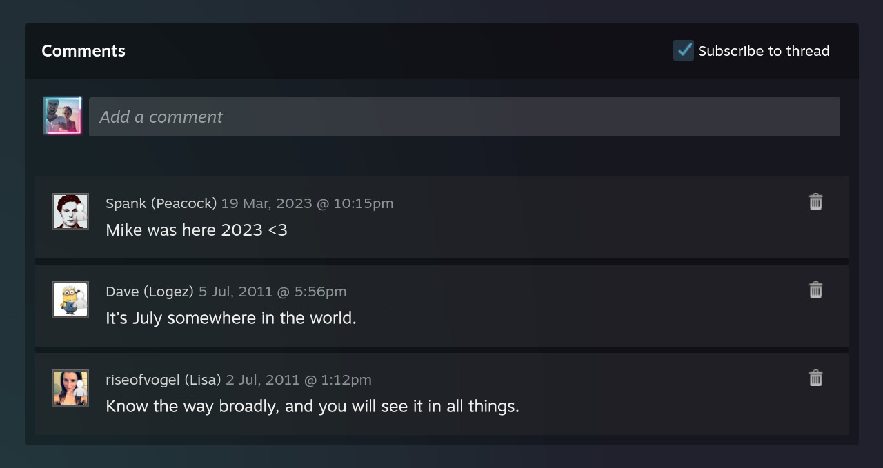
As it’s the last section on the page, we updated the comment design to use a two-column layout that makes better use of the space, and supports infinite scroll to reduce the effort required to browse.
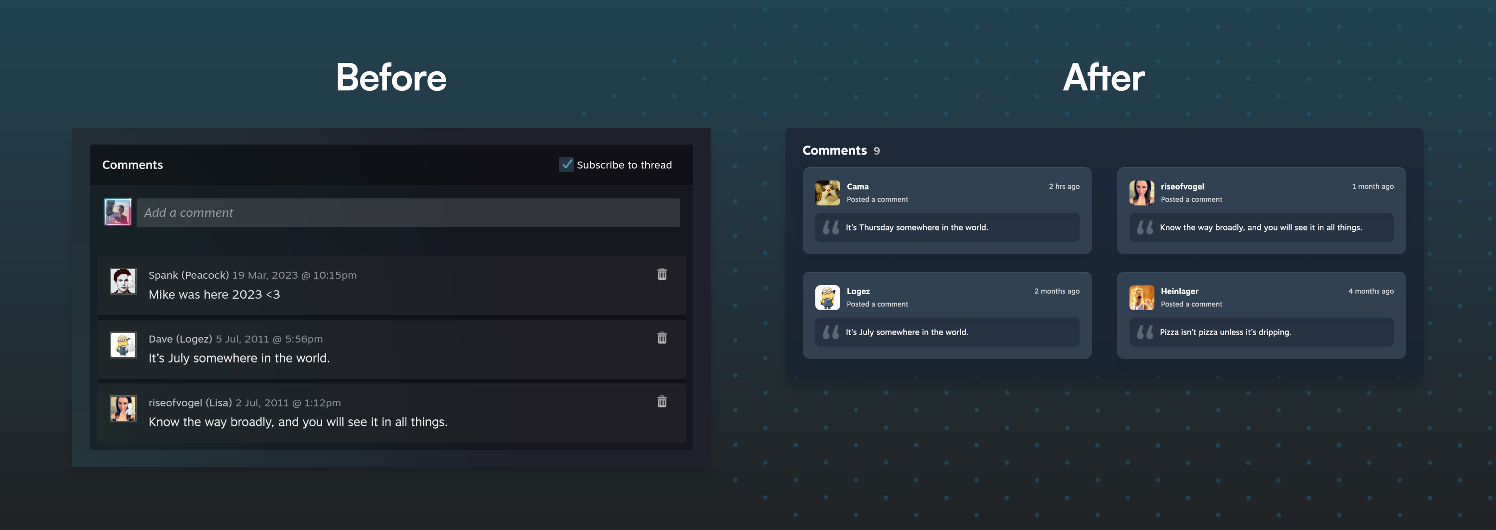
Profile page | Before vs. after
Game page
Steam assumes the sales process ends after payment, that players will immediately download and play a game through to completion. But once a game enters your library, it faces a perpetual challenge: compete for play time against every other game you own.
The Game page should make it easy to re-engage with a game and remind you why you bought it in the first place. Instead, it relies on the Play button and a single piece of artwork to do all the heavy lifting – forcing you to judge a game by its cover. It lacks the points of intrigue needed to pull you in weeks, months, or years later.
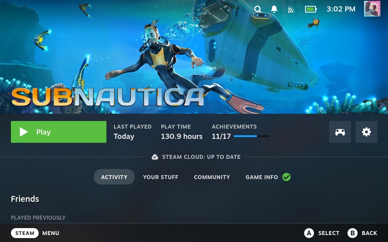
Without additional context, you’re left with only a vague idea of what a game is about. Often, the one thing you can remember is that other people liked it, but the page doesn’t even show the game’s rating. For that, you have to visit the store.
The only two elements that might jog your memory – the game synopsis and tags – are treated as afterthoughts, buried under Game Info (the very last tab). The problem with hidden content? It usually stays hidden.
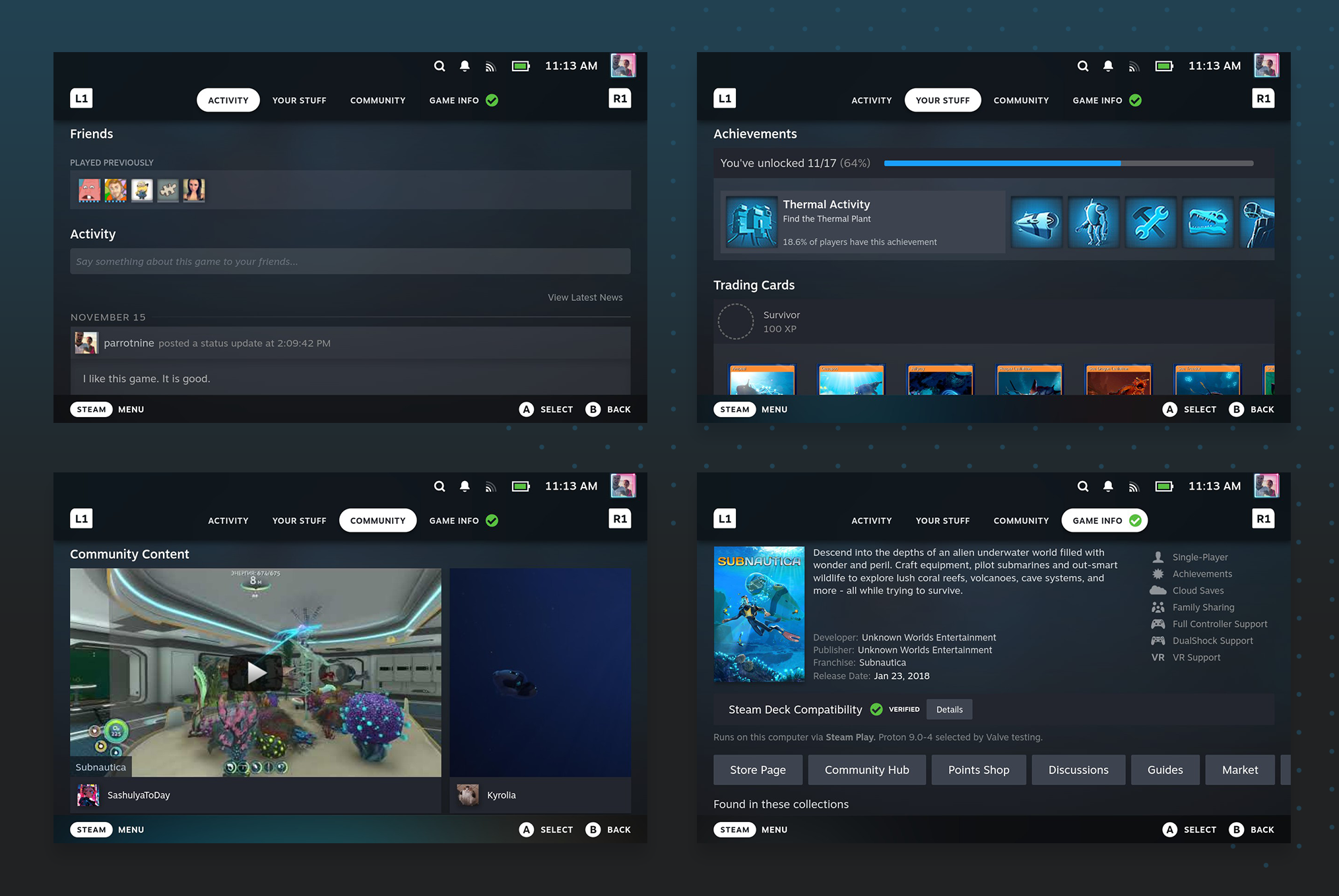
The Game page encourages such indifference that you’re likely to find yourself back in your library, scrolling once again – the game you just viewed already lost to memory.
Steam exemplifies the jam experiment to perfection. With too many games to play and nothing to sell you on them post-purchase, you waste precious time browsing and never settle on one. It’s hard to immerse yourself in a game when you’re haunted by the nagging feeling that another game might be more worthy of your time.
So we designed a Game page that converts owners into players – and fans – every time they visit. One that reassures you a game is worth your time, and hypes you up enough to not just play the game, but get lost in it, FOMO forgotten.
How? Showcase a variety of details that make people love the game even more. Fuel their fandom.
And transform the game page from a solitary island into a gateway of discovery, inviting you to explore the many games and creators within the industry.
Game layout and overview
We had two options for the Game page design: evolution or revolution. For an audience the size of Steam’s, incremental evolution is the sensible choice because people are resistant to change.
Here’s an early concept of how that might look:
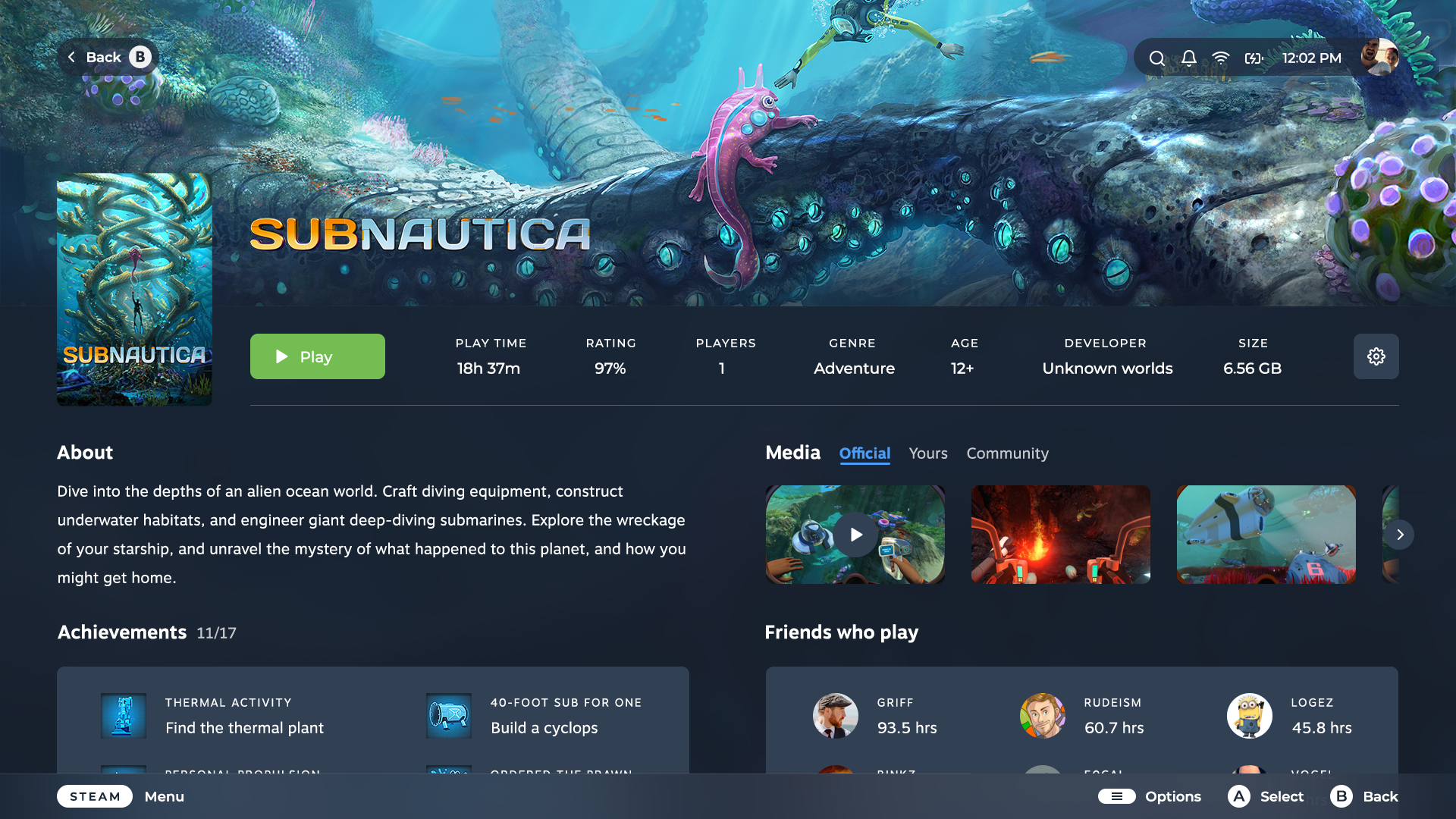
But as engagement was the goal, the existing design fell short. You can only infer so much about a game when artwork is the centrepiece.
A picture is worth 1,000 words; a video is worth 1,000 pictures. While our evolutionary-style design included videos and game-specific media (notably absent in Steam), the layout kept them from being the core focus.
But trailers and gameplay videos provide the most context. Watch a video on auto-play for 10 seconds and you’ll have a good sense of what a game is about. Valve put videos front and centre on the Steam store for a reason; if they managed to convert you once, they can do it again.
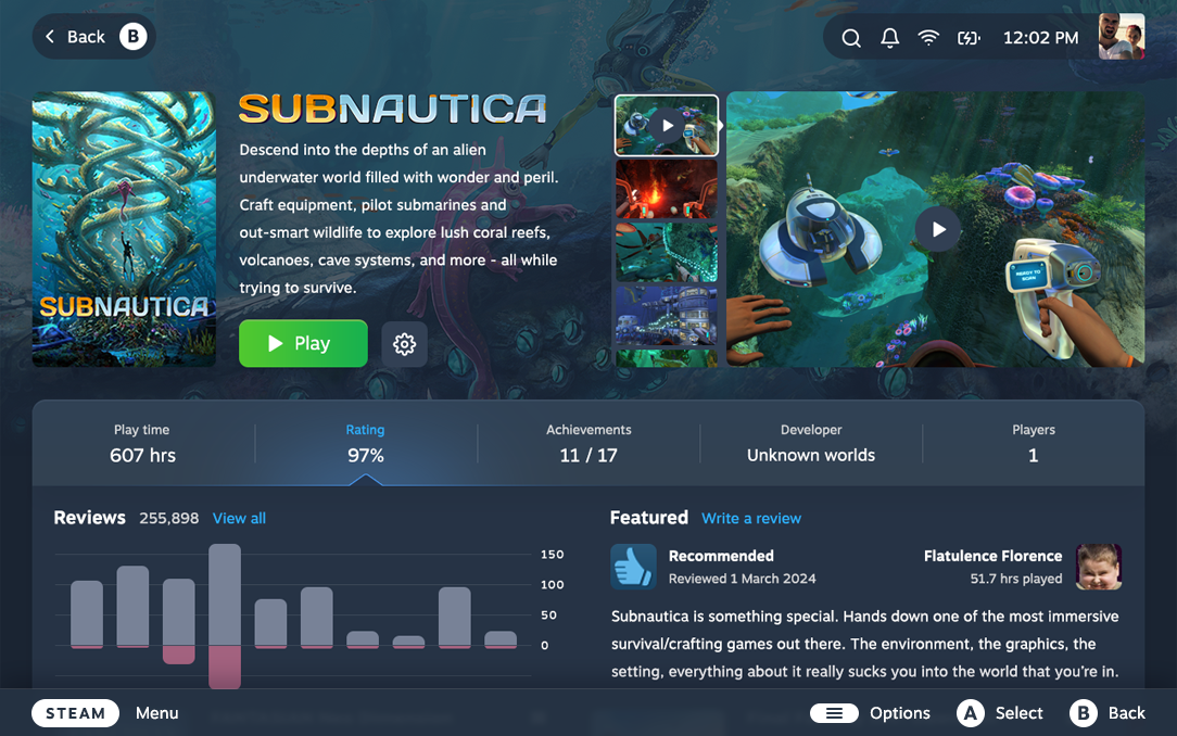
With that in mind, we opted for a revolutionary approach and combined the best of the Game and Store pages. The result is an interface that’s information-dense to maximise the value of every viewport, yet presented in a format that’s organised and easy to read.
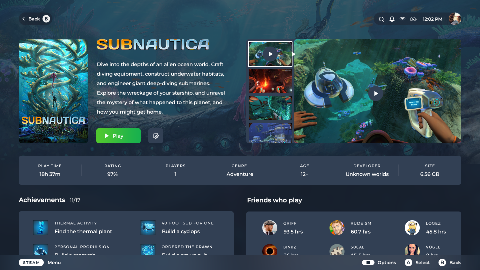
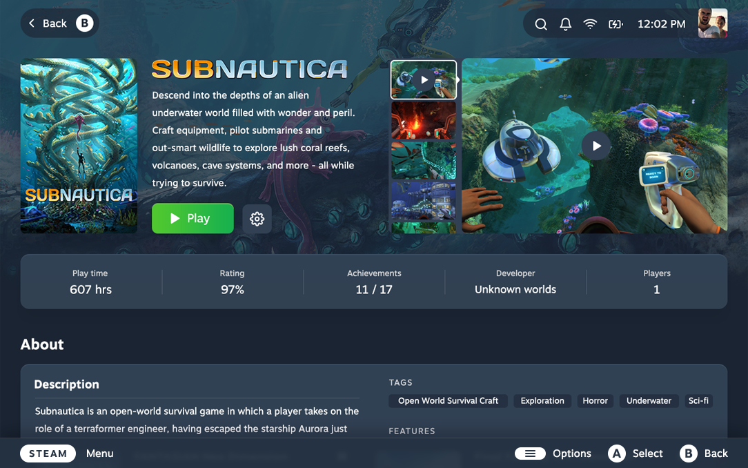
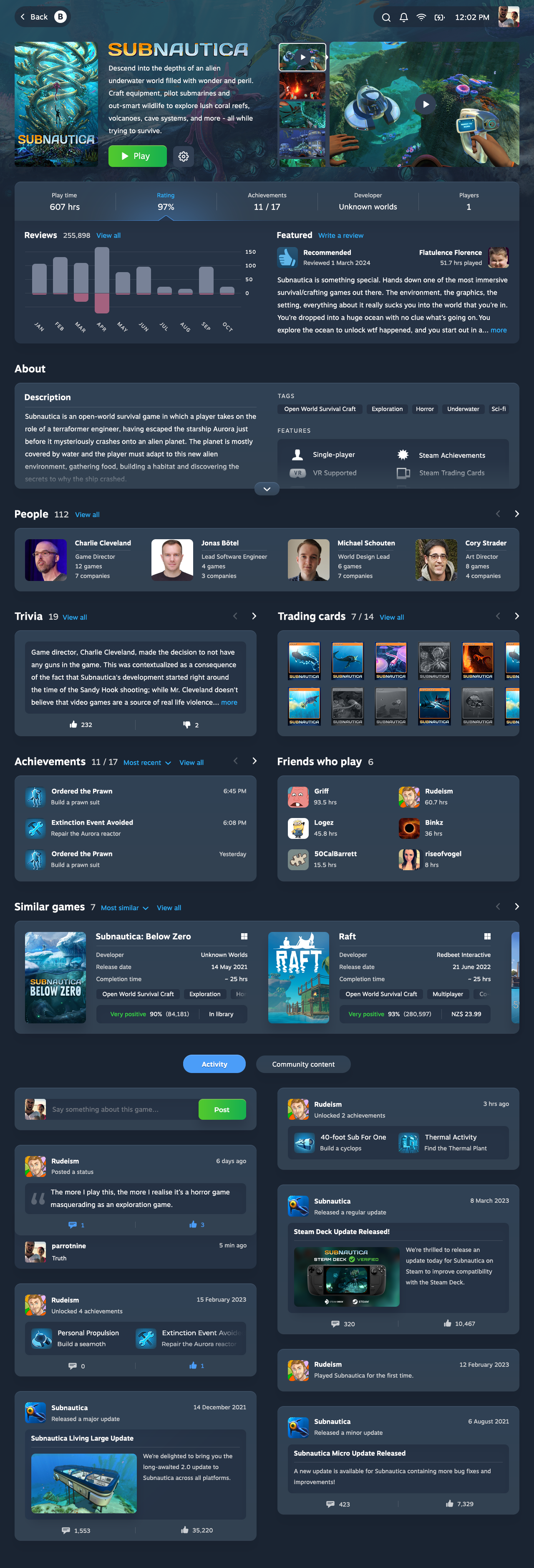
The artwork now recedes into the background so the game summary and media can take their rightful place centre stage.

Beneath the play button is an expandable metadata section, designed to spark your curiosity.
Steam highlights when you last played, your total play time, and achievements. The new design expands on this with usage over time, first play date, total play sessions, and the average completion time (sourced from howlongtobeat.com).
Sometimes, a game can feel never-ending. While unplayed games are a problem, even fewer players finish the games they start. Knowing you’re close to the end could be the motivation you need to jump back in and finish it off.
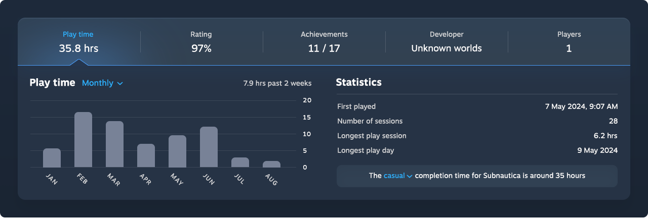
And that’s just one of five highlights.
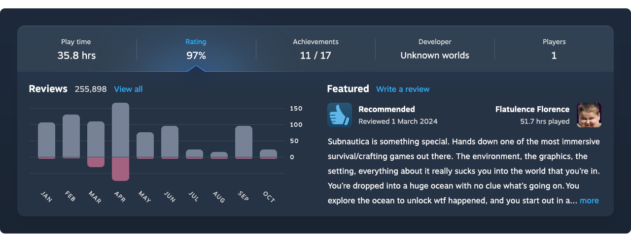
Player opinions are critical for purchase decisions, so the game’s rating was an essential addition. Expanded, it reveals a featured review (or your own) and a chart to show how the ratings have changed over time.
Did the game improve after a polarising launch, like No Man’s Sky? Or are players salty about a recent update like Helldivers 2? Often, a new trend in the data is all it takes to pique your curiosity.
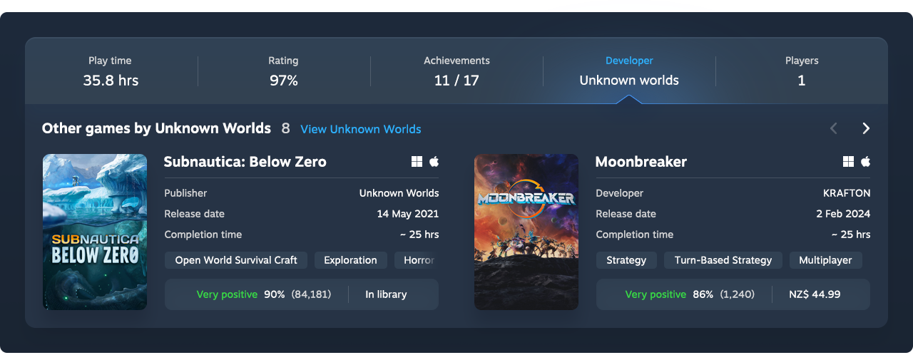
The expanded Developer metadata features other games the company has created and the publishers involved, so it’s easy to find and explore their catalogue.
Additional game content
The content below the Overview section now includes more insight about the game for those who want to dive deeper. Existing information is easier to read, complemented by new sections designed to awaken the fan inside us all.
It starts with a full About section to help you fill any gaps left unaddressed from the media above. This includes a list of tags, which tell you so much more about the game than its genre ever could.

Curious what other games an artist or voice actor has worked on? Inspired by IMDb and Plex, we added a People section that celebrates the individuals behind the game and provides a direct path to explore further (more about this with the Contributor page).

Enjoy game trivia? We created a section for that too, powered by data from the open-source site MobyGames. It appears alongside your achievements, friends who play, and trading cards, each contained in its own section that’s easy to read and navigate with a controller. In sections with horizontal arrows, you can press LB/RB to cycle through the available content.
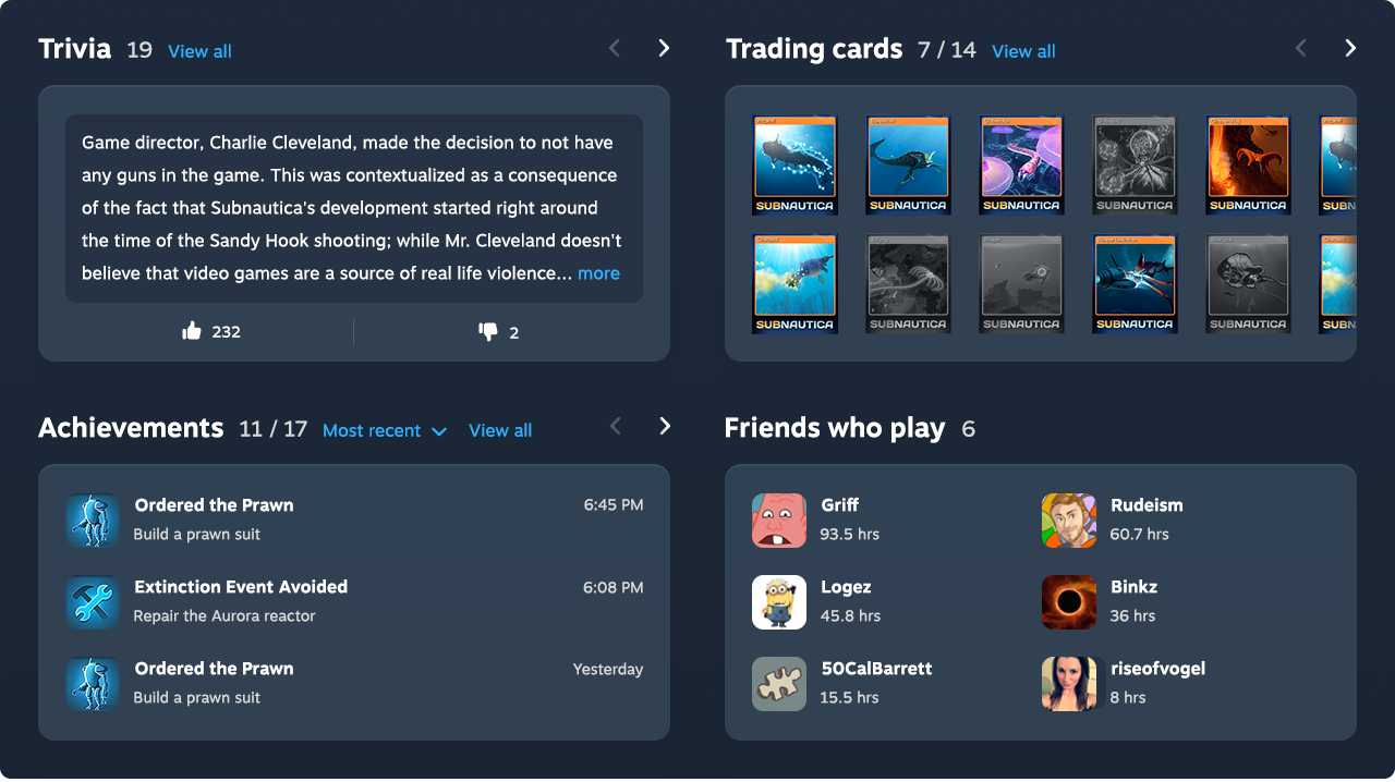
The “Similar games” section is another new addition that seemed like a no-brainer. Already present on the Steam store and in app stores like Apple’s, it’s one of the most effective ways to discover software in the same category.

Essentially an advertisement for other games, it’s a rare opportunity to satisfy business goals and enhance the gamer experience. Similar games add context to the current game, and offer suggestions you’re more likely to enjoy than those Steam recommends elsewhere.
The completion time gives you a sense of the commitment required before you click through, and the rating includes the number of reviewers so you know how many people share that perspective.
Finally, the bottom of the page features the game activity and community content. Game activity includes yours, your friends’, and the game developer’s, with an infinite scroll to keep it low-commitment.

Let’s be clear: the new Game page design is opinionated. We’ve set sensible defaults, but the 132+ million monthly Steam users can’t possibly care about the same things. People are more invested in things they’ve customised themselves (known as the IKEA effect), so the modular layout lets you design the gaming experience around you.
Bring the items you want into focus, remove those you don’t. Make Steam your own.
A feature on our wishlist
We’ve tried to keep the redesign realistic, based on information we know we can draw from. But if we had the resources to add our own twist, we’d also add a game recap feature.
How many times have you restarted a game and played for a while ... but never quite finished? Or resumed play only to find yourself in an intense situation with no idea what’s going on? A game recap would catch you up on your previous activity, while a timeline (independent of achievements) would track your progress through the story so you know there’s a reason to keep playing.
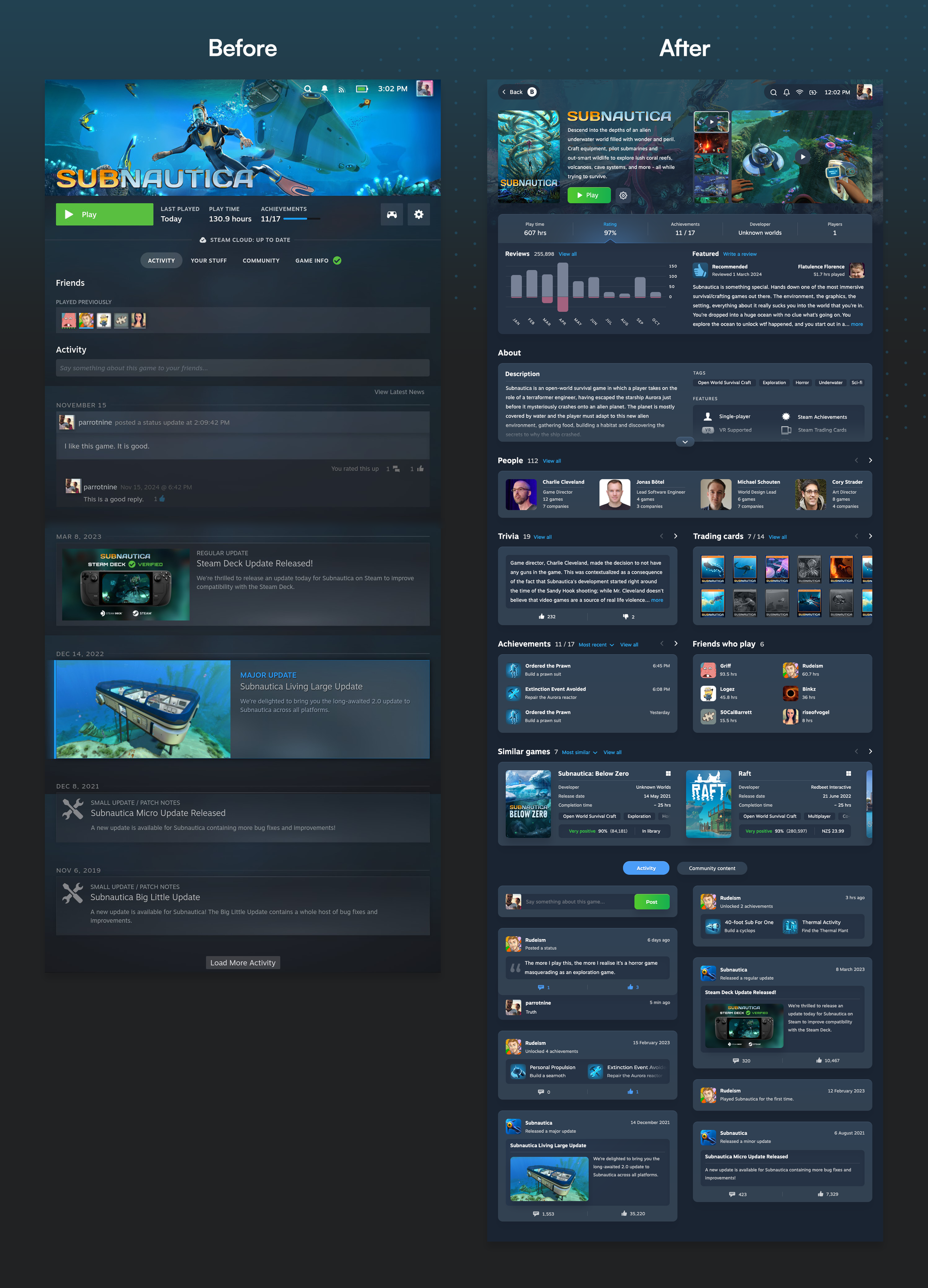
Game page | Before vs. after
Contributor page
The best feature of Plex is how easily you can explore the people behind a piece of media: see what else they’ve worked on, who they’ve collaborated with, and what those collaborators have also worked on. The People section on the Game page presented an opportunity to bring that experience to Steam.
Maybe a character’s voice sounds familiar, so you want to see what you might recognise them from (unless it’s Troy Baker, who may as well list the entire Steam catalogue). Or perhaps you want to immerse yourself in more games with a soothing art style like Journey. Or feel the chill of Nobuo Uematsu’s compositions in other games.
With the introduction of the Contributor page, all barriers to exploration have been removed.
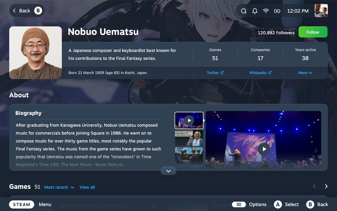
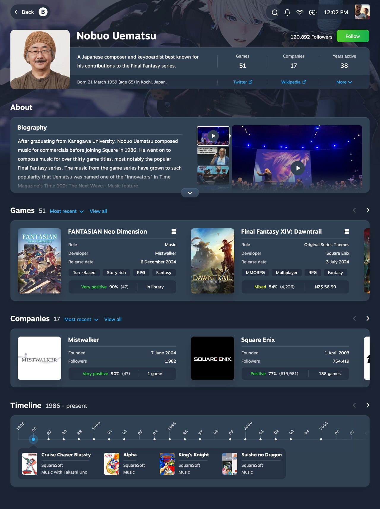
Similar to the Profile page, the Contributor page starts with an overview of the person, including the number of games they’ve worked on, companies they’ve worked with, and their active years in the industry.

Beneath is an About section, where you can learn more about them and view media that features them and their creations.

Next is a list of games they’ve contributed to and the roles they played, sorted by most recent.

You can browse the companies they’ve worked for, ranked by the overall performance of their games.
And a timeline provides a visual representation of their career, highlighting each game they contributed to, the companies involved, and their main role. Think of it like LinkedIn for the gaming industry.
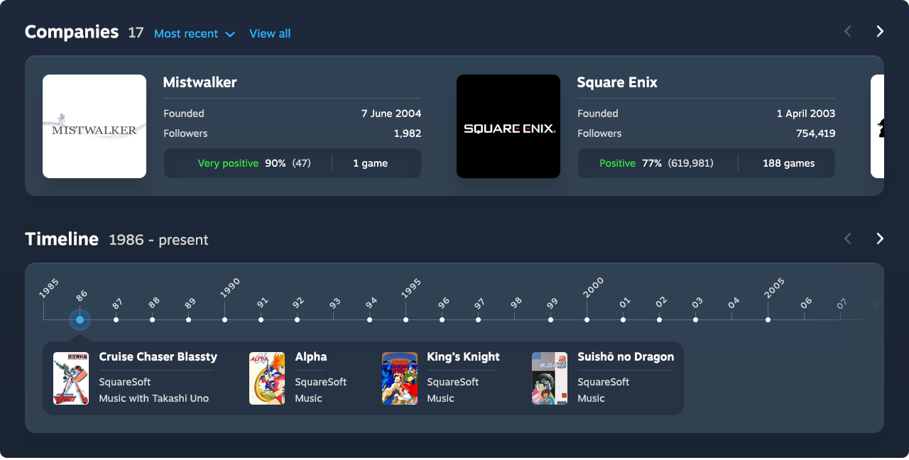
But not every game they’ve worked on will be available on Steam, and Steam doesn’t have individual pages for game contributors. We’re here to make realistic changes, not those borne out of pie-in-the-sky aspirations. So where could we pull this information from?
The company ranking is an aggregate of all their game reviews on Steam, while the rest of their information comes from MobyGames.
An open-source game database anyone can contribute to, MobyGames is a treasure trove of reviews, trivia, and credits for the people and companies behind a game. Each person’s page includes a biography, game credits, and details about the people and companies they’ve worked with.
On 7 December 2024, the MobyGames database had 290,014 games, 1,244,333 people, and 54,494 companies, compared to around 359,000 games on Steam.
What if they joined forces, like Amazon and IMDb?
Integrating MobyGames into Steam – and using badges, XP, and trading cards to incentivise contributions – would boost Steam’s competitive edge in several areas. It would solidify Steam as the definitive source of gaming knowledge, and provide a more comprehensive experience for those who use it to launch third-party games, like old game backups.
Contributor page | After

Company page
The developers and publishers behind a game are just as interesting as the individual contributors. But rather than celebrate the team and their portfolio of creations, all they get is a basic page that gives you no sense of the humans behind it.
To make matters worse, the Company page resides within the Steam store. You need to go out of your way to get to it, and you’re not rewarded when you get there.
For an end-to-end discovery process, from game to contributor to company, it was necessary to bring this page closer to your library.
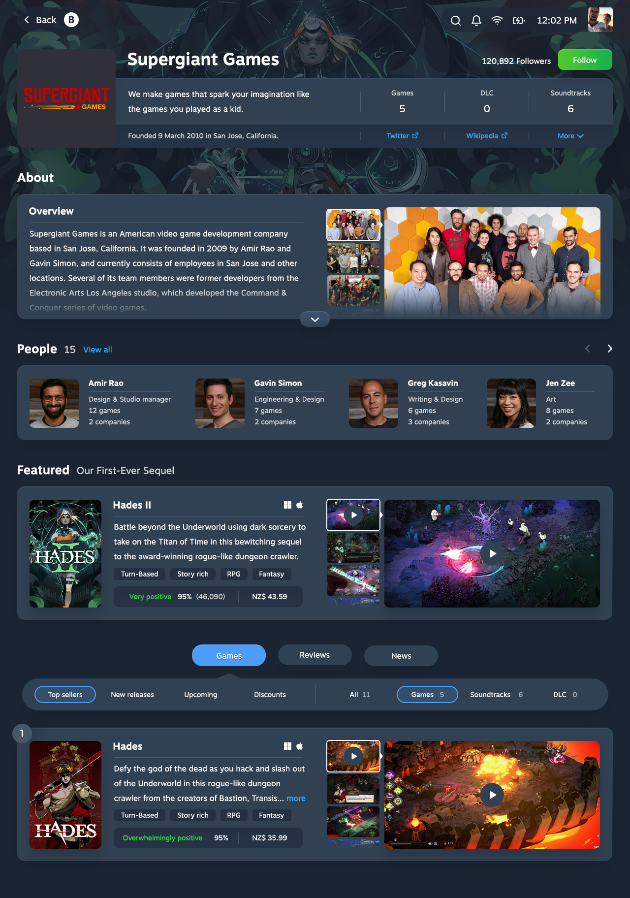
Company overview
The space underneath the company’s name, normally reserved for a tagline, instead contains a link they can use however they choose. Whether they want to encourage people to visit their website or buy their games at a discount, they’re forced to prioritise a single call to action – which the distracted gamer is likely to miss for the large Follow button underneath.
The tagline provides context about the team and their focus, but it’s not included in the top-level information that frames the page. Instead, you’ll find it further down, under the Featured tab. Navigate to a different tab and that context is gone.
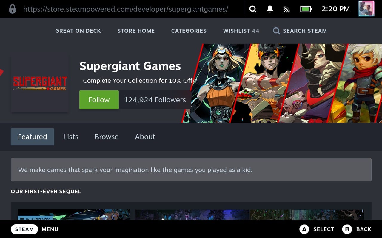
To make the overview more inviting, the company’s artwork now fades into the background – a move that adds depth and frees up space for an Overview section consistent with the Profile and Contributor pages.

The Overview section provides more context for each company, including the tagline and the date/location of their founding.
Also on display are the number of games, DLC (downloadable content), and soundtracks they’ve published, from which you can glean a surprising amount about their business model.

And you now have quick access to their website, social media, and other important pages, with two primary links and a dropdown list for the rest.
Tabs, people, and featured games
Steam splits the Company page into four tabs: Featured, Lists, Browse, and About. Lists and Browse display content you can already view from the Featured tab, and About has so little in it that half a sentence to call out its existence is more than enough.
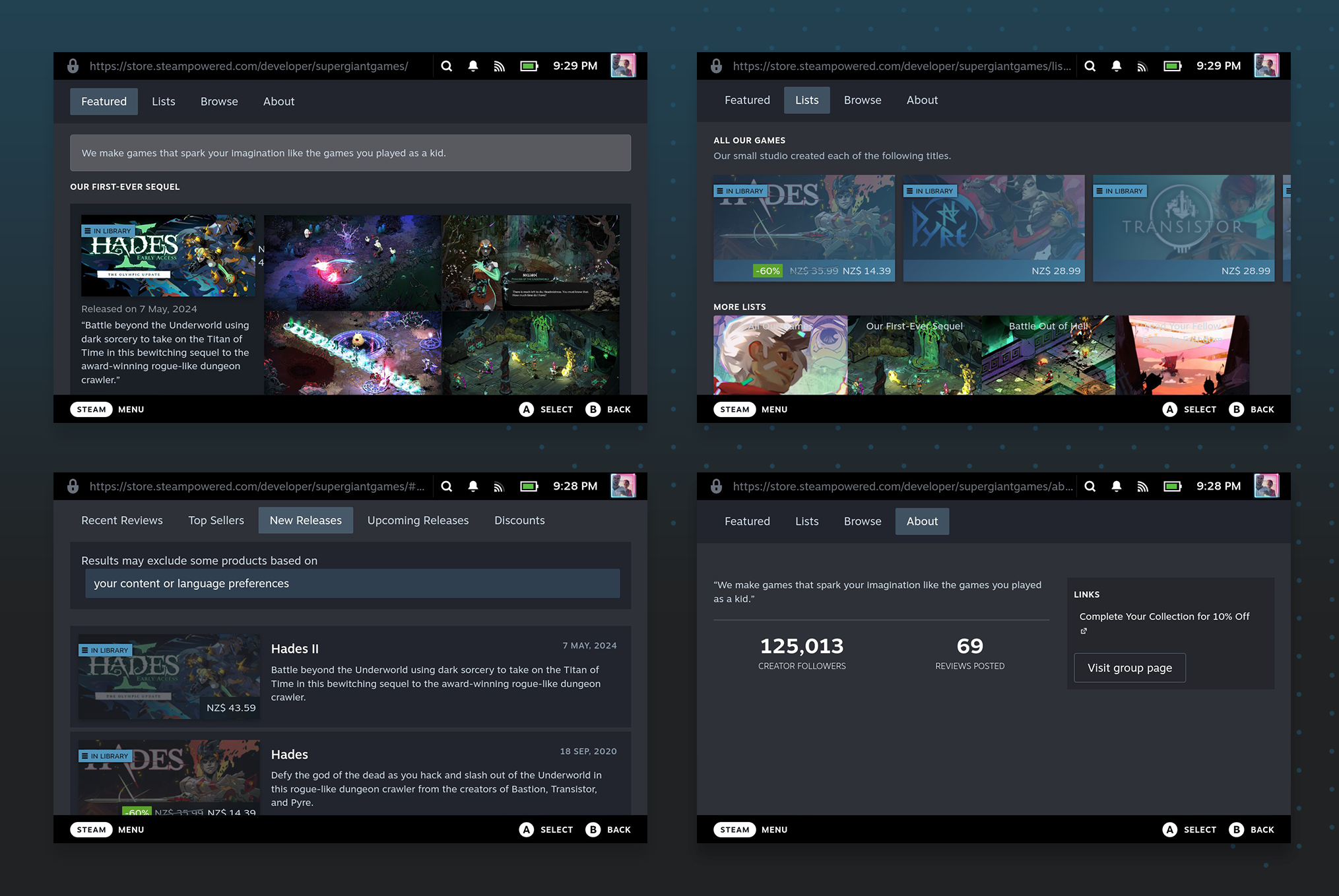
If the company have set up their page, the Featured tab will highlight one or several games. But it relies on the image to communicate the title, which is inaccessible and often difficult to read. And of the four images carefully curated to show off each game, you can’t get a closer look at any of them.
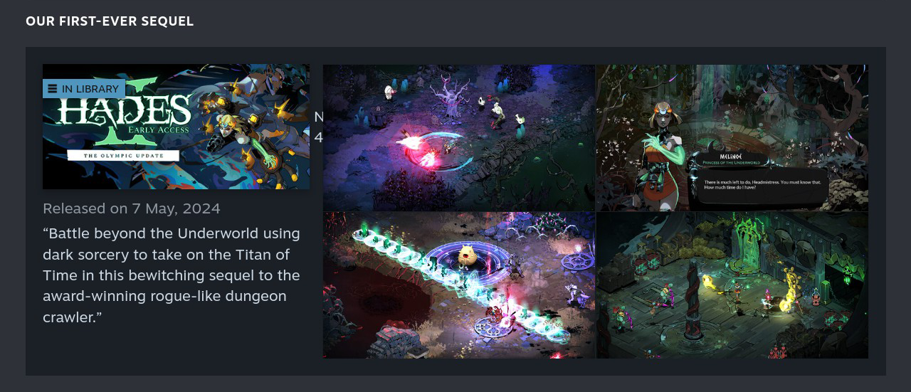
To showcase the information more efficiently, we condensed the tabs down to a single page view.
We started with an About section that fits neatly into the first viewport and provides more insight about the team. Just like the Contributor page, we pulled the summary content and related media from MobyGames.

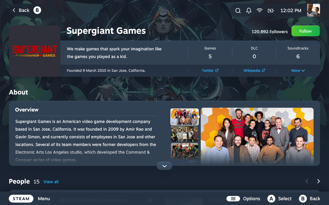
To introduce a human element, we added something that was sorely missing from the old Company page: the people who work there and the role they play. Click through to view that contributor’s page, where you can see other games they’ve worked on and companies they’ve worked with, and jump head-first down another rabbit hole.

The “Featured game” section now includes a text title for improved accessibility and readability, and uses the game’s cover art instead of a secondary image to increase recognisability. It supports more than four bits of media, with the ability to take a closer look at each. And while it uses the same text description as the old design, you’ll find it easier to read in the new format.

Steam lets companies feature multiple games, but if you prioritise everything you prioritise nothing, so the new design only shows one at a time. You can view the company’s Steam catalogue in the very next section, so it was unnecessary to waste space on duplicate content.

Company feed
The page ends with a list of the company’s games – top sellers, new, and upcoming releases – alongside reviews and discounts if they have any.
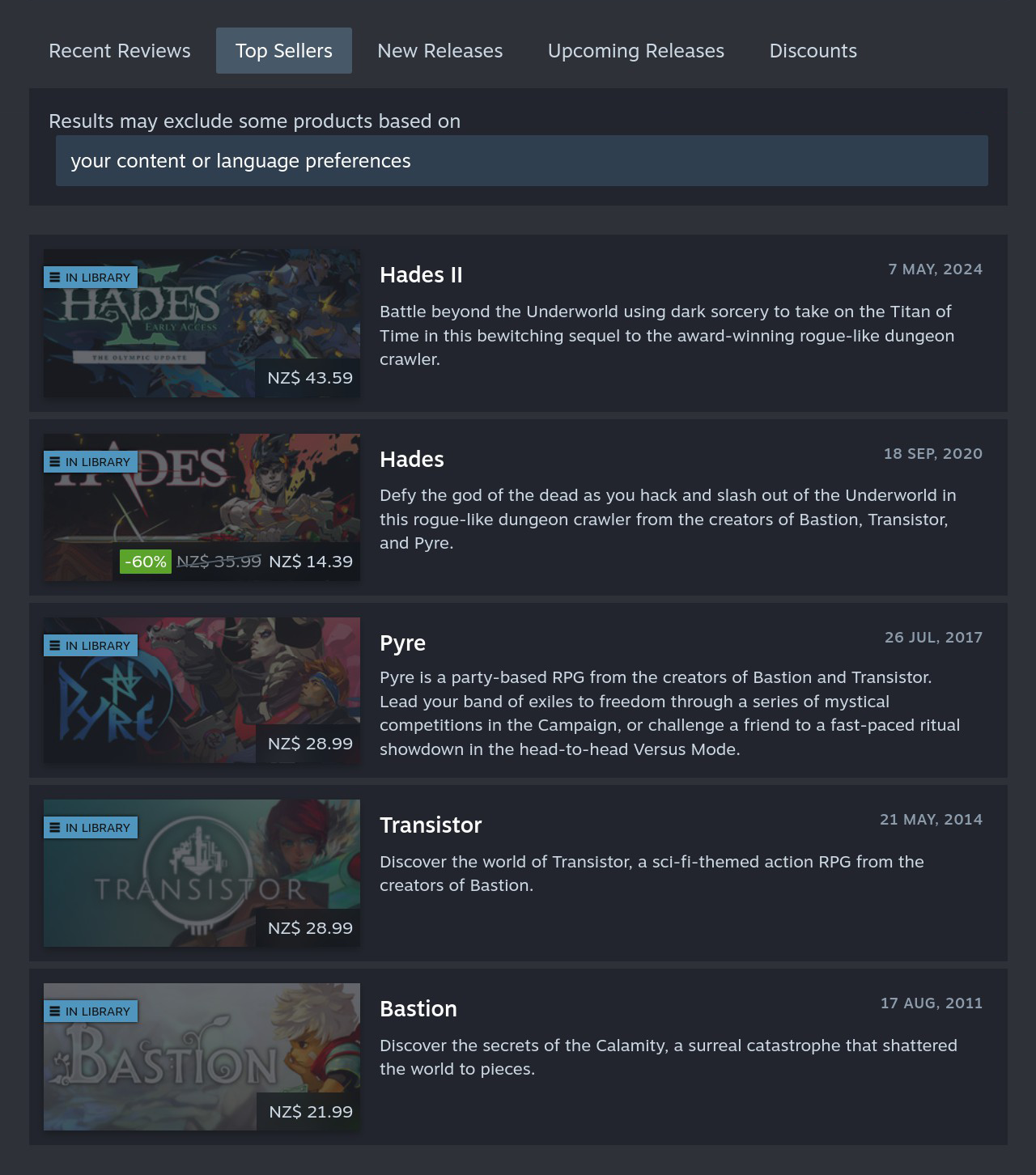
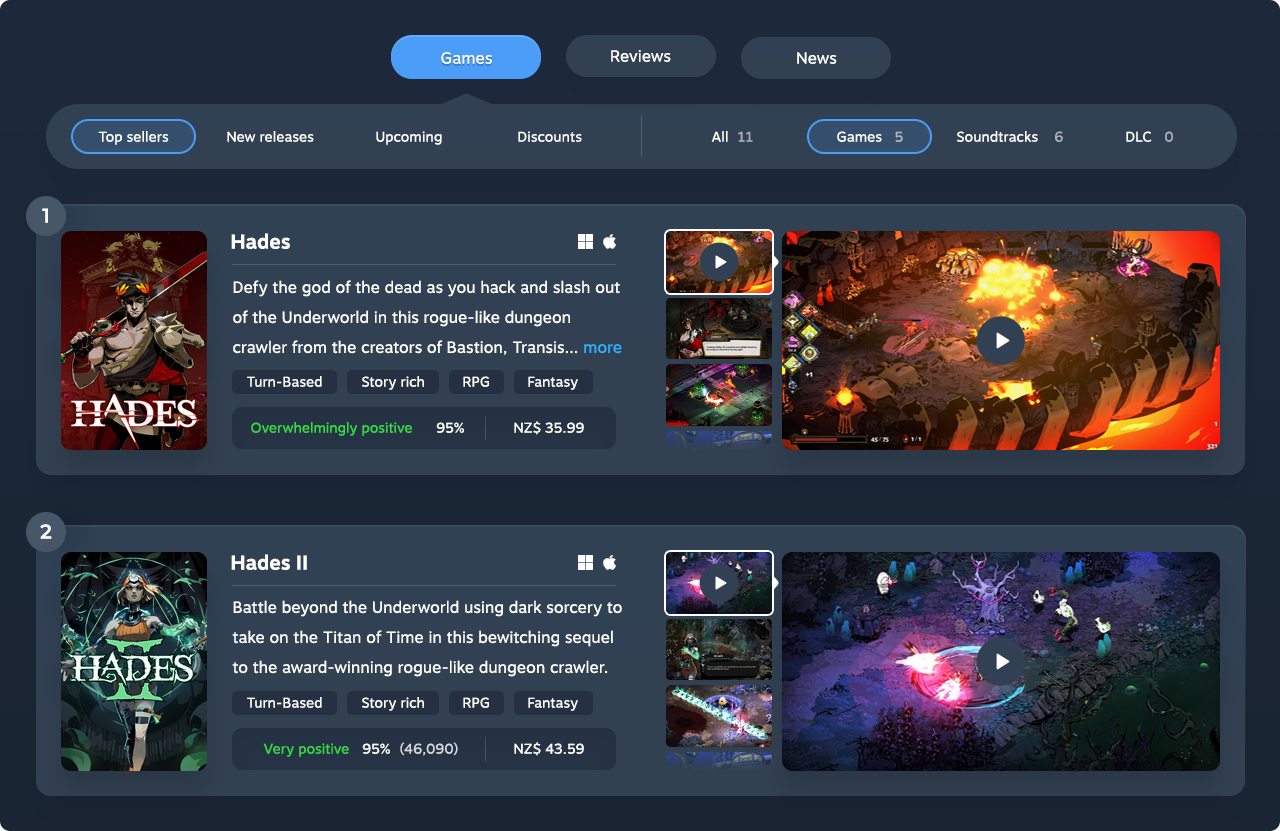
But this categorisation is flawed, as Top Sellers, New Releases, Upcoming Releases and Discounts all belong underneath a Games category.
Reviews are those written by team members about other games, so they deserve their own tab. And News is the place for company announcements, for those who choose to share them.
Company page | Before vs. after
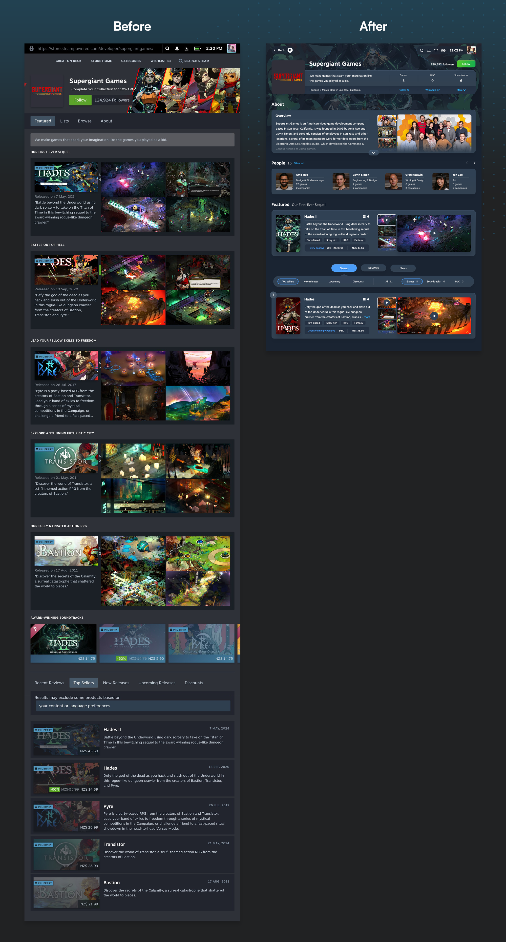
The final designs
For a closer look, download the full Steam redesign (ZIP, 13MB).
Where to from here?
Our goal was to help people get immersed in their games, and play their way through their Steam Pile of Shame. The new design lets them do so in a way that’s enjoyable, engaging, and feels right at home on the Steam Deck.
The outcome may look simple, yet it’s the result of thousands of design decisions. In the interest of brevity, this case study barely scratches the surface.
But there’s a mountain of work between a concept and the final product, especially for one as comprehensive as Steam. Most features still require much deeper thought, all interactions must be mapped out, and the Steam store and desktop experience need to be updated to make all touchpoints consistent.
Static designs will only get us so far: it’s difficult to assess interactions when you have to visualise them in your head. Our next step is to build an interactive prototype in HTML, CSS, and JavaScript (not Figma), so we can play around with it, optimise the design, and get others to test and share their feedback.
The prototype phase is where the real magic happens: we evolve a good design into a great product.
Many details will change during this process, so the final design could be quite different. But thanks to the modular layout, it will look similar at a glance: information-rich and optimised for engagement.
Valve is welcome to take inspiration from our work to make the Steam experience better, but they know as well as we do that the devil – and delight – is in the details.
If you want to speed up the process, let’s talk.

